Tutorial: TV Numbers
As much as some of you may like to use the already laid out numbers from CCSLC & my Photobucket account, I find the best way to place numbers on my concepts is to actually have the fonts installed on my computer.
What do I mean? I mean that you can actually have all of the NHL (and other leagues) team fonts on your computer the same way you have Times New Roman or Arial. Go to this link. That link is also available on the TEMPLATES page under the link titled "Download Sports Fonts". Click all of the sports (they will all be useful), and save all of the zipped folders. Unzip all of those folders. Now you're going to go into those unzipped folders and COPY the files with this icon.

At this point I don't know what Mac users have to do (Google will probably have the answer), but PC users then go to the following file path C:/Windows/Fonts. Now PASTE those font files in that folder. That will install the fonts.
However it is COMPLETELY understandable to stick with the numbers already made. Just keep in mind that they typically only fit the CCSLC template. They are too small for the Official Style Guide template and the NHLuniforms template.
I will again work with two templates for this tutorial. The CCSLC template, and the NHLuniforms template.
 Everything that is done to the CCSLC template applies to the Official Style Guide template.
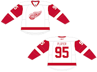
Also remember, as I will only show this once, how the TV numbers appear on the front of the concept will be EXACTLY the same as how they appear on the back. I'll show you as we start with an easy number, #95... Notice what side the 5 is on and notice the side that the 9 is on. They appear in that same order on the back. Think of folding one of your jerseys in half and what the numbers would look like. That is exactly how the numbers should look like on your concepts. Here's #95 on the NHLuniforms template...
 When you start to use a 1 in your numbers it throws off the balance a bit. Thus, TV numbers wouldn't appear "even" on the sleeves. This isn't a huge deal, a lot of people don't worry about this and that's perfectly okay. I personally like to do this. I do this by using the SELECT tool to evenly select your TV number, after it has been rotated accordingly. You then PASTE it on your concept and make sure that exactly the halfway points line up to the edge of your template, like this.
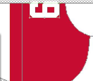
Now you just need to delete the part of the number that is outside of the lines. If you're using MS Paint, you will simply need to draw the small but of grey outline again.
You would do the same for the NHLuniforms template, except it would be on an angle. What your concept should look like is this...
and this...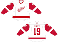
Just a quick side note here, the idea above is the same method you would use when placing shoulder patches on your concepts. You would cut them in half just like above. Each half would appear in the same order on both sides of the concept, just like the TV numbers. If you don't get that, that's okay. That's another tutorial for another day.
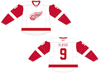
Single numbers (0-9) is where I see the most trouble. Either people place the number only on one side of the concept, or they place the number on both sides of the concept. The accurate way to display a single number is to cut it in half, just like we did above except now you're only dealing with one digit. Here's what that would look like... and the NULuniforms template...
Again, it's perfectly okay to use the pre-made numbers from the links above, but I find there is much more freedom and creativity if you download the fonts. If you choose to download the fonts, here are some font sizes to learn that should fit the templates nicely. I have used these font sizes in the pictures above. These sizes are for the original NHL fonts, not the ones labeled "Edge".
CCSLC Template
Player's #: size 120
TV #'s: size 40
NOB: size 28
NHLuniforms Template
Player's #: size 132
TV #'s: size 48
NOB: size 33
MS Painters, hopefully this can help you...
It's numbers angled properly for the NHLuniforms template. I only have created these in Detroit's font. It was somewhat time consuming so NO I will not be doing them in another font. However, these should be useful when using a standard block font.
What do I mean? I mean that you can actually have all of the NHL (and other leagues) team fonts on your computer the same way you have Times New Roman or Arial. Go to this link. That link is also available on the TEMPLATES page under the link titled "Download Sports Fonts". Click all of the sports (they will all be useful), and save all of the zipped folders. Unzip all of those folders. Now you're going to go into those unzipped folders and COPY the files with this icon.

At this point I don't know what Mac users have to do (Google will probably have the answer), but PC users then go to the following file path C:/Windows/Fonts. Now PASTE those font files in that folder. That will install the fonts.
However it is COMPLETELY understandable to stick with the numbers already made. Just keep in mind that they typically only fit the CCSLC template. They are too small for the Official Style Guide template and the NHLuniforms template.
I will again work with two templates for this tutorial. The CCSLC template,
 and the NHLuniforms template.
 Everything that is done to the CCSLC template applies to the Official Style Guide template.
Also remember, as I will only show this once, how the TV numbers appear on the front of the concept will be EXACTLY the same as how they appear on the back. I'll show you as we start with an easy number, #95...
 Notice what side the 5 is on and notice the side that the 9 is on. They appear in that same order on the back. Think of folding one of your jerseys in half and what the numbers would look like. That is exactly how the numbers should look like on your concepts. Here's #95 on the NHLuniforms template...
 When you start to use a 1 in your numbers it throws off the balance a bit. Thus, TV numbers wouldn't appear "even" on the sleeves. This isn't a huge deal, a lot of people don't worry about this and that's perfectly okay. I personally like to do this. I do this by using the SELECT tool to evenly select your TV number, after it has been rotated accordingly. You then PASTE it on your concept and make sure that exactly the halfway points line up to the edge of your template, like this.
Now you just need to delete the part of the number that is outside of the lines. If you're using MS Paint, you will simply need to draw the small but of grey outline again.
You would do the same for the NHLuniforms template, except it would be on an angle. What your concept should look like is this...

and this...

Just a quick side note here, the idea above is the same method you would use when placing shoulder patches on your concepts. You would cut them in half just like above. Each half would appear in the same order on both sides of the concept, just like the TV numbers. If you don't get that, that's okay. That's another tutorial for another day.
Single numbers (0-9) is where I see the most trouble. Either people place the number only on one side of the concept, or they place the number on both sides of the concept. The accurate way to display a single number is to cut it in half, just like we did above except now you're only dealing with one digit. Here's what that would look like...
 and the NULuniforms template...
Again, it's perfectly okay to use the pre-made numbers from the links above, but I find there is much more freedom and creativity if you download the fonts. If you choose to download the fonts, here are some font sizes to learn that should fit the templates nicely. I have used these font sizes in the pictures above. These sizes are for the original NHL fonts, not the ones labeled "Edge".
CCSLC Template
Player's #: size 120
TV #'s: size 40
NOB: size 28
NHLuniforms Template
Player's #: size 132
TV #'s: size 48
NOB: size 33
MS Painters, hopefully this can help you...
It's numbers angled properly for the NHLuniforms template. I only have created these in Detroit's font. It was somewhat time consuming so NO I will not be doing them in another font. However, these should be useful when using a standard block font.
Tutorial: TV Numbers
 Reviewed by Ryan
on
December 24, 2011
Rating:
 Reviewed by Ryan
on
December 24, 2011
Rating:


3 comments:
Nice Tutorial, I'm sure this will help alot of people including myself.
maybe someone can help me out with this, Im wondering how to get the TV numbers no pixelated and blurry. Thanks to this tutorial, not only has my question about the size of the number and NOB have been answered but this helps moving forwards 1000%. Thanks Ryan for a great tutorial!
For the fonts, Mac users just have to double-click the file to install it.
Post a Comment