It's Official: Winter Classic at the Big House
.png) We got the official announcement today that the Leafs will travel to the Big House in Ann Arbor, Michigan to play the Red Wings in the 2013 Winter Classic! We also got a look at the Hockeytown Winter Festival logo and possibly the Winter Classic wordmark. I can tell you that here in Toronto the city is buzzing. People are so jacked to get tickets that the site to sign up for ticket info has crashed! From sports talk radio callers, it sounds like Leafs fans are going to try to invade Michigan and take this thing over. Wings fans better up their game, haha!
We got the official announcement today that the Leafs will travel to the Big House in Ann Arbor, Michigan to play the Red Wings in the 2013 Winter Classic! We also got a look at the Hockeytown Winter Festival logo and possibly the Winter Classic wordmark. I can tell you that here in Toronto the city is buzzing. People are so jacked to get tickets that the site to sign up for ticket info has crashed! From sports talk radio callers, it sounds like Leafs fans are going to try to invade Michigan and take this thing over. Wings fans better up their game, haha!All of the events that I mentioned yesterday were also confirmed today and will take place at Comerica Park. I was also thinking about PuckDrawn's annual Grand Rapids Griffins jersey design competition, where the winner actually has their jersey made and the Griffins wear it for their December 31st game. Well, for the 2012-13 season, that game is scheduled for the AHL Outdoor Classic at Comerica against the Marlies. I wonder if that comp will still happen?
The lack of votes for the COTW and COTW-January polls has been really disappointing. Today is the last day to vote for both of them and only 6 votes have been cast for the monthly poll and only ONE vote cast for COTW! Anyways, here is the rundown...
COTW vote (ends Thursday @ 11:59pm EST)
COTW-January vote (ends Thursday @ 11:59pm EST)
Only one entry has come in for the Create-A-Team contest in the last 24 hours.
Hamilton Steel (by HJC)
------------------------------------------------------
Montreal Canadiens concept (by Rylen)
Rylen's first contribution to HJC is a Rocket Richard tribute sweater. I like the idea, but this could use some more white. Also, the red in the logo should be the same shade as what is used on the jersey. I also don't think the white hem fits in too well. It's a good start though Rylen, I look forward to hopefully seeing more in the future.
Augsburg Panthers DEL concept (by Martin)
This is a German league team. Their current sweater actually look like vintage Red Wings sweaters. They have a white, red and green versions. For this concept, I would go with less green and something not so bright. Also, the numbers on the back appear to be small.
Chicago Blackhawks concept (by Deferoiler)
I`m not liking this one too much. First, the crest uses true white while the rest of the concept uses vintage white. There are also no shoulder patches or TV numbers, at least. I also think the red hemline looks out of place. Also, the black background really does not work with a jersey that also uses black.
Minnesota Wild concepts (by Thomas)
I think the white jersey needs some green in the hem with the red. The green jersey has some potential. I think the hem stripes could be placed further down on the sweater. Also, mixing some green in there would help. Finally, I think the numbers need and outline.
Edmonton Oilers concepts (by Stephen T.)
This is a neat idea. These are based on the WHA orange Alberta Oilers sweaters, but Stephen has used the bronze from the 3rd jersey. I really like the white version and I think it would be a great option as a white 3rd jersey. The concept itself is pretty well executed too.
Washington Capitals concepts (by Chris Z.)
Chris uses the 90`s logo in a way that I think looks better, with red and blue. However, I think different shades of red and blue would work better. While this is a decent concept, I think it could add more life if perhaps the current red and blue were used.
Calgary Flames concepts (by Kyle C.)
I like these concepts for the most part. I might be in the minority when I say that I like the flags as shoulder patches for the Flames. Two things I`d change on this concept and they are both on the red jersey. First, I find the yellow yokes too distracting. Next, I would make the collar yellow instead of white.
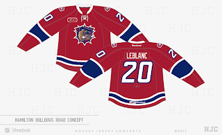
Hamilton Bulldogs concept (by HJC)
My recent visit to Hamilton gave me a closer look at the Bulldogs' sweaters and I thought that they could do a better job getting away from a Reebok cookie cutter looking sweater and play more off of the history of their parent club. I tried to keep some of the elements Bulldogs fans are used to while doing a better job tying into the Canadiens.
Erie Otters concepts (by Kevin) Description on the concepts. *COTW nom from me!
It's Official: Winter Classic at the Big House
.png) Reviewed by Ryan
on
February 09, 2012
Rating:
Reviewed by Ryan
on
February 09, 2012
Rating:
.png) Reviewed by Ryan
on
February 09, 2012
Rating:
Reviewed by Ryan
on
February 09, 2012
Rating:


(!stContrib).png)


5 comments:
Stephen T. for COTW
Stephen T's bronze jerseys are really good! COTW from me!
I'll second Kevin for COTW. Really enjoyed the whole series so far.
Kevin's Otters concepts got my vote!
@Stephen T. - check the spelling. otherwise, nice job, some of your best work.
Post a Comment