Friday: Let's make a deal... or not.
Hey everyone, as of tomorrow, it looks like our nightmares are going to come true. It looks pretty bleak from here, and it is almost certain that tomorrow the NHL will officially be locked out.
On the bright side, you weekend is here, which gives you the chance to get some really solid hours into NHL 13 (at least, that's what I hope to do)
The voting for both COTW and the August COTY vote finished up last night, and Ryan will hopefully have the results of those votes for you on the weekend.
---------------------------------------------------------------------------------------------
On to the concepts.
Florida Panthers concept (by Kyle C.)
A solid effort from Kyle on this Panthers alternate. In my opinion, the only logo for the front of a Panthers jersey is the leaping panther breaking the stick. It is so awesome. I like the presence that red has on this jersey, but wish yellow had a stronger role. Perhaps if the blue stripe was changed to yellow, and the yellow stripe was red it would look a bit better. 7/10.
Santa Fe Herd concept (by Chuckie)
This colour scheme has really grown on me. It reminds me a bit of the old Manitoba Moose colour scheme (minus the green). My favourite from these 3 jerseys is the black alternate; the hem stripes really make a difference and I think the home and away sweaters would really benefit from similar hem stripes. 6/10.
New York Mets concept (by Matt D.)
I have really enjoyed Matt's MLB series so far. The one thing I would change on this sweater is the cuff design. I really don't think this concept needs it. As mentioned earlier, the photoshopped player model has some execution errors. For future instalments, I would simply leave it off. It gets really repetitive seeing a poorly photoshopped model on every one of these concepts, and I think these jerseys really speak for themselves. 7/10.
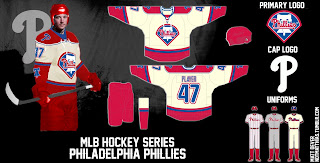
Philadelphia Phillies concept (by Matt D.)
For some reason this Phillie concept just speaks to me. I love the rounded numbers and how the vintage white and true white coexist on this sweater well done. 7/10.
Edmonton Oilers concept (by WinnipegJets96)
This jersey is intende as a commemorative alternate jersey marking the 40th anniversary of the WHA's Alberta Oilers. I like a lot of things going on this sweater (I especially like the ALBERTA name plate. very authentic, but it would undoubtedly read EDMONTON if the oilers were to go this route for real). I do not like the small secondary logo on the chest. It is repetitive, and crowds the sweater. 6/10.
Winter Classic concept (by WinnipegJets96)
I like the leafs jersey, with the blue on blue nameplate, but honestly if the wings wore this sweater for the classic I would be very disappointed. The Canadiens basically wore their away jersey for the las Heritage Classic, and the Wings would be stupid not to learn from the Habs' mistake. Half the fun of Classic games is the special vintage sweaters. 6/10.
Quebec Nordiques concept (by Steven G.)
These sweaters are well executed, but lack the Quebec style. There is too much red on these, and no fleur de lis. I would also like to see a more powdery blue. This current colour scheme is not distinct enough for me from the Habs, the Nords provincial rival. Overall really well executed though. 7/10.
Edmonton Oilers concept (by Kyle C.)
WOW, basically twin concepts in this post! This is the perfect matching alternate sweater for Edmonton. Great execution on this one. 8/10 and a COTW nom from me!
Friday: Let's make a deal... or not.
 Reviewed by Unknown
on
September 14, 2012
Rating:
 Reviewed by Unknown
on
September 14, 2012
Rating:


.png)


2 comments:
Steven G. for COTW
The Whalers striping pattern looks pretty good in Nordiques colors in Steven's concept. I'd love to have an old Whalers jersey.
Post a Comment