Thursday: Game 7, the RHL, and concepts!
 |
| from dallasnews.com |
it. Anyway, my dad and I had the awesome chance to see Game 7 of the CHL (Central, not Canadian) Finals here in Allen, TX between the Wichita Thunder and the Allen Americans (who are partly owned by Mike Modano, Craig Ludwig, and Ed Belfour). It was an amazing game. The Thunder took a 2-0 lead in to the 3rd period, and the Americans fought back to tie the game and force overtime. Allen scored in OT to win the game and the Ray Miron Presidents' Cup, 3-2. Also, the Blackhawks have gone down 2-1 in their series and Game 4 is tonight. I'll be biting my fingernails the whole game, anyway, GO HAWKS! Let's get rolling!
-------------------------------------------------------------
Here are the daily voting reminders...
COTW vote May 13-19 (ends Friday @ 11:59pm EST)
Boston Bruins Untouchables entries (due Friday @ 11:59pm EST)
-------------------------------------------------------------
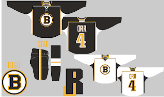
Here are today's entries for the Bruins portion of the Untouchables comp...
AJ Stowaway
Brendan R.
-------------------------------------------------------------
-------------------------------------------------------------
Colorado Avalanche concept (By: Kyle)
One more thing, JB has started a project called the Redline Hockey League. You can read all about it on this here picture. The RHL is on Facebook, Twitter, Behance, and Tumblr. Some RHL concepts will also be featured right here on HJC! I have to say myself, it looks awesome so far! Check it out.
Kyle starts us off with some pretty cool, and classic, Avs concepts. I like the simplicity. No black, no silver. Just burgundy, blue, and white. How the Avs should be. I love the hem and yoke striping, it works. The blue pants work well too. Great job. One thing, I would recommend some sort of shoulder patch or pants logo, maybe the bigfoot logo? Also, the helmets need logos. 8/10
Dallas Stars concept (By: Mark M.)
With the Stars unveiling their new uniforms on June 4th, Mark has some simple Stars concepts for us. I like the yokes. I think the striping is a bit too thin. I think these are a bit too boring for my tastes, but that's just me. I can tell you one thing, I would take these over the jerseys that are no more. Also, the Texas state logo is on the concept, why isn't it somewhere on the jersey? I would like to see that implemented somewhere too make it less bland. 7/10
Rouyn-Noranda Huskies QMJHL concept (By: Bastian)
The Huskies have tons of gradients on their jerseys. Bastian has simplified them, and I LOVE this. The simple, slight gradients in the striping is awesome. It's not an overwhelming amount, I love it. Their logo is awesome, thanks for using it here. I love that font too, anyone know the name of it (numbers/name)? Anyway, great job here Bastian. 8.5/10
Seattle Thunderbirds WHL concept (By: Scott D.)
Scott has some cool Thunderbirds sweaters for us. I like just about everything here. If Seattle were too ever get an NHL team, these jerseys would be awesome. My one concern would be the away jersey, is it too close too the Canucks road jersey? Not sure, but these are just awesome. Great job, as always, Scott. 8.5/10
Tampa Bay Lightning concept (By: Myself/Tyler G.)
Well, I was watching some old videos from 2004 when the Bolts won the cup, and I really liked their old black jerseys. The templates for the home and road are based off the Washington Capitals jerseys. The blue alternate uses the "victory stripes" on the hem and yoke. Tell me what you think in the comments! Thanks.
Ottawa Senators concept (By: Mike S.)
Mike continues his Outdoor series with the 'Nucks vs Sens game from BC Place. I like the barber pole stripes, something the Sens really need to do. The shield logo looks good as well. The thing I don't like is the Reebok logo, I think it should be just black with the vintage white background. Cool concept here, Mike. 7.5/10
Hartford Wolf Pack AHL concept (By: Scott M.)
This was Scott's entry into the Wolf Pack redesign competition. I love these. The stripes in the pit stains are awesome. The numbers are really cool too. The Rangers pants fit. And that is one heck of an alternate. Three awesome jerseys here from Scott. No complaints at all. 9/10 and a COTW nom from me
Québec Remparts QMJHL concept (By: Bastian)
Bastian changes the red to orange for the Remparts. The jerseys are awesome, love the striping. Also, that logo is one of my favorites in all of sports. No complains from me other then the orange. Awesome job. 8.5/10
Thanks for reading, have a good Friday everyone!
Thursday: Game 7, the RHL, and concepts!
 Reviewed by Tyler Gross
on
May 23, 2013
Rating:
 Reviewed by Tyler Gross
on
May 23, 2013
Rating:


.png)


4 comments:
Scott's Wolfpack set is awesome except for the stripes in the armpits.
Wonder what they'd look like in the lighter rangers blue so they'd go 100 percent with the pants, and gloves etc. that players would use and could move from minor league up to the big club if they made the move from CT to MSG.
I think that font on Bastian's Huskies' concept is the Dallas Cowboys throwback font. I could be wrong.
The font is called Academic M54. Look here: http://www.dafont.com/search.php?q=academic
I nominate Tyler G.'s Tampa concept
Post a Comment