Trending
This season marks the middle of our current decade in the NHL. Usually by this point you can get a feel of an extended trend in hockey design. Let's take a look at each decade and see what trends come to light:
(Note: I am summarizing each decade based on each 5-6 year. Not all references will refer to a specific year. The purpose is merely finding over-arching trends rather than a historical summary of league aesthetic.That means don't comment saying that I said Nashville entered the league in 2005. I simply mean it's the first decade they appear.)
 |
| Image Credit: Thirdstringgoalie.blogspot.com |
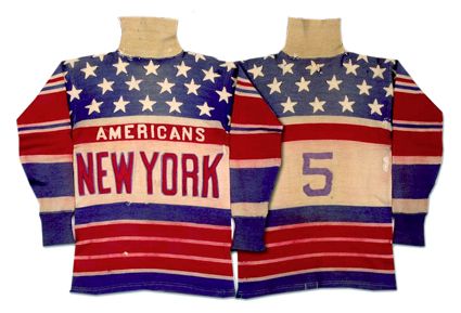
1925-1926: Barber pole striping is the order of the day. Check out the New York Americans and Ottawa Senators. Understatement is not a concern. Only Boston uses a mascot in their logo branding. Ottawa has no logo at all. Every team uses a ringed sweater collar, except for the New York Americans, who use a turtleneck collar. All teams use the same jersey at home and on the road.
 |
| Image Credit: BetweenthePosts |
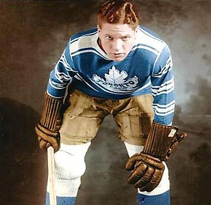
1935-1936: Only one team (Boston) doesn't use some shade of blue or red. Chest stripes are used by five of the eight teams. Turtleneck-style collars are gone. Three teams use a mascot in their branding (Chicago, Detroit, and Toronto) but only Detroit does not have an accompanying script declaring their team location/name. Ottawa and Pittsburgh are gone, and Toronto is now the Maple Leafs. Chicago, Detroit, and the New York Rangers enter the league. Four teams now have a white alternate jersey that they use on the road.
 |
| Image Credit: Taken from Flickr user leswill. Image is of Dutch Hiller (1946) |
1945-1946: Barber pole striping has been gone for awhile, and chest stripes are fading from hockey as well. Chicago has not gotten the memo yet, though. One third of the league has a jersey with no logo. Only one team uses no red in their jersey set. Contrasting shoulder yokes have become a thing. The Montreal Maroons and New York Americans are no more. Only the Bruins and Rangers have a solitary jersey used at home and on the road.
 |
| Image Credit: blackhawks.nhl.com |
1955-1956: A trend towards clean lines and simplicity is nearing it's peak. Boston remains resolute in a league completely dominated by red and blue. Boston and the NHL All-Star game jersey bring back barber pole striping. Pre-war nostalgia? Half the league now uses tie-down collars instead of traditional sweater-style collars. The Rangers introduce drop-shadow effect in the league. Chicago switches to a mascot-only logo, joining Detroit in that regard. Every team now has a home/away jersey. Boston goes from one jersey only, to three. Chicago is the only team in the league with a shoulder/arm patch.
 |
| Image Credit: Sportslogos.net |
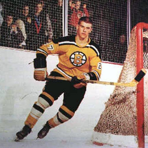
1965-1966: The trend of clean lines, color balance, and simplicity reaches its zenith. You could argue the league never looked as good as it did during this era, and has never looked as good since. You could say the same of car design, advertising, and men's fashion accessories. It's a golden age of design. Chicago has begun using a V-neck collar. Only Boston and Detroit still use the old style sweater collar. The rest of the league, and the ASG jersey, uses tie-down collars. Maybe the biggest change of all: every team now uses sleeve numbers.
 |
| Image Credit: found via delphiforums from user SealsFan1. No idea who the original photographer is. |
1975-1976: The first wave of major expansion; Buffalo, Atlanta, California Golden Seals, LA, Kansas City, Minnesota, New York Islanders, Philadelphia, Pittsburgh, St. Louis, Vancouver, and Washington are introduced. The predominant trend is bright colors. Only one team (Boston) uses a black jersey. Only three of eighteen teams use any black at all. Only Detroit continues soldiering on with an old-style sweater collar. V-necks are the most popular collar of the day, which have enabled the introduction of layered collar stripes. Tie-downs are only used by three teams. Two teams (Philly and Toronto) use striping that extends the entire arm span of the jersey. Teams have begun putting player names on the backs of jerseys, though only on the road.
 |
| Image Credit: canucks.nhl.com |
1985-1986: The Kansas City Scouts, California Golden Seals, and Atlanta Flames are gone. The Calgary Flames, Hartford Whalers, New Jersey Devils, Quebec Nordiques, Edmonton Oilers, and Winnipeg Jets are introduced. The trend of brighter colors continues. Eight teams now use "Athletic Gold" (AKA yellow) in their branding. Two teams (Vancouver and LA) use it for their light jerseys. Four teams now use full-length arm striping (Toronto, LA, Philly, and Winnipeg). The All-Star Game jerseys follow that trend. Every team now uses a V-neck collar, with Detroit finally making the switch. All jerseys now include player names. Helmets are used league-wide, with dark and light helmets for home and away games.
 |
| Image Credit: TheRoyalHalf (can you have a more 90s screenshot?) |
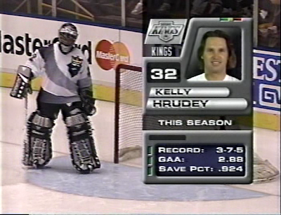
1995-1996: Minnesota has moved to Dallas, and the Nordiques are now the Colorado Avalanche. Ottawa returns, and the Lightning, Sharks, and Panthers emerge. This is the single strangest year in NHL jersey history. This is the year of the Burger King jersey, the Wild Wing, the Winnie-the-Pooh jersey, The Robo-Penguin, the infamous Fishsticks jerseys, Vancouver's gradient alternate, and the star-shaped alternate. Angular striping and organic patterns are the trend of the era. Twelve teams have a jersey that doesn't use horizontal stripes. Three teams have incorporated teal in their branding. The V-neck collar celebrates two decades of complete dominance. Four teams now use arched nameplates. Fifteen teams now include logos on their helmets, with Winnipeg using different helmet logos for home and road games. Five teams now include alternate jerseys in their sets.
 |
| Image Credit: ducks.nhl.com |
2005-2006: Reebok takes over. The NHL returns to Minnesota. Carolina replaces Hartford, Winnipeg moves to Arizona, and league expands to Columbus and Nashville. The decade is dominated by one trend: Black For Black's Sake, now infamously and derisively known as BFBS. Five teams now have a black alternate, with two more including alternates that introduce black as a trim color. Sixteen teams have now incorporated black into their team branding. Twenty-one teams now have an alternate jersey in their rotation. Darker, "edgier" colors are the order of the day. The tie-down collar makes a comeback, with twelve teams now using them on at least one of their jerseys. Vancouver and Montreal wear vintage jerseys for a select few games. Minnesota introduces "Fauxback" into the jersey lexicon with their alternate jersey incorporating a roundel logo. Edgy black jerseys are the trend, but a trend towards vintage design is already starting. This is one of the last years before Reebok introduces it's template designs.
 |
| Image Credit: bluejackets.nhl.com |
2015-2016: Reebok's last year as manufacturer. Atlanta moves to Winnipeg. Nineteen teams have an alternate jersey. Six teams now have a black alternate. Two are latecomers to a party that died awhile ago, and three have overstayed their welcome. Ottawa gets a pass. Six teams have brought back old jerseys as alternates. Five alternates are what have become known as "fauxbacks." This decade so far shows the tail end of the BFBS trend, and the beginning of trend towards emphasizing brighter colors, simplicity, and cultivating a cohesive and easily recognizable team brand; something the BFBS era had damaged. You see this with Nashville changing their whole brand emphasis towards all gold everything, and Dallas going with a distinctive shade of green. Tampa and Carolina use less black in their home jerseys. Outdoor event jerseys for the Winter Classic, Heritage Classic, and Stadium Series are now the catalysts behind jersey design trends. The short-lived Reebok template designs are already being phased out. The vintage trend extends towards the 1990s, with Anaheim, Arizona, and Vancouver introducing special event jerseys that apply 90s designs to modern Reebok jerseys. The Winter Classic and Stadium Series jerseys introduce a modern take on the old-style sweater collar.
In summary, we can pinpoint a few pervasive trends in hockey design:
- 1910s-1940s: Barberpole striping and monogram logos. Sweater collars. One jersey at home and on the road.
- 1950s-1960s: Clean lines, color balance, simplicity. Tie-down collars. When you think classic, this is what you're thinking about. Sleeve numbers, but no names.
- 1970s-1980s: An era of attention grabbing colors and struggling new franchises. Helmets and names on the backs of jerseys.
- 1990s: The Third Jersey program. Angular stripes, organic patterns, gradients loud colors, and action-oriented designs meant to convey motion. It's brash, it's bold, and you either love it or hate it. This era captured the attention of fans it never had before. Branding extend to popularizing helmet logos, pants logos, and shoulder patches. So much happened.
- 2000s: Darker, "edgier" jerseys. Radar couldn't have detected the league during this decade. More teams have alternate jerseys than don't. Reebok happens. A short-lived attempt at homogenizing the league with template designs that is already dying.
- 2010s: A return to more classic design. Colors get brighter. BFBS is on the way out. Team marketing departments have realized that promoting team colors is key to having a cohesive, recognizable team brand. Alternate jerseys persist, and event jerseys become more prolific.
In further summary, we can see that change in athletic design occurs at a much faster in the recent decades than it did in the first half of the 20th century, but that design trends themselves are cyclical.
What developing trends do you see in today's athletic design? What past trends could one day return, and which ones will stay in the past? Tell us your thoughts.
********** Edit by Ryan ****************
TEASERS for the 2016 Pairs Competition have now been posted on the HJC Design Blog!
***************************************
-----------------------------------------------------------
Salmon Arm Silverbacks (BCHL) Home/Away Concept - Vaughn R.
Positives: The set has an air of fortitude and aggression about it that a BCHL player would likely appreciate. I like subtle cuff stripes. League branding is used appropriately. Execution is good and Vaughn's presentation has been improving as well recently.
Negatives: Purple and black are difficult colors to work with. They are both darker colors, so you need a healthy amount of a lighter color for contrast and balance. Most areas are fine, but the sleeve numbers and the primary logo on the white jersey need a sliver outline to make them more legible. The white jersey is the stronger of the two here in terms of color balance. I would move the shoulder patches to the shoulders. The arms - with striping, numbers, and logos - seem crowded.
Overall: Color balance is the main issue. Use white like a car designer uses chrome or a cook uses strawberries in a salad. (7/10)
Salmon Arm Silverbacks (BCHL) Alternate Concept - Vaughn R.
Positives: It's amazing what color contrast can do. The shield logo pops off the jersey here because of the white in the edges. Your eye goes right to the white in the crest because the rest of the jersey is dark. Purple is an underutilized color in hockey, so of Vaughn's set, this is the one to own if you'd want to stand out.
Negatives: Curious as to why the shoulder patch that is pictured on the concept background is not actually used on the jersey. Without that patch, there's not really a reason for the sleeve numbers to be placed where the are. If I were a player, I'd want the numbers closer to the shoulder for greater ease of elbow flexibility.
Overall: A wonderful shade of purple used here, making for a very respectable alternate. (7.5/10)
Team Sweden Logo Concept - Jay S.
Positives: The Swedish flag can make some great logos. Photographically, their flag falls perfectly in the "thirds." It's just very pleasing to the eye. Off-setting the Tre Kronar logo was a good choice. The shield plays well here. It communicates strength and prestige.
Negatives: The banner isn't necessary. Almost everyone but the most American of teenagers is going to know that's Sweden without the banner announcing it. Also, the banner is a little too "ClipArt" for me. That, and the Algerian font doesn't jive well with the "strength and prestige" of the shield. Also, you need to put your ID on your logo concepts, too.
Overall: For working off a stock ClipArt image, it's not bad. (6/10)
Team Sweden Concept - Jay S.
Positives: Colors are balanced very well. Execution is pretty good, with one minor detail.
Negatives: The striping is bland, and disappointingly lacking in references to Swedish nationalism or beloved designs of the past. Outlining a number in the same color as the number serves no purpose, as it does not make the number more legible. It exists to exist, much like an appendix. There are also some loose pixels leftover from the blue outline of the shield that blends into the jersey.
Overall: The jersey itself isn't blazing any trails. More creativity and feeling is needed. Design it like you mean to make a statement. Come into it with that purpose in mind. (6/10)
Hartford Whalers Concept - Lucas D.
Positives: The Whalers are currently at the top of my list for wanted jerseys. The grey is an interesting choice, setting this concept apart from other Whaler jerseys. I tried it once in 2012; results were mixed if mixed was a synonym for bad. Results here are much more palatable. Execution is solid.
Negatives: With the striping, I'd make the area between the blue and green stripes white. That would be more consistent with the collar, numbers, name, and logo. Cuff stitching is missing. The sleeve number on the left arm would be visible on the view of the back of the jersey. That's a small complaint, but small details make great concepts. The name is near impossible to read unless you zoom in. A contrasting name bar may actually be a necessity here.
Overall: A little more white here could make the jersey stand out a little better. (8/10)
San Jose Sharks Concept - Ryan C.
Positives: The angular arm stripes are sublime. Teal is used prominently as you do. The black yoke helps with color balance. The colors and contrasting outline chosen for the numbers help them pop off both jerseys. Both are effortless to read. The font chosen for the diagonal wordmark works well. I have no execution complaints. I'd like to see Ryan take the next step in his presentation. Take the Dylans and Taylor R. as examples they do it better than just about anyone.
Negatives: The shoulders are cramped. The yoke is a bit small, so when you put a primary logo on the shoulders, they just look crowded. I'm not sure how I feel about the wordmark. The name "Sharks" implies so much action that a primary logo without action just doesn't feel right.
Overall: This set has some creative ideas, and there is much to love about Ryan C's eye for color balance and execution. (8.5/10)
Team USA Logo Concept - Jay S.
Positives: Essentially, this is a modified version of "The Great Seal of the United States of America." It is easily recognizable as American.
Negatives: This would be a nightmare to stitch on a jersey; all those feathers and arrows. It would be very difficult to recreate. Again, you should probably put an ID on your logo concepts.
Overall: The Seal is very patriotic, but I would argue that it doesn't work well for athletics. (6/10)
Team USA Concept - Jay S.
Positives: Even without the logo, you could pretty well guess what country this represents. It is similar to the old Capitals jerseys, but not too much so. Colors are balanced well.
Negatives: There are no sleeve numbers. There's a shoulder patch, which basically looks like one of the stars that has had stars and stripes added to it. It's difficult to really tell what it is exactly. Providing an enlarged version of the logo would help.
Overall: I think taking off the top two stars and adding sleeve numbers would help. The Seal still doesn't look quite right to me on a jersey. It's like seeing Frank Sinatra in sweatpants. (6.5/10)
-----------------------------------------------------------
That's all for this week. Don't forget to use our convenient voting polls to vote this week and give your own opinions on today's artwork. That's much more valuable than simply nominating a concept and leaving it at that. It's always helpful to get more than one opinion.
COTW March 20-26 vote (ends Friday @ 11:59pm Eastern)
Trending
 Reviewed by Caz
on
March 27, 2016
Rating:
 Reviewed by Caz
on
March 27, 2016
Rating:


1 comment:
If Ryan's Sharks concept were for Worcester and not SJ, Instant improvement and probably COTW. As is, a decent SS idea.
Post a Comment