
Wednesday: Sarnia Update
Happy Wednesday everyone.
It's been awhile since I've said anything about my Sarnia Sting jersey that won the third jersey contest last Spring, but starting in December they started wearing the jersey.
Luckily, the Sting have enjoyed some success this year do to the stellar play of Alex Galchenyuk, but he's in the show now, but they are still succeeding without him. Is my jersey a lucky charm? (I like to think so)
Anyway!!!! Only one voting reminder this week


New York Islanders Concept (Sergio I.)
 What I Like: Simple look for a team that (for the most part) keeps it simple.
What I Dislike: Normally I like the fisherman, but not in these colors. Specifically the orange beard.
Suggestions: Would be nice to see the concept with names and numbers on it. As a result of no names or numbers, the shoulders of the home and away look very very blank.
Rating: 6/10
Team Norway Concept (Bastian)
 What I Like: White jersey looks fantastic. Simple striping looks good on Nike jerseys.
What I Dislike: White arms on red jersey. If anything, it should be the other way around where the white jersey has the red arms. It makes the socks look odd without a lot of white. Inconsistent striping on red jersey (Hem vs. Arms)
Suggestions: Make the red jersey be a color swap of the white jersey. Either little blue stripe with white cuffs or vice versa.
Rating: 7/10
 What I Like:Chest stripe with these colors. Normally I'd think the M is way too weak to be a main logo on it's own, but for some reason I like it here.
What I Dislike: Green stripe on arms is THICK but very thin on chest. The way the striping interacts with the numbers. It'd be nice to actually see the back of the jersey because I feel the stripe would be bigger on the back, or the numbers would be smaller. Minnesota outline around "A", neat idea but would look weird on a real jersey, way too jagged.
Suggestions: Add an extra red trim around the M so it appears to be a part of the striping. Fix the striping around the numbers. Make the green stripe on the arms thinner to match the chest. Ditch the Minnesota outline.
Rating: 7/10
Dallas Stars Concept (Matt M.)
 What I Like: Green! Striping pattern.
What I Dislike: So much white on the home. "DALLAS" going down the pants. Socks are different between two jerseys.
Suggestions: Make the arms of the home match the away (green,gold,green,white). Ditch the "DALLAS" on the pants. "STARS" on the home chest should be gold in my opinion. Also, I prefer the current Stars logo coloring (Star filled with green no gold)
Rating: 7/10
Florida Panthers Nike Concept (Dylan W.)
 What I Like: Mostly red on home jersey. Alt jersey striping.
What I Dislike: Not a lot of red on away jersey. Darker blue used on alt. jersey. Circle logo used on Home-Away jerseys.
Suggestions: Swap blue and red on away jersey. Put the jumping panther on the chest of the home and away, maybe keep the circle as a shoulder patch.
Rating: 7/10
Bayern Munchen Hockey Concept (Tatu H.)
.png) What I Like: It's always fun to see other sports uniforms turned into hockey jerseys. It's nice to see how true to the soccer set the hockey jerseys are. I like the uniqueness of the alt.
What I Like: It's always fun to see other sports uniforms turned into hockey jerseys. It's nice to see how true to the soccer set the hockey jerseys are. I like the uniqueness of the alt.
What I Dislike: Nothing against the concept, it's just with soccer jerseys, if the logo is red white and blue, why have red and yellow on one jersey, and white and orange on one? Not very "Uniform" My only gripe about the concept would be how thin the striping is. It might work on a soccer uni, but on a hockey jersey, thicker is always better.
Suggestions: Thicken up them stripes.
 What I Like: The logo and striping. The whole concept reminds me of the teams you played against in NHL Hitz 2003's franchise mode when you played made up teams from around the world that had fun names and jerseys.
What I Dislike: Jersey's base color is a very dark gray and not black, not sure if that's intentional or not.
Suggestions: Make the jersey base black. Maybe make the player name yellow, that's just a personal preference though.
Rating: 8/10
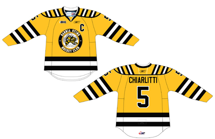
Pacific Tigers Concept (Jets96)
 After a quick search online there's no actual hockey team for the Tigers, so there's nothing to compare this to, which is good now I couldn't be biased toward one or the other.
What I Like: I like the thin double stripes. It's a decent look, some might want something a little more modern and "wavy" to match the logo. I think it looks nice. The number font fits in perfectly with the logo. Some might not like the orange mesh on the arms, but I find it's hard to see on the actual jerseys, so I'm cool with it.
What I Dislike: I feel like there should actually be more white in the dark jersey. You see, in the logo on the white jersey, there's a large amount of orange between the two black swooshes, and on the dark jersey it's orange between white.
Suggestions: Swap orange and white on dark jersey striping. Add one set of stipes on pants.
Rating: 8/10
 |
| Photo: Sarnia Sting Facebook |
Luckily, the Sting have enjoyed some success this year do to the stellar play of Alex Galchenyuk, but he's in the show now, but they are still succeeding without him. Is my jersey a lucky charm? (I like to think so)
There are some slight differences between my entry and the eventual final product. For one, they used white numbers with black outlines when I used black with white. There's also a line thickness issue with the actual jersey. The white hem stripe should be the same thickness as the black stripes. I'm able to look past it all though, the main reason being, something that I made, and worked really hard on made it onto the ice and that's a huge deal to me.
 |
| My original entry |
COTW Jan 28-Feb 3 vote (ends Friday @ 11:59pm EST)
Also, some contest entries,
DDragon60

Dylan W.

Dylan A.

Adam H.

And onto the concepts!
Dallas Stars Concept (Adam H.)

What I Like: Green makes it's glorious return as the main color.
What I Dislike: Striping is very busy on the hem with all the stars. WHITE PANTS ugh.... Not a fan of the number font. Not a fan of the gold yoke on the home jersey. Should be black to coincide with the striping in my opinion.
Suggestions: The main logo I can tell is based off of a sheriff's badge, but on the jersey it looks more like a Bar Mitzvah. I'd scrap the stars on the jersey, sock, and pants striping. Also, make the white pants green. The Capitals wore white pants back in the day and they stopped wearing them immediately. They got dirty and I think the players were embarrassed to wear them. Change the number font as well. Adam, you're getting a lot better and it's great to see.
Rating: 6/10

What I Dislike: Normally I like the fisherman, but not in these colors. Specifically the orange beard.
Suggestions: Would be nice to see the concept with names and numbers on it. As a result of no names or numbers, the shoulders of the home and away look very very blank.
Rating: 6/10
Team Norway Concept (Bastian)

What I Dislike: White arms on red jersey. If anything, it should be the other way around where the white jersey has the red arms. It makes the socks look odd without a lot of white. Inconsistent striping on red jersey (Hem vs. Arms)
Suggestions: Make the red jersey be a color swap of the white jersey. Either little blue stripe with white cuffs or vice versa.
Rating: 7/10
Minnesota Wild Third Jersey Concept (Darren H.)

What I Dislike: Green stripe on arms is THICK but very thin on chest. The way the striping interacts with the numbers. It'd be nice to actually see the back of the jersey because I feel the stripe would be bigger on the back, or the numbers would be smaller. Minnesota outline around "A", neat idea but would look weird on a real jersey, way too jagged.
Suggestions: Add an extra red trim around the M so it appears to be a part of the striping. Fix the striping around the numbers. Make the green stripe on the arms thinner to match the chest. Ditch the Minnesota outline.
Rating: 7/10
Dallas Stars Concept (Matt M.)

What I Dislike: So much white on the home. "DALLAS" going down the pants. Socks are different between two jerseys.
Suggestions: Make the arms of the home match the away (green,gold,green,white). Ditch the "DALLAS" on the pants. "STARS" on the home chest should be gold in my opinion. Also, I prefer the current Stars logo coloring (Star filled with green no gold)
Rating: 7/10
Florida Panthers Nike Concept (Dylan W.)

What I Dislike: Not a lot of red on away jersey. Darker blue used on alt. jersey. Circle logo used on Home-Away jerseys.
Suggestions: Swap blue and red on away jersey. Put the jumping panther on the chest of the home and away, maybe keep the circle as a shoulder patch.
Rating: 7/10
Bayern Munchen Hockey Concept (Tatu H.)
.png)
What I Dislike: Nothing against the concept, it's just with soccer jerseys, if the logo is red white and blue, why have red and yellow on one jersey, and white and orange on one? Not very "Uniform" My only gripe about the concept would be how thin the striping is. It might work on a soccer uni, but on a hockey jersey, thicker is always better.
Suggestions: Thicken up them stripes.
Rating: 7/10
Radioactivity Jersey (Bastian)

What I Dislike: Jersey's base color is a very dark gray and not black, not sure if that's intentional or not.
Suggestions: Make the jersey base black. Maybe make the player name yellow, that's just a personal preference though.
Rating: 8/10
Pacific Tigers Concept (Jets96)

What I Like: I like the thin double stripes. It's a decent look, some might want something a little more modern and "wavy" to match the logo. I think it looks nice. The number font fits in perfectly with the logo. Some might not like the orange mesh on the arms, but I find it's hard to see on the actual jerseys, so I'm cool with it.
What I Dislike: I feel like there should actually be more white in the dark jersey. You see, in the logo on the white jersey, there's a large amount of orange between the two black swooshes, and on the dark jersey it's orange between white.
Suggestions: Swap orange and white on dark jersey striping. Add one set of stipes on pants.
Rating: 8/10
Wednesday: Sarnia Update
 Reviewed by DBro Alexander
on
February 06, 2013
Rating:
Reviewed by DBro Alexander
on
February 06, 2013
Rating:
Reviewed by DBro Alexander
on
February 06, 2013
Rating:


1 comment:
I love everything about Matt M's Dallas Stars concept. Very well done. I'd like to nominate his for COTW.
Post a Comment