Friday: Millionaire Moose
TGIF, welcome to the Friday post!
No jersey news, let's jump right into the site news.
COTW and COTY April voting ends tonight! Remember to get your vote in, it takes 5 seconds and you'll help keep the blog flowing.
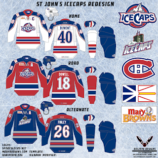
The St. John's IceCaps Redesign/preemptive get your own jersey Contest closes its entry phase tonight. So don't forget to get your entries in!
Here are some of the entries that have come in since last post:
Taylor R.
Jeff H.
On to the concepts!
No jersey news, let's jump right into the site news.
COTW and COTY April voting ends tonight! Remember to get your vote in, it takes 5 seconds and you'll help keep the blog flowing.
The St. John's IceCaps Redesign/preemptive get your own jersey Contest closes its entry phase tonight. So don't forget to get your entries in!
COTY-April vote (ends Friday @ 11:59pm Eastern)
COTW May 10-16 vote (ends Friday @ 11:59pm Eastern)
IceCaps entries (due Friday @ 11:59pm Eastern)
Taylor R.
Jeff H.
On to the concepts!
------------------------------------------------------------------
Southampton EPL Crossover Concepts (By: Phil B.)
+ The arm band flag stripes and side bars look great, and its connection to the logo
+ Further more, the jersey itself seems to be based on Southampton's 13/14 kit and their current kit, nice use of the original jerseys, exactly how a crossover should be!
+ Colours are balanced well, and good choices, while there is green and blue on the logo, it would clash with the other colours, especially the black and yellow together
+ Solid execution
- Despite there being a logo on the pants, they are still plain, and would be a great place to continue the flag stripes
- The jersey does seem very Calgary-esque with the yellow, I still would have chosen it over the green or blue, but the jersey would look way better without it
Rating: 8.5/10
Sunderland EPL Crossover Concepts (By: Phil B.)
+ Once again, Phil takes inspiration from the actual soccer kits, and again, it works, vertical stripes wouldn't work on a hockey jersey, but work on the arms
+ Better colour choices, since all these colours appear on the actual kits
+ Again good execution
- The white jersey would look better with red cuffs, so it matched the hem
- The gold outline on the white jersey bleeds into the red and makes it hard to tell where the colours end and looks fuzzy
Rating: 8.5/10
Vancouver Canucks Concept (By: Brandon C.)
+ Love me some black, red, gold
+ The Millionaires' V would be an awesome secondary logo, and getting it off a throwback and something new would be refreshing since
+ The striping looks like what would happen if the 80's Devils, Millionaires and Early 90's Canucks mixed and it works really well
+ Solid execution
- The stick in rick logo, at least as I see it, never looks good in any other colour scheme other than blue, green, white, this would be a great way to use the Stick in Rink logo
- Even repeating the V again would be a better logo choice than the script on the helmet. It's hard to read from a distance, and the more colours it uses, the more it'll stand out
Rating: 8.75/10
Manitoba Moose Concept (By: Jeff H.)
+ As I said before, the Moose have great logos, but need an original jersey, and yes, this would fix this pretty well
+ It'd be pretty cool if the Moose were to use light blue as their main dark colour on their jerseys
+ The moose numbers in blue look amazing
+ Love the realism with the ad
+ Good execution
- The gloves and pants need more white to match the jersey more
- Not sure the jersey needs arm/hem cuffs, the jersey would look better without them, since the yoke adds more than enough light blue
Rating: 8/10
Utica Comets Concepts (By: Dylan T.)
+ Hey, this would look pretty good....if the jersey was complete
- Again Dylan, this is an incomplete concept, and isn't really worth the time reviewing, you needs to put numbers, tv numbers, and an NOB on the back. The logo just looks slapped not and is too low, and only putting one shoulder patch most never works. The back of the jersey looks extremely dull and gives the readers no insight into a very important part of the jersey.
I hope, Dylan, that you take this advice and finish your concepts and send in completed ones from here on out. Everyone makes mistakes but it's important to correct them!
Rating: Incomplete
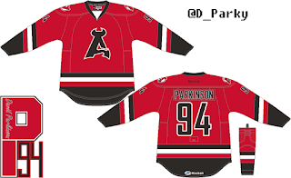
Albany Devils Concept (By: David P.)
+ The NJ Devils couldn't pull off a black version of their logo, but the A Devils can, that logo looks great
+ Again, the angled striping is not something the NJ Devils could pull off, but the A Devils can use it to look different
+ Solid execution!
+ I really like how the black pops all over the jersey
- TV numbers are too small and are barely visible on the arms
- Not sure how much I like the curvy numbers, they aren't bad but it'd be nice to put the concept with square numbers to compare what looks better
Rating: 9/10- COTW Nom. from me!
------------------------------------------------------------------
That's the post!
Don't forget to vote and get your entires in before the deadline!
Have an awesome weekend!
Go Jets Go!
Friday: Millionaire Moose
 Reviewed by winnipegjets96
on
May 22, 2015
Rating:
 Reviewed by winnipegjets96
on
May 22, 2015
Rating:


5 comments:
Phil's Southhampton for COTW
Where did you find that Manitoba Moose font?
COTW to Brandon and his Canucks concept.
Christian, I did a Google Image search for the numbers and found them there. Not a true font, but it was clipping the numbers and recoloring them for the Moose jersey.
Moose is life
Jeff's Manitoba Moose concept for COTW
Post a Comment