Tutorial: Sweating The Details!
How many concepts come into HJC everyday that have "execution issues"? A lot! 9 out of 10 times if there is an execution error, readers ignore that particular concept. You may not want to believe it, but IMAGE IS EVERYTHING. Your concepts have to look good or else they will be dismissed by readers without much thought.
Hopefully, this tutorial can help you correct some of those execution errors. After this is posted I'm going to be a lot less tolerant of concept artists who ignore these issues.
I'll start by saying that you shouldn't be using the NHLuniforms.com template unless you use Photoshop or Paint.net. It was not built with MS Paint in mind. MS Painters, your options are the RBK Edge template (from Sportslogos.net),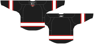 or the NHL Official Style Guide template.
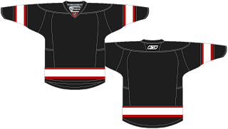 I've created a very basic striping pattern that we will work with today.
On the templates above you may notice that there are some green spots on the jerseys. Those are the "loose pixels" that I always talk about. I have made them green so you can see where their locations are and what you should be looking to fix. Starting with the CCSLC template, there are loose pixels at the tips of the front collar.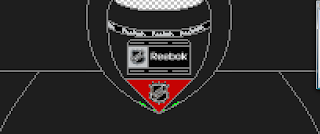 You'll also find them on the front at the corners of the hem.
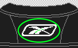
 Finally, you'll find some on the back just under the collar and inside the Reebok logo.
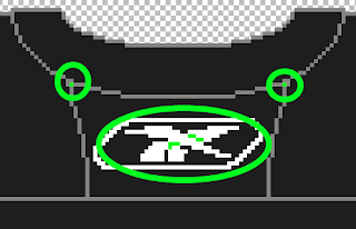
On the Official Style Guide template there are less of those loose pixels, which is why I prefer it. You'll find them again at the tip of the collar on the front,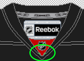 and inside the Reebok logo.
Make sure that you pay special attention to these pixels when re-colouring an existing template or creating a new sweater from scratch.
For ease, I am going to work with the RBK Edge template (from Sportslogos.net). Here it is with those loose pixels properly filled.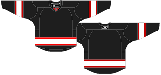 Wait, again something is wrong. Did you spot it? The red hem stripes on the front of the jersey are a different shade of red than the rest of the jersey. This is another issue that pops up. Make sure that all of your colours are consistent with each other. I see this a lot with different shades inside the logo than what appears on the jersey. It also appears sometimes inside the empty spaces of 0,4,6,8, and 9's of jersey numbers. You'll find the theme of this tutorial is to slow down with your concepts and make sure that you have taken care of the details.
Now the red hem stripes have been fixed and I have added some numbers. Both on the back and on the sleeve.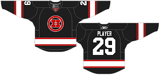 Numbers on the sleeves are known as "TV numbers". You may think that they are a waste of time or not important. If you think that's true, email a hockey broadcaster and ask them if the TV numbers matter to them. You bet they do! If they aren't so important, why does the NHL have a rule (with the occasional special exemption) that TV numbers must be on every sweater?
The front Tv numbers have been completed. Now, I like to be as accurate as possible and I want the front and back TV numbers to line up EXACTLY. Here's how I would do it. Use the SELECT tool to grab the number from the left sleeve on the front. Then line it up with the sleeve stripe on the back right sleeve of the sweater, like this.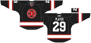 Now just move it directly down and into place, making sure that all of the edges and stripes line up. Technically there is room to place a small portion of the other TV number on the back left sleeve, but MS Paint isn't really equipped for that.
There are other details to be aware of. Such as, what if this team was an AHL team? Readers really like to see the effort put into concepts. So, this would need the AHL patches and such. Lets start with the collar insert where it's as simple as colouring over the NHL logo.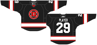 The tag inside the jersey needs to be changed to an AHL tag. Go open a blank AHL team template from a team that has a jersey colour that is very similar to your concept. AHL Team templates can be found on the TEMPLATES page under the link "NHL & IIHF team templates". I'm going to use the Binghamton Senators.
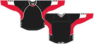 Use the SELECT tool to select EXACTLY and ONLY the AHL tag.
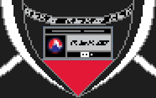 Copy it from the AHL template and then paste it onto your concept. And of course move it into position.
Now do the same thing for the AHL and Reebok tags on the back hem. Select as little of the tags as possible. Paste them onto your concept and move them into position.
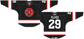
Just like that we have turned our concept into an AHL concept.
The same can be done for IIHF concepts. Just remember, IIHF jerseys are made by Nike. So, you want to remove all Reebok tags and replace them with Nike emblems.
One last thing, for the best quality image please save your concept as a PNG. It's simple, when you go to the Save menu there is a pull down box like this.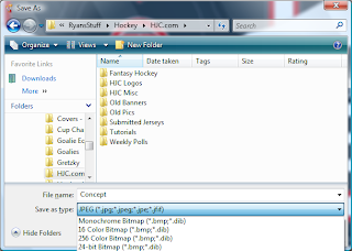 It is cut off on that image, but at the bottom of that pulldown list is PNG. Select it and then hit the save button. Now send it in to HJC!
Now that this tutorial has been posted I won't be so forgiving with new concepts that are sent in. There is no excuse anymore for these "execution errors". Also, if you're tired of MS Paint's limitations, try out Paint.net. It's free and available HERE.
Hopefully, this tutorial can help you correct some of those execution errors. After this is posted I'm going to be a lot less tolerant of concept artists who ignore these issues.
I'll start by saying that you shouldn't be using the NHLuniforms.com template unless you use Photoshop or Paint.net. It was not built with MS Paint in mind. MS Painters, your options are the RBK Edge template (from Sportslogos.net),
 or the NHL Official Style Guide template.
 I've created a very basic striping pattern that we will work with today.
On the templates above you may notice that there are some green spots on the jerseys. Those are the "loose pixels" that I always talk about. I have made them green so you can see where their locations are and what you should be looking to fix. Starting with the CCSLC template, there are loose pixels at the tips of the front collar.
 You'll also find them on the front at the corners of the hem.
 Finally, you'll find some on the back just under the collar and inside the Reebok logo.
On the Official Style Guide template there are less of those loose pixels, which is why I prefer it. You'll find them again at the tip of the collar on the front,
 and inside the Reebok logo.
Make sure that you pay special attention to these pixels when re-colouring an existing template or creating a new sweater from scratch.
For ease, I am going to work with the RBK Edge template (from Sportslogos.net). Here it is with those loose pixels properly filled.
 Wait, again something is wrong. Did you spot it? The red hem stripes on the front of the jersey are a different shade of red than the rest of the jersey. This is another issue that pops up. Make sure that all of your colours are consistent with each other. I see this a lot with different shades inside the logo than what appears on the jersey. It also appears sometimes inside the empty spaces of 0,4,6,8, and 9's of jersey numbers. You'll find the theme of this tutorial is to slow down with your concepts and make sure that you have taken care of the details.
Now the red hem stripes have been fixed and I have added some numbers. Both on the back and on the sleeve.
 Numbers on the sleeves are known as "TV numbers". You may think that they are a waste of time or not important. If you think that's true, email a hockey broadcaster and ask them if the TV numbers matter to them. You bet they do! If they aren't so important, why does the NHL have a rule (with the occasional special exemption) that TV numbers must be on every sweater?
The front Tv numbers have been completed. Now, I like to be as accurate as possible and I want the front and back TV numbers to line up EXACTLY. Here's how I would do it. Use the SELECT tool to grab the number from the left sleeve on the front. Then line it up with the sleeve stripe on the back right sleeve of the sweater, like this.
 Now just move it directly down and into place, making sure that all of the edges and stripes line up. Technically there is room to place a small portion of the other TV number on the back left sleeve, but MS Paint isn't really equipped for that.
There are other details to be aware of. Such as, what if this team was an AHL team? Readers really like to see the effort put into concepts. So, this would need the AHL patches and such. Lets start with the collar insert where it's as simple as colouring over the NHL logo.
 The tag inside the jersey needs to be changed to an AHL tag. Go open a blank AHL team template from a team that has a jersey colour that is very similar to your concept. AHL Team templates can be found on the TEMPLATES page under the link "NHL & IIHF team templates". I'm going to use the Binghamton Senators.
 Use the SELECT tool to select EXACTLY and ONLY the AHL tag.
 Copy it from the AHL template and then paste it onto your concept. And of course move it into position.
Now do the same thing for the AHL and Reebok tags on the back hem. Select as little of the tags as possible.
 Paste them onto your concept and move them into position.
Just like that we have turned our concept into an AHL concept.
The same can be done for IIHF concepts. Just remember, IIHF jerseys are made by Nike. So, you want to remove all Reebok tags and replace them with Nike emblems.
One last thing, for the best quality image please save your concept as a PNG. It's simple, when you go to the Save menu there is a pull down box like this.
 It is cut off on that image, but at the bottom of that pulldown list is PNG. Select it and then hit the save button. Now send it in to HJC!
Now that this tutorial has been posted I won't be so forgiving with new concepts that are sent in. There is no excuse anymore for these "execution errors". Also, if you're tired of MS Paint's limitations, try out Paint.net. It's free and available HERE.
Tutorial: Sweating The Details!
 Reviewed by Ryan
on
December 10, 2011
Rating:
 Reviewed by Ryan
on
December 10, 2011
Rating:


9 comments:
Nice tutorial, it's nice to remember those things for future concepts.
As a MS Painter myself always use that program this best way to know to keep a eye on those spots, if not there will be bad results.
One thing missing from your tutorial: all the troubles generated by pixels can be avoided by working in vector format. Apps can be easily found on the net and I can provide HJC with my templates.
Also, it's correct to correctly place the manufacturer's trademarks on the jersey you design, but I think that inner collar details are not that important since it doesn't interfere with creative designs.
Could you do a tutorial or something on jersey parts (e.g.: yokes, etc . . .)?
@Stephen, please give him you templates; I have been looking for a good one all day. Ended up just exporting my stupid little logo into paint.net. To do the concept.
@Ryan,
Just to refresh my memory; What side do you put the Captians C on?
is that H logo a preview of a new look for HJC??
@Michael captain C goes on the left side of the jersey. Over the player's heart. Except for DET and PHX.
@Ricky could you explain further?
@flopBurrows The H is not a preview. The HJC survey banner from a couple weeks ago was.
It's hard to further explain because I don't know what I'm talking about (vocab-wise). But it's relative to how to name the jersey parts and where to locate them.
stephane, could you please provide your templates? also, what program do you use?
@Avi : I personally use Adobe Illustrator. Not the current version, an old one (CS4). But I will - in the following minutes - send my primary templates to Ryan in .AI (illustrator) and SVG formats. With SVG, almost any vector capable app will work.
Post a Comment