HJC Needs Your Votes
Committee Members, we definitely need you to vote this week. There are so many 3rd Jersey Comp entries and we need as many voters as possible to avoid ties. Here is a full rundown of the ongoing votes and when they end.
For those of you that enjoyed the Weekly Poll, you will be happy to know that it will be returning. Instead of starting on Monday's it will be a mid-week thing, or I might use weekend posts to start it. Either way, look for the return of the Weekly Poll around All-Star Weekend.
3rd Jersey Competition Top 5 vote (ends Sunday @ 11:59pm EST)
COTW Jan 2-8 vote (ends Thursday @ 11:59pm EST)
COTY-December vote (ends Thursday @ 11:59pm EST)
---------------------------------------------------------------------------
Vancouver Canucks concepts (by Torin)
The home and road concepts are decent. I like how the big V on the arm works with the stripes. The retro coloured 3rd jersey doesn't do much for me. If it were to be worn by a player I would think that the sleeve design may get hidden under the player's arm. Execution note; your stripes and patterns should go over top of the jersey stitching.
Buffalo Sabres concept (by Glen L.)
This is Glen's first contribution to HJC. The execution is decent, but there are a few things. As mentioned above, the stripes should go over top of the stitching. Also, the red used on the sweater should match the red in the logo. Finally, I don't think the classic yellow really fits this red, white, and black logo.
CRE Salzgitter Icefighters concept (by Martin)
You can see this team's webpage here. A couple things about the concept, I personally think that the TV numbers should match the player numbers. Also, there are already stripes across the chest, I don't think the hem stripe is needed.
Detroit Wheels concept (by Chuckie)
Chuckie has used a couple of baseball logos to create this "fantasy team", the Detroit Wheels (even though there is a Red Wings logo on the pants). If you're going to use this template, take the time to fill in all the areas. I can see some spots weren't filled in around the laces. I think this would have been better if it were called a Wings concept and the Winter Classic D logo was used.
Columbus Blue Jackets concept (by WinnipegJets96)
I like this because Jets96 has gone back to one of the first concepts he sent in and has applied what he's learned and made it better.
Philadelphia Flyers concept (by HJC)
It's a pretty simple design, but I feel like it fits the Flyers well. The shoulder patch I originally created for a Winter Classic concept I did a few months back. The big P logo is based on and old team called the Philadelphia Ramblers.
Los Angeles Kings concepts (by Brandon C.)
I like the traditional look of the sweaters and the re-colouring of the vintage crown logo. I think the grey sweater would be awesome as a current alternate, but with one of the above crown logos. Execution is pretty good except the vertical stitching should end at the hem stripes.
Team Latvia concept (by Fredrik)
I like how the grey stripes breaks up the thick white stripe and I also like that grey stripe on the collar. This is a really good looking set of jerseys. Nice job by Fredrik of not using collar laces where they could just easily be thrown on because this has a retro look. Sometime collar laces just aren't needed (Colorado, I'm looking in your direction).
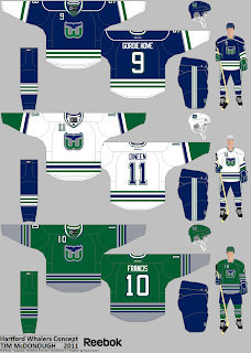
Hartford Whalers concepts (by Tim M.)
The merging of the 80's and 90's looks is really well done here. It really shows well on the white sweater. I always preferred the Whalers in green instead of blue, but these still look fantastic! I really like the presentation too. COTW nomination from me!
HJC Needs Your Votes
 Reviewed by Ryan
on
January 11, 2012
Rating:
 Reviewed by Ryan
on
January 11, 2012
Rating:


4 comments:
tim for cotw. i would buy one of those if i could. that gives me a fun idea ryan. you should ask sportsk if they will make a concept a jersey for you. that way you can have your own concept as a jersey like you did with that penguins winter classic jersey.
@Cody
I've looked into something like that. It's very expensive. Sportsk.com only sells merchandise, making jerseys is something SP Apparel or Athletic Knit does.
@ Fredrick: I'm a big fan of the Team Latvia jersey. I like it how your presentation of the jerseys are neat and, the colour combo look very cool together if you ask me. COTW nomination!
Thanks, Sam!
Oh, I just wanted to point out that I didn't create the logo on my concept, found it online somewhere!
Post a Comment