A Tournament Concept
Vote reminders:
Concept of the Year 2011 vote (ends Thursday @ 11:59pm EST)
COTW Jan 23-29 (ends Thursday @ 11:59pm EST)
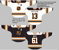
The COTY vote is VERY close! Be sure to get your vote in so that we don't have a tie and I can announce the winner on Friday! Also, there has only been 2 votes cast so far for the COTW vote.Here are some of the All Star Game entries that have come in. Submission phase ends on Thursday @ 11:59pm EST.
ASG Entry (by Brady)
ASG Entry (by Brian B.)
ASG Entry (by D3troit1388)
ASG Entry (by HJC)
ASG Entry (by Stephen T.)
Colland International Ice Hockey Tournament concept (by WinnipegJets96)
This is a tournament idea by Jets96 and he has also included hypothetical results. Also included are gold, silver, and bronze medals as well as a championship trophy. Tickets and the tournament logo are also included. I remember simulating these types of tournaments (involving all sorts of teams) on the NHL video games. Jets96 has also included the sweaters that each team will wear. Note how each team only has one.
Toronto Maple Leafs concept (by Bryan S.)
This is Bryan's idea for what the Leafs should wear for the 2013 Winter Classic, if they rumours are true. As I've said before, I like the T in the old style leaf logo. I also like the "heritage" feel of this jersey, but the vintage white is looking more yellow than white. Also, at the bottom of the front of the jersey, I know the back hem does hang lower, but it should appear blue, not vintage white.
Dallas Stars logo (by Brian B.)
With these adjustments Brian is trying to add some depth to the logo. I think he's done that, but I don't know if the changes are drastic enough to be noticed on a sweater from a distance or to an untrained eye that has already purchased the old logo. That person may not think to look for any differences.
Winnipeg Jets concepts (by B&I Design)
I really like the logo! Actually, I love the logo, well done! It looks great on the vintage jerseys as well. The blue doesn't look so blue to me though. It seems more on the purple side.
Winnipeg Jets concept (by Brandon C.)
Nice work here by Brandon. I like the double outline around the yoke, that's something we really haven't seen too much with the Edge jerseys. In my opinion, switching the red and the white on the collar would look better. Well executed concept though Brandon.
Team USA concept (by Scott)
When looking at the Rangers' Winter Classic sweater, Scott saw a better fit for Team USA. I'd have to agree with him. He's done a really nice job translating the jersey to the Nike Swift cut. Not having a NOB adds to the vintage look I just don't know if the IIHF has a rule about that. My other concern would be about the hem stripes as they curve with the hem on the back, but they are straight on the front. Either way, good call by Scott and a COTW nomination from me!
A Tournament Concept
 Reviewed by Ryan
on
February 01, 2012
Rating:
 Reviewed by Ryan
on
February 01, 2012
Rating:


6 comments:
Brandon C. for COTW!
In Scott's, why is there white in between the red and blue on the back when its vintage white?
Good eye Josh.
Thank You very much!
Nice work Scott. COTW nom from me!
@Josh, its a minor mistake. Thanks for pointing that out!
Post a Comment