Tuesday: Nash A Ranger, Blues Concepts, & More
On the other end of things the Rangers may have just made themselves Stanley Cup favourites. Also, placing a #61 and the name Nash on the back of a Rangers' alternate sweater looks pretty good. I think that one will move up a few places on my jersey wishlist.
---------------------------------------------------------------------
Committee Members, now that the hooplah of the HJC Open is done with we can go back to concentrating on the COTW votes. As usual, this week's vote ends on Thursday. Be sure to get your votes in before then.
COTW July 16-22 vote (ends Thursday @ 11:59pm EST)
---------------------------------------------------------------------
I have decided that for this blog to carry on to almost everyone's satisfaction that I will take on some help. This help will write up the posts and provide the daily links. Details will come tomorrow.
---------------------------------------------------------------------
Team Canada concepts (by WhiteLightning)
White has Reebok take over the IIHF jerseys with this concept. I like what he's done with the red and white jerseys. That's probably what they would look like if they were Edge-ified. I like the idea of the third and how it's modeled after the 1972 Summit Series sweaters, but I think the leaf needs to be repositioned. The widest point of the leaf should start at the corners of the hem. There shouldn't be any white underneath, in my opinion anyways. 7/10
Slayer concepts (by Stephen T.)
I don't listen to Slayer, so I can`t speak much about the band. However, I get their general image and these look like they fit that image quite well. The double black is a great idea here. Execution note; the TV number 5 is the wrong way on the front-left and back-right sleeves of the white jersey. 7/10
Mexico City Vipers concepts (by Chuckie)
While this is a fantasy team, there is a hockey league in Mexico believe it or not! I like the classically striped home and road sweaters. You all know how I fee about gradient jerseys, the 90's can keep them. The NOB seems tough to read. There's a reason why almost all North American sports teams use all uppercase letters. The logos don't seem like a set. They come across as a Google search for "Vipers logos" and these two came up. 6/10
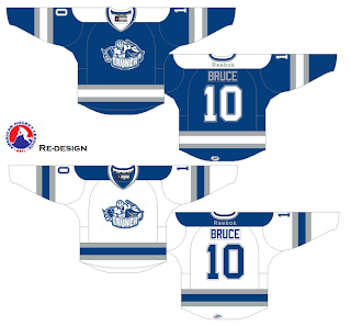
Syracuse Crunch concepts (by WinnipegJets96)
I get the idea of taking the Bolts' look for the Crunch and adding some silver lining. That "lining" has been done on the collar and numbers, but then on the stripes it so much thicker. It's more "blotching" than "lining". Personally speaking and execution wise I would like to see the Reebok logo down on the hem beside the AHL patch. It just looks like you couldn't be bothered with it and got rid of it. 6/10
Syracuse Crunch concepts (by Dave C.)
I like the jerseys and it's mainly because they are clearly different from Tampa's, but by colour association you can see that they are affiliated with the Lightning. If I could suggest one change and that would be to have the arms two colours on the blue jersey just like they are on the white one. The Bolts also have quite the prospect on their hands with this Namestnikov kid. 7/10
Calgary Flames concept (by Scott M.)
This one is straight forward and I couldn't agree more with Scott. The Flames should clean up their current sweaters and make them look like this. End of story. Agree? 8/10
St. Louis Blues concept (by Chris S.)
The jerseys are cool, but these suffer from some execution errors. First, on the white jersey the numbers are using a different shade of blue than the rest of the jersey. I know there's supposed to be light and dark, but I would have to think that you'd want the two lighter blues to match. Also, the tips of the collars have not been coloured in fully. Finally, I think the hem trim is unnecessary and it doesn't look good. No team has used it in conjunction with hem stripes to date and I don't think they will anytime soon. 6/10
St. Louis Blues concepts (by Torin)
The home and road concepts are really good. The light music bars running with the big white stripes is a really nice element here. They are something new while at the same time hinting back to the Blues' beginnings. The alternate is alright, but a little less imaginative. On this one I suddenly don't care for the music bar stripes running through the chest. 8/10
St. Louis Blues concepts (by Brandon C.)
Everything here looks quite good...except for the logos on the blue jerseys. I'm never going to be in favour of the St. Louis BLUES using their primary logo in any colour but white. Also, yesterday was the first and possibly only time that the trumpet logo could work as the primary logo on a jersey. The jerseys though a very nicely striped. 7/10
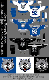
Sudbury Wolves concepts (by WhiteLightning)
To me, Sudbury of the OHL is the team most in need of a re-design in the entire Canadian Hockey League. This wouldn't be what I would suggest. These do look good though. It's only that they are re-coloured Blues' sweaters that turn me off. Execution wise they look very good. The logo based on the Timberwolves is a good starting point for a new logo (obviously they would need their own) because Sudbury has a TERRIBLE logo right now. 8/10
Minnesota Wild concept (by Tyler G.)
There's a small rumour circulating the internet that we may see a new Wild road jersey next season or beyond. Tyler gives us his interpretation of what we will see. He has also added shoulder patches to this one and, as he writes on the concept, the current third would become the home jersey. This one is very nicely executed, but I think the NOB is a different font. It is on the green jersey anyways. 8/10
Vancouver Canucks concepts (by Colin & Justin C.)
I can't remember exactly, but this may be the first collaboration concept we've had on HJC. In my opinion, this set is so good that there's no much to say about it. I feel like a slow clap should start here. My own personal preference would be to have the white and blue stripes touching on the green jersey, but it's not needed. COTW nom from me! 9/10
Tuesday: Nash A Ranger, Blues Concepts, & More
 Reviewed by Ryan
on
July 24, 2012
Rating:


7 comments:
I second Colin & Justin C. for COTW.
I don't like the Canucks at all, and I would wear those jerseys. Great work, Justin and Colin! That's a perfect Vancouver set.
Thanks for the noms guys!
I love Justin's Canucks concept. Definite COTW nom from me. I really believe this set would win over the majority of Canucks fans.
Thanks, Matt. A lot of the design is due to Colin, though!
woo hoo! I'm glad everyone is appreciating our work, It was a lot of fun and really constructive collaborating with Justin on this concept. I would highly recommend the practice of working with someone else on designs, the finished product truly becomes better than the sum of the parts.
Gotta toot my own horn here but Ryan I found a time when you complimented the Blues' logo in white and also a time when you said you "loved" the trumpet as a main crest (which was also my first concept ever.)
White bluenote:
http://www.hockeyjerseyconcepts.blogspot.com/2011/04/blues-hawks-preds-etc.html
Trumpet logo:
http://www.hockeyjerseyconcepts.blogspot.com/2011/02/saturday-afternoon-concepts.html
Post a Comment