Tuesday: Right to business
Hey guys, no dilly dallying. Right to the important stuff today
COTW Oct 22-28 vote (ends Thursday @ 11:59pm EST)
No Horizontal Lines Contest Entries Due: Friday, November 2, 2012 @ 11:59pm EST
Here's the Contest Entries for today
Colin M.
Dallas Stars Concept (Adam H.)
I like this look for the Stars but this concept is riddled with execution errors. The wordmarks on the front and names on the back are all way too big. And the shoulder patches shouldn't be facing the way they are. They should be rotated so that when looking at the jersey from the side they are up right, not sideways. For the jersey itself, the C in the star, is creative, but is really big and clutters up the jersey, which has a clean look to it. Ditch the gold pants and this concept is on it's way to being great. 6/10Adirondack Phantoms Concept (Andrew T)
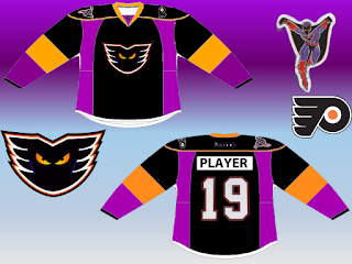
We saw a white version of this jersey yesterday and what was said stands. The side panels just don't work. and the arm striping is too blocky. The Reebok on the back should be white, or even orange, just so it's visible. And I don't like the white pit stains. 6/10
Brooklyn Nets Hockey Concept (Mike S)
The new Nets have a pretty basic color scheme and jersey design, but it would have been nice to see the simplicity transfered to this jersey. The Nets actual jersey has on solid stripe down the side. I think a jersey like the Red Wings dark jersey would look nice with the Nets branding on it. 7/10
Augsburger Panther (German League) (Stephen T.)
The Panther has a very festive color scheme. That red seems to be neon. Even though I hate it, this concept is missing the authenticity of the ads, unless Stephen is imagining a perfect world without the jersey ads. I also don't care for the name under the number, seems like it would get lost. Question, would the team be wearing Nike socks if Under Armour is providing their jerseys? 7/10
Buffalo Sabres (Matt M.)
Matt does a nice job of keeping the Sabres looking looking classic. I prefer the striping of the white jersey, It's too bad there's not a lot of contrast between white and yellow, otherwise it could be used ont the dark jersey. 8/10
Winnipeg Jets WHA 40th Ann.
As much as I do like the jersey as it seems to fit in with the logo very nicely, the Authenticity nazi in me wants to pint ou that the team's first WHA jersey was pretty similar to the current Rangers set up. The colored namebar is accurate. If this jersey is a throwback, then using the Ducks template wouldn't work, way too modern. Also that logo was never used on the front of a jersey. But still, I really like this concept, it all just works together. 8/10
Colin left all the details on the image itself so I'll leave you to it. I have nothing to say about this, I love Colin's Arsenal series. 9/10
Tuesday: Right to business
 Reviewed by DBro Alexander
on
October 30, 2012
Rating:
 Reviewed by DBro Alexander
on
October 30, 2012
Rating:


.png)

.png)


5 comments:
Matt M. for COTW
James. B Canucks concept is pretty sweet. I like it.Very Cool.
The concept by Colin M is bizarre! I hate to criticize, but it almost looks like a two year old got a hold of it. I know they are supposed to look like mountains, but man, someone went wild on this concept.
Good idea, bad execution.
so, anonymous, the constructive criticism I'm taking from your comment is... to simplify???
I can't execute this better from a purely technical standpoint, so what would make it better for you?
Colin M. Well sometimes less is more. So yeah something a little more simplistic. Avs fans would love the mountains to return but these ones sort of look like a richter scale. I see what you are trying to do, but it's a little overdone. I remember Justin C did something very similar, but slightly less busy and wild. I saw an Avs concept recently by ''Snow Monster'' and that one had mountains on it and it looked great while not too busy.Perhaps something like one of those. Just clean it up, make it simpler and we have a winner.
Hey Colin, here are a couple links to the jerseys I am talking about. Looks like you took some inspiration from Justins'set. concept.http://1.bp.blogspot.com/-o47FhYR4vAE/T5X8fgXMJcI/AAAAAAAAL-M/C11Y41vDEfU/s1600/JustinCox-COL.png
http://1.bp.blogspot.com/-R-0ItuIc0HM/UIcL9qPIv5I/AAAAAAAAAVI/BOE_4yxDQrA/s1600/DanielDougherty-COL.png
Post a Comment