Thursday: Turkey Day in America
Hello everybody and welcome to my first post here on HJC as Thursday's new writer! I'm so excited to be here as the writer filling in for Thallos, who resigned a couple of weeks ago. Anyways, it's Thanksgiving in the States and I hope everyone celebrating tonight eats a TON and watches some football, I know I will be. On the topic of Thanksgiving, I sure am thankful for everyone here at HJC who works hard just to give us a nice daily dose of concepts. It's kind of hard to be thankful for hockey right now, since there isn't any NHL. Although on Wednesday, the NHLPA released a proposal to the NHL with a $182M gap from Owners over the next 5 years, although Bettman says the two sides are still "far apart" from a deal. Anyways, lets get going!
---------------------------------------------------
There are two votes going on right now, so HJC Committee members, don't forget to vote if you haven't already! See the COTW nominees for this week by clicking the "CONCEPT OF THE WEEK" page at the top, or by clicking the banner to the right.
COTW Nov 12-18 vote (ends TONIGHT @ 11:59pm EST)
Expansion logos Top 3 votes (ends Friday @ 11:59pm EST)
---------------------------------------------------
Seattle Metropolitans concept (By: Caz W.)
These are some pretty cool Metropolitans concepts here from Caz. I like the color scheme, I think it fits Seattle well. I like the jersey design, the logos, and just about everything. These logos should have definitely been sent into the expansion contest if you made them. The font looks good, everything looks good here. There is not much AT ALL not to like here. Execution is great too. 9/10 and a COTW nom from me
Colorado Rockies concept (By: Chris L.)
We've never really seen anything like this. It's an idea that has a lot of potential, and could look a lot better with some better execution and TLC. First of all, I'll start out with the execution errors. Number one, I recommend actually just using some number, rather then a number sign. At least to give an idea to what a number may look like. Second, the maroon on the logo should match the maroon on the rest of the uniform. On the socks, just have the two curved stripes in the middle, the maroon stripe on top will get lost in the pants, and the bottom stripes will get lost with the skates. Design-wise, it's not too bad, although I think the top uniform could use some more blue. I recommend checking out the "PAINT.net TUTORIAL" page at the top. 5/10
AHL Outdoor Classic concept (By: Darren H.)
Here is what Darren would want in the AHL Outdoor Classic, both of these are really cool! I love the Bears one, a great, classic look for them. Everything looks good there. I also love the Penguins ones. Although, I just realized the striping is completely different on the front then on the back, is that supposed to be like that? I'm not too sure about that, but it sure would be unique. On an execution note, the numbers on the back of the Penguins jersey has a different blue then the jersey. Other then that, the execution is good. Great concept here, Darren. 8/10
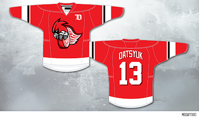
Detroit Red Wings concept (By: Martin B.)
We haven't seen many concepts like this one here from Martin. That logo is pretty cool. To match the arm striping, I would add a black stripe on the hem striping as well. It's hard to make Red Wings concepts because they have such a classic look it's hard to change it. On an execution note, this jersey needs an NHL logo on the collar insert, and a Reebok logo on the back under the collar. A good attempt here, but I don't like it personally. 5/10
Detroit Red Wings concept (By: Ryan T.)
Here is a classic Red Wings concept from Ryan. To me, this is just a Winter Classic jersey with red and white switched around and an added yoke. On an execution note, the back of the collar needs to be red, not black, to match the front. 5/10
Minnesota North Stars concept (By: Stephen T.)
Here is a North Stars concept that goes along to what the North Stars did at the end of their existence, and what the Dallas Stars did at the beginning of their existence. I'm not sure about the logo with the shape of Minnesota there instead of the Star, but I don't mind it. I would add some green to the collar on the away jersey. Overall, not a bad idea. 6/10
Once again, to the American readers, have a Happy Thanksgiving and a good Friday.
Thursday: Turkey Day in America
 Reviewed by Tyler Gross
on
November 22, 2012
Rating:
 Reviewed by Tyler Gross
on
November 22, 2012
Rating:


4 comments:
Caz for COTW
Thanks for the COTW nominations!
Tyler, I thought about sending the logos in, but I think it would have been a rules violation, since it was a conglomeration of the flag of Seattle with the outline of the Space Needle from the Seattle Sounders FC logo. I use Paint.net, and it's not very good for making original logos.
I would give Darren's concept a nom, but I don't think the Pens jersey is supposed to be like that. The Bears sweater is great though!
I think Chris' Rockies concepts have a bit of potential. It would have been appreciated if actual numbers were used so we can see what type of font would be utilized.
I like Stephen's jerseys as well, but I'm not a fan of Minnesota replacing the star in the logo.
Darren H for COTW
Post a Comment