Thursday: Winter Classic Locked Out
Looks like Wayne Gretzky's projections were a tad bit too optimistic;
the NHL plans to cancel games through December and the Winter Classic,
one of the biggest highlights of an NHL season, let alone one of the
largest grossing events of the NHL. It's truly a sad thought that we
won't be watching two teams hit the ice outdoors on New Year's Eve.
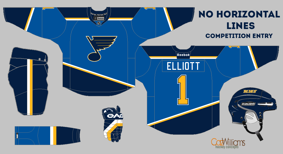
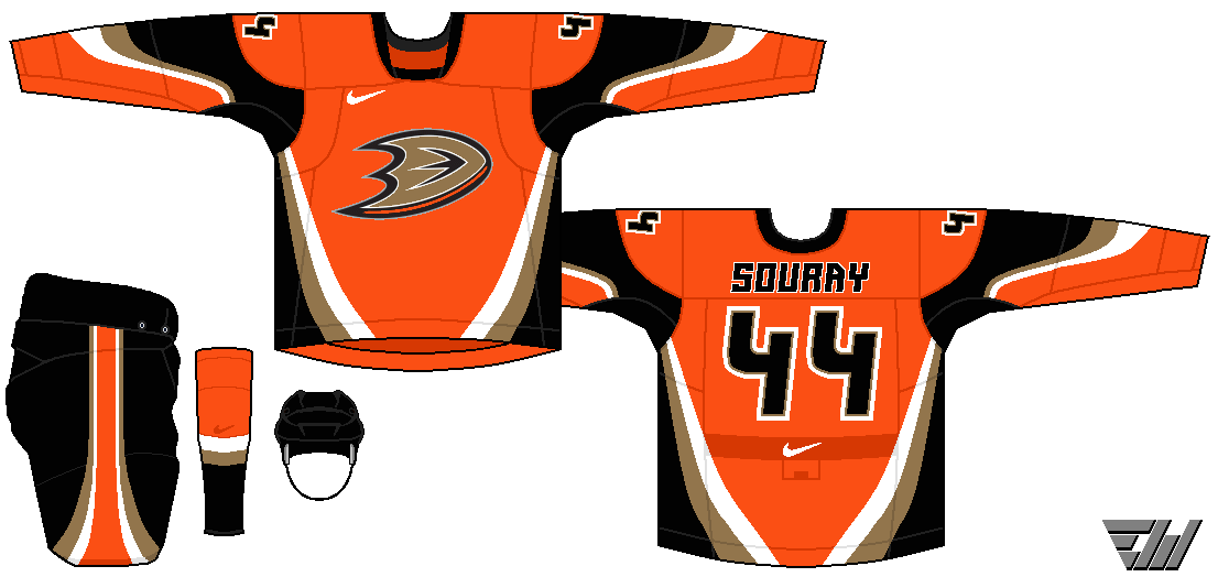
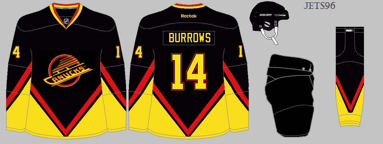
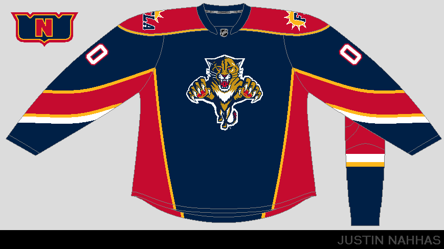
On a lighter note, we've got some cool concepts for you today. Lots of green concepts, some Habs, some 'Yotes and a college concept. Finally, we've got the "No Horizontal Lines" competition, along with the COTW.
No-Horizonal Line Entry (Eric W.)
No-Horizonal Line Entry (Jets96)
No-Horizonal Line Entry (Justin N.)
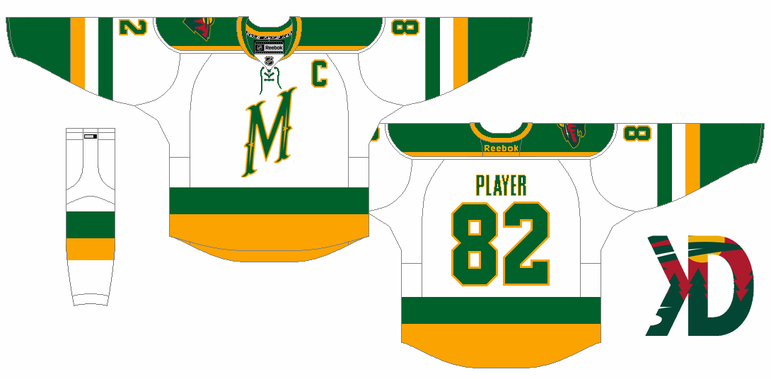
Minnesota Wild concept (by David K.)
With some clear inspiration from the Minnesota North Stars, David reverts back to the original color scheme of green-yellow and it looks great. The M logo works better than I thought it would with yellow. (7/10)
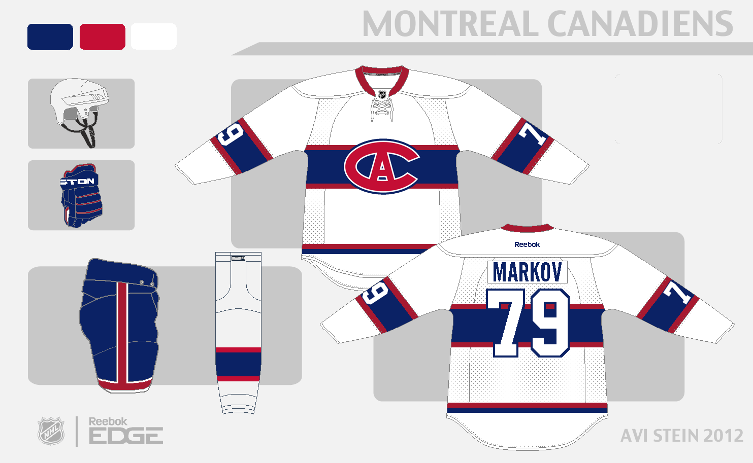
Montreal Canadiens concept (by Avi)
I always wanted to see Montreal adopt a third white jersey ever since they appeared in the 2003 Heritage Classic and Avi pulls this off pretty damn well. Using an awesome logo, this jersey in comparison to their current away jersey is a nice addition to their classic set. (8/10)
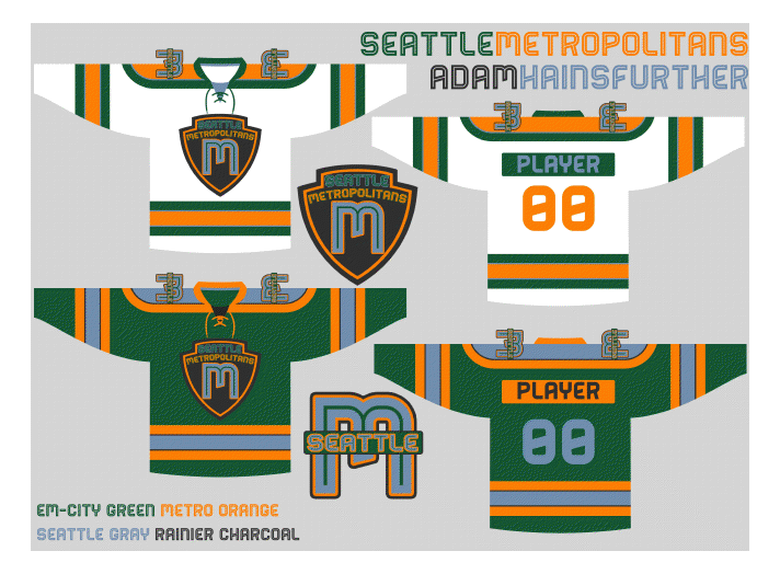
Seattle Metropolitans concept (by Adam H.)
With a lot of speculation around Seattle and a potential expansion team, Adam gives us his take on his idea of what Seattle should look like. Admittedly, I don't think the logo is strong enough for a hockey team, but kudos for creating your own design. (6/10)
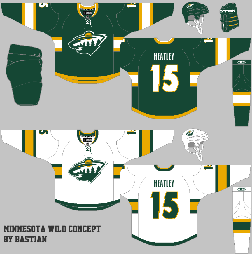
Minnesota Wild concept (by Bastian)
Again we see another Minnesota concept with yellow, but with a darker green. I'd like to see the yellow and green switch on the away jersey but overall it's a decent design. The away logo kind of throws me off with the amount of white that dominates the logo. (6/10)
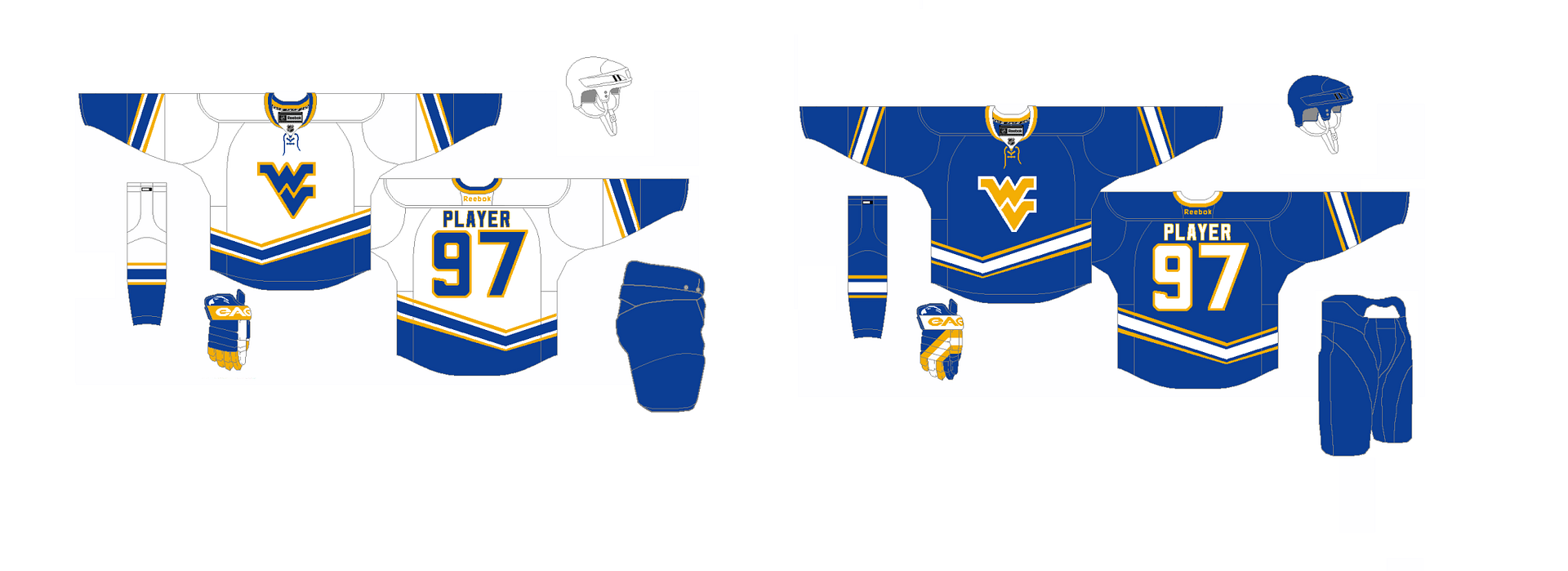
West Virginia University concept (by Stephen T.)
We don't see too many college concepts here, but it's a welcomed changed. If West Virginia ever had a decent enough hockey team, I'd pay enough attention to them if they were wearing these. I really like how well the white jersey flows; very consistent with a fitting design. (7/10)
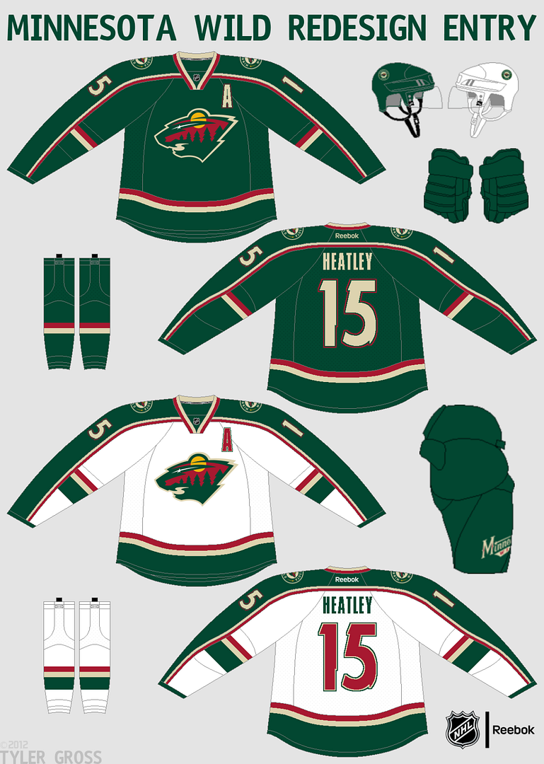
Minnesota Wild concept (by Tyler G.)
I've gone on the record of saying I love Minnesota' current away jersey. Here, Tyler alters the design but improves upon it with the addition of some arm stripes, and accompanying hem stripes. The green jersey is pretty sleek in comparison and overall this set is pretty great looking. (8/10)
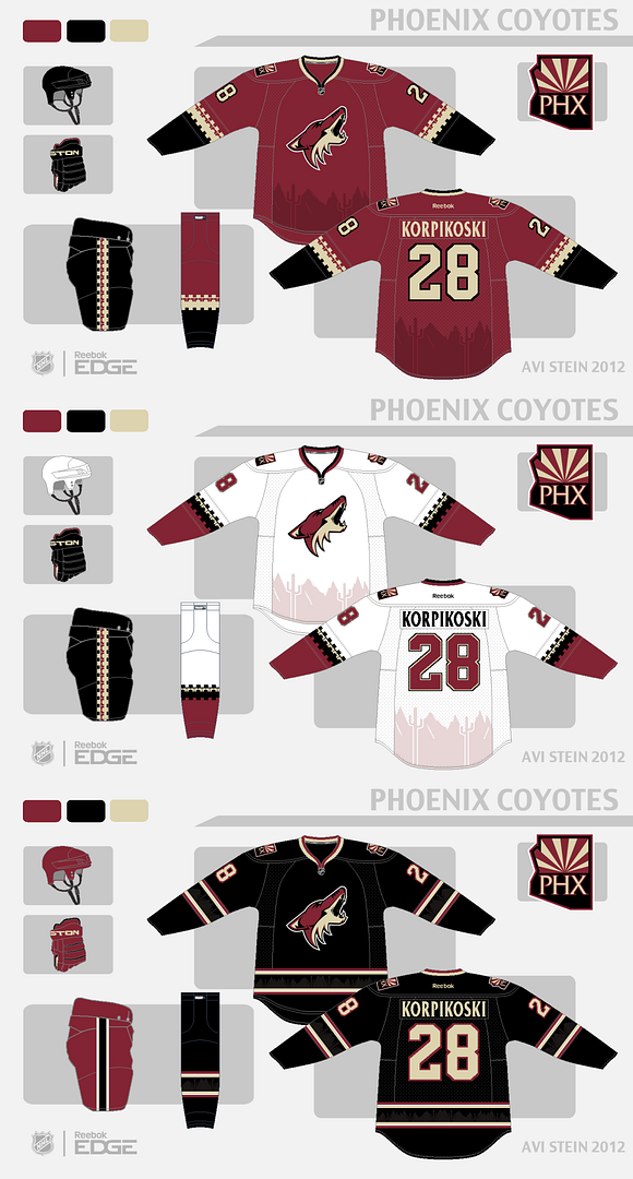
Phoenix Coyotes concept (by Avi)
I've seen some pretty unique concepts for Phoenix (a lot incorporating the Picasso-look of the 90s) but not as many I like as much as this one. I'm a big fan of sublimated graphics on jerseys and the desert landscape works really well here. My only complaint would be the white jersey, where I'd try to add some contrast between the brick-red and black, but I think these jerseys are sweet. The black alternate is amazing. (9/10)
On a lighter note, we've got some cool concepts for you today. Lots of green concepts, some Habs, some 'Yotes and a college concept. Finally, we've got the "No Horizontal Lines" competition, along with the COTW.
COTW Oct 22-28 vote (ends Thursday @
11:59pm EST)
No Horizontal Lines Contest Entries Due: Friday,
November 2, 2012 @ 11:59pm EST
---------------------------------------------------------------------------------------------
No-Horizonal Line Entry (Caz W.)No-Horizonal Line Entry (Eric W.)
No-Horizonal Line Entry (Jets96)
No-Horizonal Line Entry (Justin N.)
---------------------------------------------------------------------------------------------
With some clear inspiration from the Minnesota North Stars, David reverts back to the original color scheme of green-yellow and it looks great. The M logo works better than I thought it would with yellow. (7/10)
Montreal Canadiens concept (by Avi)
I always wanted to see Montreal adopt a third white jersey ever since they appeared in the 2003 Heritage Classic and Avi pulls this off pretty damn well. Using an awesome logo, this jersey in comparison to their current away jersey is a nice addition to their classic set. (8/10)
Seattle Metropolitans concept (by Adam H.)
With a lot of speculation around Seattle and a potential expansion team, Adam gives us his take on his idea of what Seattle should look like. Admittedly, I don't think the logo is strong enough for a hockey team, but kudos for creating your own design. (6/10)
Minnesota Wild concept (by Bastian)
Again we see another Minnesota concept with yellow, but with a darker green. I'd like to see the yellow and green switch on the away jersey but overall it's a decent design. The away logo kind of throws me off with the amount of white that dominates the logo. (6/10)
West Virginia University concept (by Stephen T.)
We don't see too many college concepts here, but it's a welcomed changed. If West Virginia ever had a decent enough hockey team, I'd pay enough attention to them if they were wearing these. I really like how well the white jersey flows; very consistent with a fitting design. (7/10)
Minnesota Wild concept (by Tyler G.)
I've gone on the record of saying I love Minnesota' current away jersey. Here, Tyler alters the design but improves upon it with the addition of some arm stripes, and accompanying hem stripes. The green jersey is pretty sleek in comparison and overall this set is pretty great looking. (8/10)
Phoenix Coyotes concept (by Avi)
I've seen some pretty unique concepts for Phoenix (a lot incorporating the Picasso-look of the 90s) but not as many I like as much as this one. I'm a big fan of sublimated graphics on jerseys and the desert landscape works really well here. My only complaint would be the white jersey, where I'd try to add some contrast between the brick-red and black, but I think these jerseys are sweet. The black alternate is amazing. (9/10)
Thursday: Winter Classic Locked Out
 Reviewed by Thallos
on
November 01, 2012
Rating:
 Reviewed by Thallos
on
November 01, 2012
Rating:



6 comments:
Avi's Canadiens for COTW
Did you get my "No Horizontal Lines" entry? I think I sent it in on Monday.
hey tyler, your entry was posted late as an update to the monday post
http://www.hockeyjerseyconcepts.blogspot.ca/2012/10/monday-its-raining-its-pouring.html
sorry to everyone for the confusion on this contest. Please let us know if anything has slipped through the cracks.
Avi's Coyotes for COTW! Great work
Tyler G for COTW
I'll second Avi's Yotes concept for cote, I wish i could second both concepts
Post a Comment