Tuesday: Blue is a popular color eh?
Hey everyone. If you haven't seen it yet, go to Icethetics and get a load of the Dallas Stars article up there. Pretty interesting read.
Also, there's FIVE COTW nominees this week, so voting committee, go vote!
COTW Nov 19-25 vote (ends Thursday @ 11:59pm EST)
Here's today's contest entries, both from HJC regular, Stephane
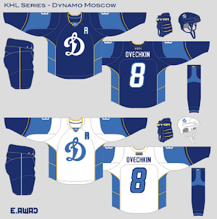
Dynamo Moscow KHL Concept (E. Awad)
What I Like: The color scheme is nice. I like the yellow piping on the arms.
What I Dislike: The template itself is not very good. It would probably work in Russia being most overseas jerseys are gaudy, but I think this concept could be better if a more traditional template was used. Also, the socks are very unoriginal.
Suggestions: More traditional striping, especially on the socks. A new number font would be nice too. Maybe something that fits with the logo better.
Rating: 5/10
Buffalo Bills Hockey Concept (Demetri G.)
What I Like: I critiqued a Bills jersey last week. I like how the striping on this concept is the same as their real jerseys.
What I Dislike: Same gripe as last week, the red jersey instead of blue, but it's my understanding the Bills fans like red. Also, not huge on the modern numbers, standard block would work fine for a football concept. Also, where's the dark helmet for the red jersey?
Suggestions: Blue jersey and block numbers would improve this concept
NHL All Star Game Concept (Chris L.) What's an All Star Game again?
What I Like: The vintage approach works well for All Star Games. The all star jerseys in Minnesota were fantastic. These are also fantastic. I like how these jerseys seem to be inspired by almost every All Star jersey from the very first ASG, all the way to 1991
What I Dislike: The striping on the socks looks funny arched up like that. It should be straight to match the rest of the jersey. Also, the TV number placement is weird. At least on the back of the jerseys you included just a piece of them but the standard placement for concepts would look better.
Suggestions: Fix the socks and tv numbers. Maybe move the logo up and get rid of the two stars above it. maybe keep a star and put a Captains C in one.
Denver Broncos Hockey Concept (Demetri G.)
What I Like:I like how this Reebok template really looks like the Broncos football jerseys. The arm stripe spike works too.
What I Dislike: The actual Broncos number font would have looked really cool on these jerseys. Also, there's almost no white on the dark jersey, but the sock is half white.
Suggestions: Switch the number font to the actual Broncos font, and change up that dark jersey sock.
Rating: 7/10
Seattle Lattes (Kyle C.)
What I Like: Very creative idea! The green and brown color scheme is very unique, and works geographically and fits well with the new identity. I like how the logo keeps its look.
What I Dislike: The number outlines are pretty busy, especially on the TV numbers
Suggestions: Fix the numbers, I feel like the white jersey's striping could lose the small white stripes.
Rating: 7/10
Pittsburgh Penguins Concept (Bastian S.)
What I Like: I personally like the double blue and gold. I especially like it with the 90's Pen's template. I think I like the home jersey in this set more though.
What I Dislike: Something about the white jersey just isn't working for me. Other than that there's nothing I really don't like about this concept.
Suggestions: Maybe switch the dark and light blue around on the white jersey. Personally, I wouldn't mind seeing the dark jersey here used as a third with their current set, but with the white jersey not working for me, I don't think I'd wanna see the Pens ditch black and gold just yet.
Rating: 7.5/10
St. Louis Blues Concept (Bastian S.)
What I Like: Wow, I love this set. The yellow yoke on the home is fantastic, and I love the red-less shoulder patch logo. I don't have a problem with the Blue's current jerseys but these blow them out of the water!
What I Dislike: Not one thing...
Suggestions: The only thing I would change is the collar insert on the blue jersey, Blue or Yellow would look way better than the current white insert.
Rating: 9/10 COTW NOM!
Tuesday: Blue is a popular color eh?
 Reviewed by DBro Alexander
on
November 27, 2012
Rating:
 Reviewed by DBro Alexander
on
November 27, 2012
Rating:


2 comments:
I'm gonna nominate that Bills concept for COTW! :)
Dmitri, is how his name is spelled.
Post a Comment