Friday: Back in Action
Hey everyone, Colin here. Happy New Year, it sure is good to be back posting on HJC!
Thankfully there has been some hockey on the TV as of late. I have loved staying up late to watch the World Juniors over the past week or so. It has both reminded me why I love watching hockey, gotten me more frustrated about the NHL, and gotten me wanting the NHL to come back even more.
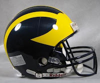
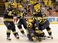
In other sports news it is also the college football bowl season (bear with me... I know this doesn't appear hockey related, I'm getting there). Many schools have rolled out new uniforms, or new helmets for their bowl games, and the technology for designs on football helmets is really progressing. The Michigan Wolverines have iconic football helmets, and their hockey team wears helmets which mimic this iconic design. The question I'm getting to is this: with all the advances being made in helmet designs, how long before (like the Michigan Wolverines) we see football helmet designs being mirrored on the helmets of more college hockey teams? Will this ever make it out of the college ranks and into pro hockey? the NHL?
Thankfully there has been some hockey on the TV as of late. I have loved staying up late to watch the World Juniors over the past week or so. It has both reminded me why I love watching hockey, gotten me more frustrated about the NHL, and gotten me wanting the NHL to come back even more.
 |
| photo from bleacherreport.com |
 |
| photo from stupidhockey.typepad.com |
----------------------------------------------------
If ANY of you feel like voting, you now can. There is no more voting committee. If you want to on this weeks COTW, email your vote to concepts@HockeyJerseyConcepts.com
COTW Dec 10-16 vote (ends Friday @ 11:59pm EST)
COTW Dec 17-23 vote (ends Friday @ 11:59pm EST)
----------------------------------------------------
Let's get to the concepts!
Boston Bruins concept (by Stephen T.)
I quite like this crest in yellow and brown, heck, I quite like the Bruins in yellow and brown in general. However. these sweaters individually don't have much logic to them, the hem stripes are WAY too high on the white jersey and then there are tiny hem stripes on the dark sweater. I also don't think the arm stripes on the dark sweater would look good on the ice. overall, not a cohesive set. 5/10.
Los Angeles Kings concept (by Bastian)
I like the yellow sweater. i don't like the yellow on yellow logo though. I feel like the white sweater has too much yellow and lacks purple. Also, I don't think that the shoulder yokes are necessary on either sweater. 6/10.
Winnipeg Jets concept (by Austin E.)
I like the simple Jet logo being used as a shoulder patch. It is much better than that winged-crossed-hockey-sticks mess that the jets have going on right now (side note: how did the Jets come up with such a great primary and such a bad secondary?). I like how this design fits with the jets current uniforms, and I do like the updated jet in the main crest, but it still feels a bit tacky mixing the old jets and new jets in anything other than a mash-up concept. still a good job though. 7/10.
Minnesota Wild concept (by Patrik G.)
I think the hem pattern shows some real promise for a fan jersey. I don't like the Reebok half arm stripes, or huge, christmassy presences of red. I think if the red were toned down (maybe use the wheat, or even green with a wheat or gold outline for the trees), and some cohesion between the hem and the rest of the jersey was found, this could be a really cool fan jersey. 6/10.
Providence Bruins concept (by Andrew G.)
I really like the way that the home and road sweaters are based off the NHL Bruins alternate. My criticism of that sweater, and these sweaters based off of it is the lack of hem stripes. In my opinion, the hem stripes should match the arm stripes. Also, for the white sweater, I would make the middle stripe black between white (instead of white between black), it would make the jersey look less empty (which it currently does). as for the yellow sweater, it seems like what Reebok would have done to the pre-edge Bruins sweaters. 6/10.
Anaheim Ducks concept (by NB-14)
I like the double piping on the sleeve stripes. I don't like the Reebok half sleeve stripes. If there was no piping and the arm stripes went all the way around, this sweater could look really cool. overall, although cleanly executed, these are not a step up from what the ducks currently wear. 6/10.
Toronto Maple Leafs concept (by Jordan R.)
I like that this sweater draws on a few eras of leafs history (especially the original green Maple Leafs... cool). I don;t like that this concept steps on toes of other Canadian teams. If the leafs introduced green into their colour scheme, I along with other Canucks fan would throw a fit (not a riot, we save those for losing in the cup finals), and then complain about western alienation. the Jets fans would probably also get mad about about the Leafs stealing their maple leaf within a circle rondel look. despite these sweaters stepping a bit to far into other territory, they look sharp, and are well executed. 7/10.
Sudbury Wolves concept (by Alan H.)
I really like the unique treatment of the sleeve stripes and arm numbers. I also like this logo and colour scheme for the Wolves. the choice of fonts was explained really well in the blurb on the concept, but I think a more classic block font would look better on these concepts. 7/10.
Friday: Back in Action
 Reviewed by Unknown
on
January 04, 2013
Rating:
 Reviewed by Unknown
on
January 04, 2013
Rating:


2 comments:
As a huge Jets fan, and a Canucks fan, I wouldn't be too concerned with the colours in Jordan's concept and the logo. I think Winnipeg will eventually go back to the 80's logo updated, so I don't see a problem with the circle logo, and yeah the colours may be in Vancouver's territory (even though I am all for Black Red Yellow) but, as an alternate, it wouldn't be awful.
Patrik G Wild jersey for COTW
Post a Comment