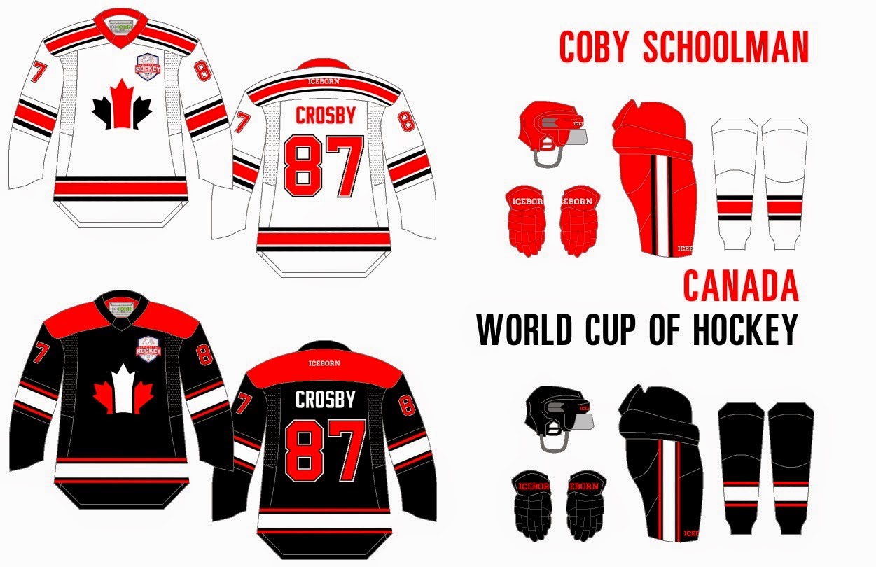
Wednesday: Starting to see this competition shape up!
Hello everyone! We've got a great competition going on right now... so if you haven't already go check the banner at the top of the page. I'm really excited to see what everyone comes up with for this competition. Why not check out what we have up to now!
Josiah B:
Ryan C:
Jared L:
Taylor R:
Wow! That's a lot of entries, but there is still times to send some more! Let's get as many entries as possible for this competition so we can choose only the best concepts. You still have lots of time! Also why not choose the best concept of the week and the VERY IMPORTANT fourth quarter of the year vote! SEND ASAP.
4th Quarter Vote (ends Friday @ 11:59pm Eastern)
COTW Jan 11-17 vote (ends Friday @ 11:59pm Eastern)
Anthony W - Toronto Toros
+ That yoke looks very sharp. I like it.
+ I haven't reviewed one of your concepts before, so if you're new... Welcome! Your concept and presentation remind me of Mario A's concepts.
- The logo shows its date. It's just not a pretty logo. It could also use a thicker outline on the blue jersey. I'td be cool to see a modernized version of it... Someone? Anyone?
- The numbers are too low, and the NOB is too high.
- Striping is a bit bland.
Overall: (6.5/10)
Christian C. - NY Islanders
+ A new alternate for the Islanders. I'm not to fond of the current stadium series one.
+ Simple striping along with the elongated yoke.
+ Crisp and simple colours. None overpower each other.
+ Execution and presentation are great... but...
-The reebok word mark on the back should be blue.
-I can't say I'm a fan of that logo. It's not awful but it could be better.
-I'd make the collar orange.
Overall: (8/10)
Derek K - Springdale Dynamos
+ Presentation is top notch. As well as execution.
+ You can never go wrong with a diagonal script on a college hockey jersey.
+ Pinstripes look pretty cool.
+ Colour balance is great. Not too much orange that it hurts your eyes.
- I really don't like that shoulder logo. Anyone else agree?
Overall: (8.5/10)
Ryan C - Cleveland Lumberjacks
+ Great colour scheme, with a great junior logo. Yes, it's only good for a minor team.
+ All the elements to a simple, yet great jersey are there.
- The concept seems fuzzy. The colours... especially the black are too light compared to the logo's colours. Almost as if the jersey was created on a sports equipment website. Try exploring different templates to further your abilities as a artist.
Overall design-wise: 7.5/10
TG - Hershey Bears
+ Simple striping. Classic, that will almost always look good.
+ Now this is what I call a colour scheme. Both shades of brown show up really well on white.
+ You just can't go wrong with anything on this jersey. If I lived in hershey I'd buy this in a second.
+ The logo choice. I absolutely love that logo. So simple yet so fierce.
- Shoulders are bare, you could put the primary logo on the yoke.
Overall : 9/10
Trent D - Columbus Blue Jackets
+ Canon logo always looks great on an alternate
+ Screams 'MURICA
+ Striping that mimics the Ohio Flag
- No TV numbers
- No NOB
- I like the stars on the cuffs, but not on the yoke.
- I'd like to see a bit more silver in the design. I think it could give you something sharp.
Overall : 7.75/10
That's all I have for you. But that shouldn't worry you too much since you'll be busy voting and making entries for the competition. Or maybe living your life and such. Wow my conclusions are awful aren't they? Anyways stay classy everyone!
Wednesday: Starting to see this competition shape up!
 Reviewed by Unknown
on
January 21, 2015
Rating:
 Reviewed by Unknown
on
January 21, 2015
Rating:


.png)


.jpg)
.png)


10 comments:
Christian, me and Anthony W. worked on that Toros concept together. I've been giving him tips and hints so he can get up there with the big boys/girls. He's got more ideas than me, so if you can't do, teach i guess.
Christian, I read Taylor's rant on Twitter. It clicked on me just a few minutes ago. Nice slipping it in to your review.
I hate it when people don't read the contest rules.
COTW to Christian C.
I'll 2nd Christian C. nice concept!
Taylor has nothing better to do than complain about me. take that energy and put it into your own concepts
Nice work everyone! EVERY competition entry posted today has not followed the rules.
HJC Logo Use Policy!!!!!!!!!!!!!!!!!!!!!!!!!!!!!!!!!!!!!!!!!!!!!!!!!!!!!!!!!!!!!!!!!!!!!!!!!!!!!!!!!!!!!!!!!!!!!!!!!!!!!!!!!!!!!!!!!!!!!!!!!!!!!!!!!!!!!!!
Ryan H, I looked at all the competition entries and I noticed that Josiah and a couple other entries actually didn't violate the Logo Use Policy(don't remember who else).
Um...I made the rules and everyone broke them today.
I stand corrected. Josiah did not break the rules.
I would also like to say that Vaugh did not break the rules either.
Post a Comment