
Thursday: Make Up Work, Part 2
Hello again guys, welcome back!
First of all congratulations to Scott for winning the Griffins competition, I can only imagine how awesome that'll be for you. A well deserving concept too, I can imagine that it'll look great on the ice.
Now this post will be pretty long again, so I'm just going to get right down to it. For those of you who don't know how this "segment" works I pick my personal top 5 NHL jersey matchups from the past week plus one worst, and just list them here. I apologize for repetitiveness but there are usually a few things that make the best jerseys so that's why. First of all we still have to make up the week of November 19-25, so let's go.
(Listed in no particular order, all photos from NHL.com)
Toronto Maple Leafs vs Boston Bruins
 While Boston's jersey is a much newer design, it looks like a classic one. Toronto on the other hand does have a classic jersey. Great color matchup too.
Detroit Red Wings vs Boston Bruins
 Here we have Boston again facing off against Detroit, with one of the most classic designs you'll find in hockey. Nice color matchup too.
Edmonton Oilers vs New Jersey Devils
 The Oilers definitely made the right move changing to their throwback set, and the Devils have only once changed their design, so this is a nice matchup of a few jerseys I'd consider classics. Also another nice color matchup.
New York Rangers vs Montréal Canadiens
 The Rangers jersey is a nice fauxback look and the Habs away jersey is one of my favorites. It's a bit plain so I'm not really sure why, but it's still a really nice look.
Montréal Canadiens vs New York Islanders
 For the last matchup today we have Montréal today, with their just as good or even better home jersey, facing off against the other New York team with their throwback design.
And for the worst....it's a a tie!
Pittsburgh Penguins vs Colorado Avalanche
 and Colorado Avalanche vs Ottawa Senators
 Why are these both the worst? Well we have Colorado's equally terrible home and away jerseys, paired up with the Pens and Sens...who have the same jersey template, and a terrible one at that. Hopefully these teams come to their senses soon and redesign their uniforms.
And now for this past week!
Calgary Flames vs Boston Bruins

Edmonton Oilers vs Dallas Stars


First of all congratulations to Scott for winning the Griffins competition, I can only imagine how awesome that'll be for you. A well deserving concept too, I can imagine that it'll look great on the ice.
Now this post will be pretty long again, so I'm just going to get right down to it. For those of you who don't know how this "segment" works I pick my personal top 5 NHL jersey matchups from the past week plus one worst, and just list them here. I apologize for repetitiveness but there are usually a few things that make the best jerseys so that's why. First of all we still have to make up the week of November 19-25, so let's go.
(Listed in no particular order, all photos from NHL.com)
Toronto Maple Leafs vs Boston Bruins

Detroit Red Wings vs Boston Bruins

Edmonton Oilers vs New Jersey Devils

New York Rangers vs Montréal Canadiens

Montréal Canadiens vs New York Islanders

And for the worst....it's a a tie!
Pittsburgh Penguins vs Colorado Avalanche


And now for this past week!
Calgary Flames vs Boston Bruins
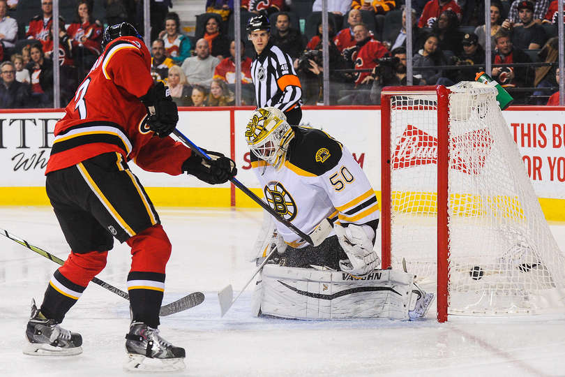
The only thing putting this matchup here is Calgary's alternate jersey, which is miles better than their regular home. I've already mentioned the Bruins jerseys in this post so no need to repeat that.
Edmonton Oilers vs Dallas Stars

This one is a nice color matchup with two great looking jerseys, and Dallas's victory green is always something to mention.
Chicago Blackhawks vs Winnipeg Jets

Decided to switch it up a bit with a new team, as I've noticed the same teams are usually here. Of course sometimes that's unavoidable as some teams have great jerseys and some don't, but the Jet's jerseys aren't bad by any means. The Hawks jerseys are usually seen as some of the best so I don't think any more explanation is needed.
Toronto Maple Leafs vs New Jersey Devils

The Devils and Leafs make another appearance here with a nice color matchup with classic designs.
New Jersey Devils vs Philadelphia Flyers

The Devils make yet another appearance but this time against the Flyers, and while I hate to have them here they do have their nice throwbacks to show off.
Worst: Calgary Flames vs San Jose Sharks

The Sharks jerseys wouldn't be bad at all if the arm pattern was on the hems, and the Flames could use some real hem stripes and no side panels too, or just a full redesign.
Well that's all for that, and as always the challenge is to redesign one of the worst matchups to make it better, maybe even one of the best.
--------------------------------------------------
Voting! We have a few this week. The COTW as always, plus the COTY November vote this week. We also have the voting for the Barrie Colts comp, with a new style for competition voting now, that should make it easier. So go ahead and vote, about 6 clicks is all you need minimum, that's not hard is it?
COTY-November vote (ends Friday @ 11:59pm Eastern)
COTW Nov 29-Dec 5 vote (ends Friday @ 11:59pm Eastern)
Barrie Colts Comp vote (ends Friday @ 10:59pm Eastern)
--------------------------------------------------
Onto the concepts!
Brad D. - Army West Point


+While I don't like the Penguins Vegas gold, I think it works here
+Good logo choice
+For once I actually don't mind the absence of hem stripes
+Not a design you see often, and it looks good here, except...
-The white and gold should be switched on the black jersey, or the socks should be changed, because the way you have them the socks on the black jersey look like they're white. Maybe it would appear differently on the ice but that's what it looks like to me now.
-The numbers are way too big and name is too small. The tv numbers are fine though.
Overall: Solid look (7.5/10)
Brad D. - Navy


+A bit more of a simpler look here but not a bad one
+The blue jersey looks great, and the colors are generally well balanced
+The gold socks on that jersey are a nice touch too
-The white jersey could use some more gold
-I'd use the other logo for the primary as well, wether that means a swap or losing the navy word mark entirely
-Again, numbers are too big and name is too small, tv numbers are fine
Overall: Another solid look (7.5/10)
Ryan C. - Quad City Mallards


+Nice fairly unique look
+The logo works perfectly with the hem stripe
+The numbers work well, and good job making sure they stand out well enough
+While I don't like it of course, the ad does make the concept look more realistic
-Not sure how I feel about the small stripe in between the hem/cuff fill and the other stripes (I hope I explained that well enough), but right now I'm leaning towards not liking it
-I wouldn't say it's bad how it is, but I'd switch the green and black on the white jersey
Overall: I'd like to see them use this (8.5/10)
Ryan C. - Winnipeg Jets


+A unique look that's for sure
+A lot of people want to see the Jets get an alternate
+While I don't prefer it, I don't hate the word mark logo with the number below it
+It's a pretty solid design,except for one thing...
-The side panel honestly brings this concept down a lot for me. It looks awkward jutting into the blue like it does and aside from that it looks like a paint bucket fill. I know a side panel could be pulled off but I'm not feeling this one
Overall: Close, it's just that one thing that brings it down (6/10)
Josiah B. - 2017 All Star Game


+The design is pretty simple at it's core
+Color vs color matchup. There aren't enough of those when the opportunity is available
+This is a much better way to do side panels
-I'd make the side panels a bit longer
-The jerseys still look a bit plain
Overall: Not amazing but not terrible (7.5/10)
Josiah B. - Heritage Classic, Ottawa vs Winnipeg


+The jets is a nice combo of both of the previous franchises looks
+The Ottawa jersey is a new design but it looks nice for sure, it would be a good replacement for their current unis
-The Jets jersey would look much better with a hem stripe
-The outline on the logo on the Sens jersey is too thin and a bit uneven
Overall: Pretty good looking game overall (7.5/10)
Ryan G. - Empire


Star Wars again...its most likely going to happen so I apologize if I miss any references that would be hard if not impossible to find for non Star Wars fans on this jersey or the next one.
+As always it's nice to see something more unique here
+Simple, Devils-esque design
+I like the absence of white
+As always the name and number font is a cool touch
-It wouldn't hurt for the stripes to be a little bolder
Overall: Good look (8/10)
Ryan G. - Lothal Rebels

+As opposed to the last design this one looks more Bruins-esque
+I like the yellow gloves
-I'd move the arm stripes down a bit so they aren't so close to the tv numbers
-Black namebar?
Overall: Another solid look (8/10)
Matt M. - Arizona Coyotes


+Yotes need new uniforms for sure
+Good logo choice, I like that one much more than their current
+Also bringing the kachina pattern back looks good
+Colors are balanced well
+Has a modern look to it which is fitting for the Yotes.
+The font fits well too
-Not a fan of the adidas stripe shoulders, but then again I'm not sure if you are either. It's just realistic for what you're making this concept for.
Overall: Great improvement (9/10) and my COTW nomination!
Well that's all for today's post. I hope you enjoyed it, thanks for reading, and I'll see you guys next week.
Thursday: Make Up Work, Part 2
 Reviewed by Bpoe
on
December 10, 2015
Rating:
Reviewed by Bpoe
on
December 10, 2015
Rating:
Reviewed by Bpoe
on
December 10, 2015
Rating:


7 comments:
I'll 2nd Matt for COTW.
I'll nominate Josiah B's Heritage Classic for COTW. It was a close call over Ryan C's Mallards concept for me. Great concepts today!
Thanks Ben!
I'll nominate second Josiah B.'s Heritage Classic Concept for COTW
Ryan C.'s Quad City Mallards concept for COTW. Replace "Quad City" with "Anahiem" and "Mallards" with "Ducks" and this would be awesome for the Anahiem Ducks.
GO JACKETS!!! GO MONSTERS!!! GO BUCKS!!!
Josiah B for cotw
Cotw nom to Bradley's Navy jersey
Post a Comment