Wednesday: New Leafs
Hello folks! Have you noticed that lately all the jersey/logo news happens on Tuesday evening (Leafs logo) or Wednesday morning (All-Star jerseys). That forces me to write up a review at the last minute. You know what, I've had enough! No more Wednesday posts for me!
Anyways, let's take a look at the Leafs new logo...
What's old is new again, as the Maple Leafs updated their 1938-63 logo. What's new about this logo? Quite a few things, the text is now centered, and the font is rounded instead of square. The shape is also a bit different, there are now 31 points compared to 35 before. That number isn't random, it's a nod to the the year the Maple Leafs Garden opened. The number of veins also represent different things, the 17 total veins are for year the Leafs were founded, the 13 veins above the text represent the number of cups they've won. You can read the full press release on the Leafs website.
What do I think of the logo? I love it. I also like the Leafs current logo, but the team is nearly 100 years old, and this new logo honours that history perfectly. Whoever designed this new logo deserves a lot of credit, because everything that needed updating about the 1938-63 logo was updated, it no longer looks dated instead it looks retro and historic. I'm also glad they went without an outline, it makes the logo much bolder. There are a few areas of the leaf were the shape looks odd to me right now, but I'm sure I'll quickly get use to it. Also part of me wanted to see something completely new, going forwards instead of back, but in the long run I think this was the proper choice.
Rating: 9/10
Also the Toronto Marlies unveiled a new logo too, which uses the same shape as the Leafs new logo and the crown from the Marlies current alternate logo. You can read their press release on the Marlies website.
What do you think about the Leafs new logo? Let me know in the comments.
Rating: 5/10
Rating: 7/10
Rating: 9/10 and a COTW nomination.
Anyways, let's take a look at the Leafs new logo...
 |
| Image from mapleleafs.nhl.com |
What do I think of the logo? I love it. I also like the Leafs current logo, but the team is nearly 100 years old, and this new logo honours that history perfectly. Whoever designed this new logo deserves a lot of credit, because everything that needed updating about the 1938-63 logo was updated, it no longer looks dated instead it looks retro and historic. I'm also glad they went without an outline, it makes the logo much bolder. There are a few areas of the leaf were the shape looks odd to me right now, but I'm sure I'll quickly get use to it. Also part of me wanted to see something completely new, going forwards instead of back, but in the long run I think this was the proper choice.
Rating: 9/10
Also the Toronto Marlies unveiled a new logo too, which uses the same shape as the Leafs new logo and the crown from the Marlies current alternate logo. You can read their press release on the Marlies website.
What do you think about the Leafs new logo? Let me know in the comments.
---------------------------------------------------
Voting this week is very important. Let me repeat that again a bit louder, in case you didn't hear the first time. VOTING THIS WEEK IS VERY IMPORTANT!!! We're deciding the best concept of 2015 this week, so go vote!
2015 Concept of the Year vote (ends Friday @ 11:59pm Eastern)
COTW Jan 23-30 vote (ends Friday @ 11:59pm Eastern)
---------------------------------------------------
Rouyn-Noranda Huskies, by Jonathan H:
For the second week in a row we begin with a stolen concept. This concept is basically identical to an Ottawa 67's concept posted on CCSLC by the user "_nxche" back in February 2014.
Rating: 0/10
Baie-Comeau Drakkar, by Jonathan H:
This concept is also appears to be stolen from that same thread, this one is a recoloured Kitchener Rangers concept. Unless I'm missing something, and there's another innocent explanation. If that's the case I'll take back what I said and provide a real review.
Rating: 0/10
All-Star Jerseys, by Jake C:
For are first real concept, we have an All-Star concept from Jake. What I like about this concept is the colour versus colour match-up, the 2014 Winter Classic showed us how good a colourful game can look, and I think the All-Star game would be the perfect place to try it again. That's pretty much the only thing I like about this concept. The jerseys are just recoloured Senators third jerseys, which doesn't make much sense for a game in Nashville. The NHL logo is a dated, inferior version of the NHL's current logo, which the NHL wouldn't want to use to represent themselves. The execution also needs improvement, the shoulder logos are too close to the collar (and I don't get why it's black on the home jersey), and the sleeve numbers need to be rotated 45 degrees. If the program you're using to create these concepts doesn't let you rotate 45 degrees, maybe try a template with horizontal sleeves instead.Rating: 5/10
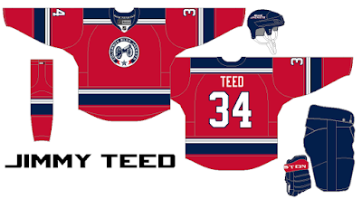
Columbus Blue Jackets, by Jimmy T:
Next up Jimmy created a Blue Jackets concept inspired by the Ohio flag. This idea has been done before, but that doesn't mean it's not a good idea. I like how the white jersey doesn't have blue on the hem, I've seen other versions of this idea with blue below the hem-stripes but with the blue pants I don't think it's necessary. Jimmy also sent a third jersey to go along with this concept...
We don't see many red jersey concepts for the Blue Jackets. I doubt we'll ever see the Blue Jackets wear a red jersey in real life, but it's fun to see for concepts. I like the striping pattern, the yoke might be too similar to the Rangers, but the sleeve and hem stripes look really sharp. The execution for these concepts is pretty good, although the sleeve numbers are a bit too close to the stripes, and the stitching on the hem should be right up against the stripes. Also there should be a Reebok logo on the back, and the sock stripes are too high.Rating: 7/10
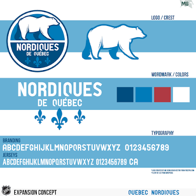
Quebec Nordiques, by Matt G:
Our final concept is a Quebec Nordiques expansion concept from Matt. Unlike most people, I don't want to see the Nordiques using the same logo as before, I think it would be better if they came up with something new like the Jets did. I like the idea of using a bear as the logo for the Nordiques, although the roundel logo is probably too similar to the Hershey Bears to work in real life. The wordmark and typography also look good. Now let's take a look at the jerseys...
The home and road are a perfect combination of new and old. Same colour scheme as before, and fleur-de-lis along the hem, but with a new and improved striping pattern. The third jersey ain't bad, but the red and light blue aren't that noticeable, and the rest of the jersey is kind of forgettable.Rating: 9/10 and a COTW nomination.
---------------------------------------------------
That's all folks! But don't forget to vote.
Wednesday: New Leafs
 Reviewed by Steven Grant
on
February 03, 2016
Rating:
 Reviewed by Steven Grant
on
February 03, 2016
Rating:


7 comments:
I second Matt G's Nordiques concept. Great work there!
I second Matt G
That's exactly what I was thinking, Steven. Throwbacks are cool, but I really like how the Jets updated their brand and that was my inspiration for a team returning to Quebec City. I'm pretty happy with this concept, glad you guys like it.
YAY!!! BLUE JACKETS!!! 100.infinity out of 10!!!
GO JACKETS!!! GO MONSTERS!!! GO BUCKS!!!
I was really excited to see something new, or at least different from Toronto's new logo. But it'it's honestly anything but new. Don't get me wrong, they should have made the move to this logo years ago because I strongly dislike their current logo. But to the average fan, this wouldn't look new, just like their old logo. The only redeeming factor for me is they're an original 6 team so I wouldn't want to see them "modernize" their logo too much.
I'll 4th Matt G's Nordiques concept for COTW.
-I like the new Maple Leaf logo. The hiring of Babcock/Lamoriello, the centennial celebration, and this logo makes it feel like a new era for the Leafs. I know the logo itself is not really new, but it's a good bridge between the past and present. I'm very satisfied with the result.
-I respect creating your own logo, and Matt's Nordiques logo looks great. I'll give it a 5th.
-Burkus, please consider switching to decaf. I'm concerned.
I'll 6th, yes 6th, Matt G. This is a great original concept that leaves room for throwing back, but at the same time is new. I especially like the navy alternate and the addition of red.
Post a Comment