Wednesday: Places to Go, People to See, Things to Do, Jerseys to Review
No, Ryan. I didn't forget to start writing until Tuesday.
It's been a busy week so far for me. Between my brother's birthday on Sunday and a game Monday afternoon immediately followed by work (with snow during travel, meaning dumber drivers), I am FINALLY able to bring you this post.
Now everyone has been posting rankings and all this nonsense and ridiculousness. So I figured I would join in on the ridiculousness: Introducing the best and worst jerseys in Islanders history!
Best: HOME 1977-1984

Jay S: Philadelphia 76ers (NBA) Concept
Crossover concepts are arguably my favorite because you can either apply their current jersey to a hockey jersey or you can go in a completely new direction with it and still have it look fantastic. Here Jay tries the latter. The problem here is that although double blue usually looks good, it only works when the two shades of blue are distinct enough. Plus the one thing i could use here is some red. even as an accent color. The 76ers are supposed to represent American history. I mean Ben Franklin is their alternate logo for crying out loud! Red, white and blue. America! (F*** YEAH!) The striping is definitely interesting and unique, and I like it. maybe change up some colors and you can call it a slam dunk. Execution note: No back branding for Reebok (featured on the inside tag) is a no go.
The team name is your score: 76%
Jay S: Philadelphia 76ers (NBA) Alternate Concept
Same thing here with the crossover idea. But this was a crazy era in Sixers design history, detracting away from the classic red, white and blue for black, red and gold. I grew up with this era, when Allen Iverson (who I'd love to see on this jersey) would battle with Jason Kidd and my (then) New Jersey Nets (my brother liked the Knicks so naturally I hated them). That said, its a crazy era, so go crazy! Try something new! This jersey is too traditional for this era. But if you really wanted to keep it conservative, the least you could do is a double outline on the number to parallel the striping, with red and black, not white. Same execution as previous.
1, 2, 3, 4, 5, Sixers: 67%
Lucas D: Los Angeles Kings Concept
First things first, that anniversary logo is leagues better than what they gave us. I just wish it wasn't blurred by the effect you placed over it, your ID and the logo. This is a bit of a modern take on the 1980-88 Kings jerseys. I absolutely love this. My only complaint would be the yellow on white clash on the white sweater and with the numbers on both, plus the collar on the purple jersey should be purple. Otherwise the colors balance well. Purple and yellow are always a great combination and a classic look for the Kings. I would love to see equipment for this beautiful set.
I love LA: 87%
Mario A: Global Hockey League All-Star Game (European Conference)
In Mario's conceptual league, it's time for the All-Star Game? In which city? I'm not sure, and maybe we can provide suggestions to Mario or he can reveal it to us in the comments below. Anyways, interesting move to put the numbers on the shoulders, a la Edmonton (which I hope happens when the ASG goes to Edmonton). I like it, but only if you move them closer to the edge of the yoke and away from the collar. The logo does look awkward against that color scheme, and the NHL has shown willingness to recolor their logo to match a jersey so I'd try that here. Yellow on white clash here too. And if you slide the nameplate down a few pixels, then your execution would be on par with what is expected of a clean concept. But honest question, why a different jersey for a goalie? I only see that in soccer, and in the next concept you'll see why it'll become a major problem. What does the equipment look like?
Arguably your best yet: 73%
Mario A: Global Hockey League All-Star Game (North American Conference)
And now we go from potential COTW winner to definite paint-bucket winner. And the skater jersey conflicts with the goalie jersey in the previous concept, as I forewarned, so from a game perspective it wont work, maybe a solid black would work. But this is just lazy. No outline on the numbers also doesn't help. The execution of the name and numbers is also thrown out the window. I wont even bother to rant about equipment.
We have seen what you're capable of, now make it your standard! 45%
Ryan C: Los Angeles Kings Concept
Not sure if Pittsburgh Penguins or LA Kings. adjust a few stripes and you have the other, but regardless its a good look, and the hem and mid-arm striping is what sets it apart from Pittsburgh. Unlike Pittsburgh, this concept has uniform thickness in the striping between the hem and the arms, so that's a plus. Execution is spot on as usual with Ryan, who I've seen go from rookie to seasoned veteran. The only thing I would change is adding a number outline. I like the shield logo as the primary, but it works on the shoulders with the highly detailed crown logo front and center. I want to see equipment, especially the socks.
I still love LA: 87%
Zack M: Jokerit Helsinki Concept
Jokerit is one of my favorite team names outside of North America, and their logo is perfect. Their current jerseys look similar to this, but there's a hem stripe instead of a chest stripe and a phantom yoke with a white outline. So this is a step in the right direction. The color interference of the logo actually helps in my opinion, because of the team we are dealing with, which translates to "The Jokers". Chaos rules with jokers, either in a standard game of cards or in Gotham City. What fails this concept is execution. Number outlines would be of great use here as you also move them closer together. The inside of the blue jersey should be blue, not white. Sock stripes should be lowered. Speaking of socks, its nice to see them, but throw in the rest of the equipment too.
Can't clown around on this one: 65%
The winner of my COTW Nomination is: TO BE DECIDED BY YOU! I have two concepts with the same top score today. It's up to you to break the tie! Or nominate both and render tiebreakers useless. That works too I guess...
You know you've returned when the excitement of writing turns into "Oh crap I need to finish this!" by post number 2. So since my number 2 is now done, posts will probably be a lot less crappy.
And on that note I'll see myself out, and see you next week.
It's been a busy week so far for me. Between my brother's birthday on Sunday and a game Monday afternoon immediately followed by work (with snow during travel, meaning dumber drivers), I am FINALLY able to bring you this post.
Now everyone has been posting rankings and all this nonsense and ridiculousness. So I figured I would join in on the ridiculousness: Introducing the best and worst jerseys in Islanders history!
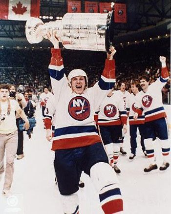
Best: HOME 1977-1984
(Photo Source: http://i19.photobucket.com/albums/b154/spyboy1/TSG%20Blog%202012/BossyStanleyCup.jpg)
The classics. Balanced blue and orange, level sock stripes and glory. And Caz's beloved V-neck collar. Honorable mention: 2010-present home.
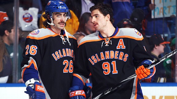
Worst: ALTERNATE 2011-2014

(Photo Source: http://espn.go.com/blog/new-york/mets/post/_/id/36737/blue-and-orange-and-black-still)
The Mouslon-Tavares bromance was awesome. These? Not so much. When the Islanders first introduced black jerseys, the colors did not do the jersey justice. There is absolutely no reason why grey should even be involved in the first place, and black helmets would work much better. But what really makes this bad is the lack of a logo on the front. This is not the NCAA. You have better options than this. Dishonorable mention: FISHSTICKS! 1995-1997 Home & Away
The Mouslon-Tavares bromance was awesome. These? Not so much. When the Islanders first introduced black jerseys, the colors did not do the jersey justice. There is absolutely no reason why grey should even be involved in the first place, and black helmets would work much better. But what really makes this bad is the lack of a logo on the front. This is not the NCAA. You have better options than this. Dishonorable mention: FISHSTICKS! 1995-1997 Home & Away
Now if you live in the United States, you should know that the Presidential Primaries and Caucuses are happening right now. So since you are already in the voting mood, click here to check out the concepts set for COTW, and here for the White Jersey vote!
If you live in Canada, just click the links anyway as you make fun of the s***show that is American Politics.
COTW Feb 7-13 vote (ends Friday @ 11:59pm Eastern)
White Jersey Comp Top 5 vote (ends Friday @ 10:59pm Eastern)
Onward and upward!
Jay S: Philadelphia 76ers (NBA) Concept
Crossover concepts are arguably my favorite because you can either apply their current jersey to a hockey jersey or you can go in a completely new direction with it and still have it look fantastic. Here Jay tries the latter. The problem here is that although double blue usually looks good, it only works when the two shades of blue are distinct enough. Plus the one thing i could use here is some red. even as an accent color. The 76ers are supposed to represent American history. I mean Ben Franklin is their alternate logo for crying out loud! Red, white and blue. America! (F*** YEAH!) The striping is definitely interesting and unique, and I like it. maybe change up some colors and you can call it a slam dunk. Execution note: No back branding for Reebok (featured on the inside tag) is a no go.
The team name is your score: 76%
Jay S: Philadelphia 76ers (NBA) Alternate Concept
Same thing here with the crossover idea. But this was a crazy era in Sixers design history, detracting away from the classic red, white and blue for black, red and gold. I grew up with this era, when Allen Iverson (who I'd love to see on this jersey) would battle with Jason Kidd and my (then) New Jersey Nets (my brother liked the Knicks so naturally I hated them). That said, its a crazy era, so go crazy! Try something new! This jersey is too traditional for this era. But if you really wanted to keep it conservative, the least you could do is a double outline on the number to parallel the striping, with red and black, not white. Same execution as previous.
1, 2, 3, 4, 5, Sixers: 67%
Lucas D: Los Angeles Kings Concept
First things first, that anniversary logo is leagues better than what they gave us. I just wish it wasn't blurred by the effect you placed over it, your ID and the logo. This is a bit of a modern take on the 1980-88 Kings jerseys. I absolutely love this. My only complaint would be the yellow on white clash on the white sweater and with the numbers on both, plus the collar on the purple jersey should be purple. Otherwise the colors balance well. Purple and yellow are always a great combination and a classic look for the Kings. I would love to see equipment for this beautiful set.
I love LA: 87%
Mario A: Global Hockey League All-Star Game (European Conference)
In Mario's conceptual league, it's time for the All-Star Game? In which city? I'm not sure, and maybe we can provide suggestions to Mario or he can reveal it to us in the comments below. Anyways, interesting move to put the numbers on the shoulders, a la Edmonton (which I hope happens when the ASG goes to Edmonton). I like it, but only if you move them closer to the edge of the yoke and away from the collar. The logo does look awkward against that color scheme, and the NHL has shown willingness to recolor their logo to match a jersey so I'd try that here. Yellow on white clash here too. And if you slide the nameplate down a few pixels, then your execution would be on par with what is expected of a clean concept. But honest question, why a different jersey for a goalie? I only see that in soccer, and in the next concept you'll see why it'll become a major problem. What does the equipment look like?
Arguably your best yet: 73%
Mario A: Global Hockey League All-Star Game (North American Conference)
And now we go from potential COTW winner to definite paint-bucket winner. And the skater jersey conflicts with the goalie jersey in the previous concept, as I forewarned, so from a game perspective it wont work, maybe a solid black would work. But this is just lazy. No outline on the numbers also doesn't help. The execution of the name and numbers is also thrown out the window. I wont even bother to rant about equipment.
We have seen what you're capable of, now make it your standard! 45%
Ryan C: Los Angeles Kings Concept
Not sure if Pittsburgh Penguins or LA Kings. adjust a few stripes and you have the other, but regardless its a good look, and the hem and mid-arm striping is what sets it apart from Pittsburgh. Unlike Pittsburgh, this concept has uniform thickness in the striping between the hem and the arms, so that's a plus. Execution is spot on as usual with Ryan, who I've seen go from rookie to seasoned veteran. The only thing I would change is adding a number outline. I like the shield logo as the primary, but it works on the shoulders with the highly detailed crown logo front and center. I want to see equipment, especially the socks.
I still love LA: 87%
Zack M: Jokerit Helsinki Concept
Jokerit is one of my favorite team names outside of North America, and their logo is perfect. Their current jerseys look similar to this, but there's a hem stripe instead of a chest stripe and a phantom yoke with a white outline. So this is a step in the right direction. The color interference of the logo actually helps in my opinion, because of the team we are dealing with, which translates to "The Jokers". Chaos rules with jokers, either in a standard game of cards or in Gotham City. What fails this concept is execution. Number outlines would be of great use here as you also move them closer together. The inside of the blue jersey should be blue, not white. Sock stripes should be lowered. Speaking of socks, its nice to see them, but throw in the rest of the equipment too.
Can't clown around on this one: 65%
The winner of my COTW Nomination is: TO BE DECIDED BY YOU! I have two concepts with the same top score today. It's up to you to break the tie! Or nominate both and render tiebreakers useless. That works too I guess...
You know you've returned when the excitement of writing turns into "Oh crap I need to finish this!" by post number 2. So since my number 2 is now done, posts will probably be a lot less crappy.
And on that note I'll see myself out, and see you next week.
Wednesday: Places to Go, People to See, Things to Do, Jerseys to Review
 Reviewed by Unknown
on
February 17, 2016
Rating:
 Reviewed by Unknown
on
February 17, 2016
Rating:


5 comments:
My vote is for Lucas D.'s LA Kings Concept
Phil, the All-Star Game is in Quebec. I wanted to do Nordiques-themed jerseys, but I used the colors of the flags instead: red, white and blue for North america, and blue and gold to represent Europe. I also added black and silver because of the GHL logo's colors. Sadly, I don't really have any say-so in regard to what the jerseys look like, even though I'm the commissioner. The team owners decide what the jerseys look like. Originally the NA Conference was all red, white and blue. However, with the logo not in matching colors and the fact that changing the colors would ruin the logo turning it into a pixelated mess,I had to add the logo's colors with the jersey colors. That's the template the teams picked. I'll make a better one in the future, but that was the one the owners wanted me to submit. I'm going to make one of my own.
P.S. The goalie jerseys are a tradition in the GHL. We took that idea from both soccer teams and the 2000 and 2001 NHL All-Star Games.
I'll 2nd Lucas for COTW
I'll 2nd Lucas D for COTW
I nominate the Los Angeles Kings concept!
😉🏒
GO JACKETS!!! GO MONSTERS!!! GO BUCKS!!! GO EMOJIS!!!
Post a Comment