Tuesday: Da Beauty League
Hello again, and welcome, Hockey Fans, to this Tuesday's post!


The Hockey offseason can be a little slow. After the draft, and the occasional uniform unveiling, (well, most years anyways) there's nothing left to do... Players and people alike are wrapped up in summer. Which also explains why we only have three concepts today, so don't forget to send in your work!!! But that's where Da Beauty League comes in!
Da Beauty League has been taking the Hockey world by storm! It's a small league in Minnesota, but it's having a pretty big impact on the players and their NHL teams. Many players are Minnesota-born, or have ties to Minnesota, either through playing for the Wild, or playing for the Gophers or any other Minnesota College. The games are played every Monday and Wednesday and are all 4-on-4 non-checking. And each team competes for the second greatest trophy in sports, the John Scott Cup!
The league consists of 6 teams,
Team Velocity TC (Training Center)
Team Tradition
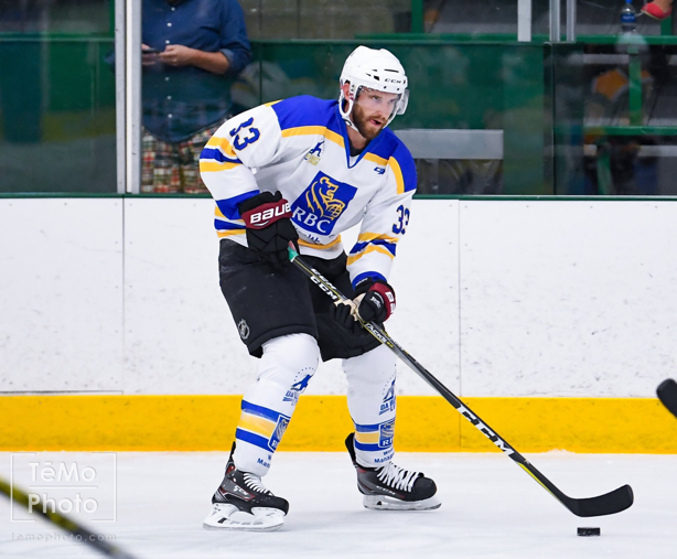
Team RBC
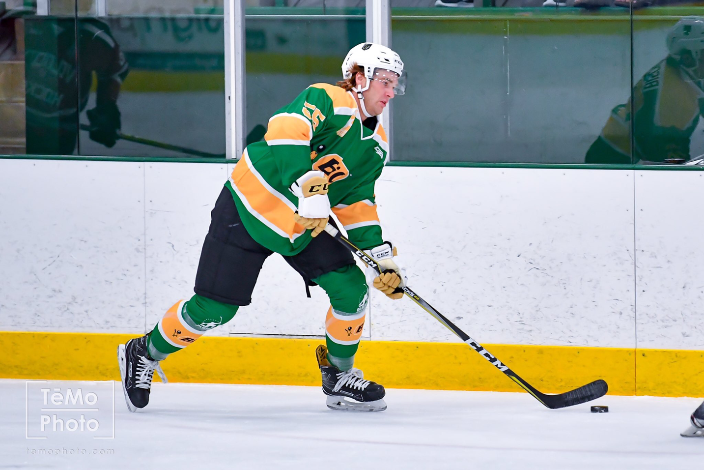
Team BiC
Team Walser
Team Tria
and since its so small, all of the teams are ad-sponsored. Now you might think that the jerseys are riddled with ads, much like a European hockey jersey, but you'd be wrong. Since each team is sponsored by a company, that company is featured as the main crest, and the striping is clearly visible. Some follow basic templates that are even identical to each other like Team Tradition, and Team RBC. Team Velocity TC is similar but a little different in the shoulder yoke.
Team Tradition


Team RBC


Team Walser


On to the concepts!!!
Well that's all from me, you Tuesday writer, Chase! Come back for more!


Team Velocity

Team BiC, and Team Walser (An Auto Company in the area) both have similar looks, although Walser has a chest stripe instead of the tail stripe.
Team BiC


Team Walser

But Team Tria is probably has the most clever jerseys in the league. The company's main logo is used as the crest, but the secondary logo, is used exactly like the Nordiques used the Fleur-De-Lis on their sweaters. On both the shoulders and the hem stripes. Very Clever!
Team Tria


As the league gets bigger, hopefully this can become almost a second NHL, and maybe real team nicknames will develop!
While Ads on a jersey aren't the best, this is certainly the way to do it! This is also my challenge to you guys! Send in some concepts that use advertisements, but are done tastefully!
Don't forget we also have voting for our regular COTW, we have the voting for July COTW, AND we have the Hockey Card comp. voting going on too! So don't forget to vote on those!
Don't forget we also have voting for our regular COTW, we have the voting for July COTW, AND we have the Hockey Card comp. voting going on too! So don't forget to vote on those!
COTW-July
COTW (Aug 4-10)
Hockey Card Top 3
—————————
Good-
- I like the return of the Kachina pattern!
- The black base is great, and works really well with the logo
- I also like the shoulder yoke!
- The combination of beige/sand and white usually never works, but it looks good here!
- I like the font choice!
Bad-
- The numbers should have an outline. Red would probably work the best here
- The socks should have the Kachina pattern on it
- I also don't like how the pants don't really match the rest of the stripes
My rating: This would be a great look for the Yotes, on that combines modern sweaters with their classic ones! 9/10 and my COTW NOMINEE!!!!!!
Matt G.- Arizona Coyotes (NHL)
I'm reviewing these separately to add another review, otherwise we'd only have two concepts today.
Good-
- I like the colored upper sleeve look, like the current road sweaters!
- The logo works well with the design!
Bad-
- Once again, the socks should have the Kachina pattern...
- The beige/sand touching white on the socks doesn't look the best...
- The numbers also need outlines!
My rating: A little bit sloppier here on this concept than the last... 8/10
Vaughn R.- CJHL Canada 150 Classic
Last but not least is Vaughn's CJHL Canada 150 Classic concept. He pits the Montreal East Rangers vs. the Ottawa Jr. Senators! For reference, the East Rangers look a lot like the 1994 Rangers, while the Jr. Sens look like a red and white version of the Habs road sweaters.
Good-
- I like that you used the Jr. Sens sock pattern on the sleeves, and gave it a little more color!
- I also like that you kept the drop shadow on the Rangers jerseys.
Bad-
- While the Rangers are from Montreal, the Habs sock pattern doesn't work the best for a jersey, and it leaves too much red on the sweaters.
- You're presentation is also awful... There is no way that the breezers should be bigger than the jersey. It's also littered with random logos and boxes. It needs to be cleaned up a little...
My rating: Your designs are decent, but your presentation is sloppy... 6/10
—————
Tuesday: Da Beauty League
 Reviewed by Chase A. Carlson
on
August 15, 2017
Rating:
 Reviewed by Chase A. Carlson
on
August 15, 2017
Rating:


No comments:
Post a Comment