Friday: U-S-A! U-S-A! U-S-A!
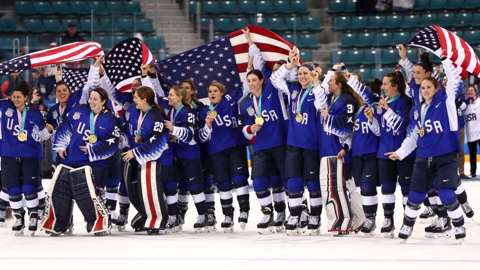
Hey y'all, and welcome to another Friday post here at HJC. As all of you know doubt already know, the US Women's Hockey team took down Canada in a thrilling game ending in a shootout in order to win the gold medal in Pyeongchang.
I would personally like to say congrats to our ladies, you've made all of us very proud by beating the Canucks at their own game and avenging the loss in Sochi. My only regret with this win is that our first gold in twenty years had to come in these horrific jerseys. Granted, it was the lighter blue alternate jersey, which is by far the best of the three, but that's really not saying a lot. I hate that all of the record books with this win recorded in it will have documentation of this nightmare of a jersey template, but if that's the price to pay for gold, I will gladly take it.
In voting news, we have the regular COTW vote for February 16-22, as well as the Week 4 vote for The Season, both of which end Friday at noon EST.
COTW Vote Feb 16- 22 (ends Friday @ noon EST)
The Season Week 4 Vote (ends Friday @ noon EST)
-------------------------------------------------------
Now on to today's concepts!
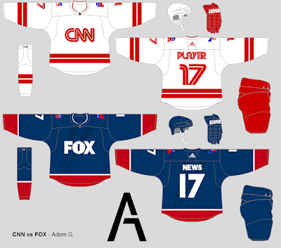
Adam G.- CNN vs. FOX
Our first concept of the day is Adam G.'s design for a game between two major American broadcast networks, CNN and Fox. Let's start with CNN. I love that the font and striping pattern match the main logo, it works really well and looks great. That being said, the name and numbers are too close together, I think because you were trying to match the logo, but it just looks messy. I wish you'd included matching striping on the breezers, and a logo on the helmet. I probably would have included more white in the gloves and made the collar a solid red. Now for the FOX jersey. I really like the sublimated pattern on the main body of the jersey, it's a great way to incorporate the FOX logo into the design. The striping pattern, while simple, was a good call considering the use of the sublimated pattern on the body. Once again, I wish there was a logo on the helmet, more done with the gloves, and I probably would have gone with a red collar. On a more political note, I probably would have given CNN two donkey shoulder patches and FOX two elephants, just so we're not pretending that they're nonpartisan. Final verdict: a decent looking set, but some design choices miss the mark a bit. 7.5/10
Danny R.- Olds Grizzlys
Next up is Danny R.'s design for the Olds Grizzlys of the AJHL. Right off the bat, I love that logo, it's way better than their current logo, and you properly cited the original artist, so good work there. I really like the more traditional look, I never understood why a team called Olds would try a more modern looking jersey (yes, I know that's the name of the town, but still). The striping pattern on both jerseys looks great, and the yoke striping is a nice touch. While I'm usually not a fan of solid breezers, I think that with the mismatched striping between the two jerseys it was the right move. Gear looks good, and execution is solid. Final verdict: a good look for a team that I think belongs in more traditional garb. 9/10 and my COTW NOMINEE!!!!!
Noah B.- Nashville Predators
Next up is Noah B.'s design for an alternate for the Nashville Predators. I like the idea of a navy alternate for the Preds, it's the most logical move for them. I like the guitar string detail, similar to the numbers on their primary set, in the white striping, but I think it's a detail that would get lost in translation on the ice. I like the inclusion of the yellow yoke to break up the navy, but losing the pick logo for just the inner circle is a real shame, it loses its Music City charm. I would have rather seen the normal Preds numbers on this one, I hate when teams abandon their unique font for a generic one, and I think a navy helmet would have worked better with this set. Final verdict: an ambitious design for the Preds, but I think the best parts about it would be lost on the ice. 8/10
Noah K.- San Antonio Crossmen
Our final concept of the day is the latest entry in Noah K.'s DCI series, this one for the Crossmen of San Antonio. I like the white yoke on the black jersey, I'm always a sucker for white yokes. Collars are done well, but the laces on the white jersey disappear, you might want to do something about that in the future. What really shines here for me is the striping on the breezers. It's a great way to work the logo in and really makes me wish you'd done something similar to that on the arms of the jersey rather than the simple pattern you went with. While I'm not always the biggest fans of Gothic looking fonts, it works well with the logo here and you didn't force it on the number plate. With the minimal use of red outside of the logo and numbers, I'm not sure that I would have gone with so much red on the gloves. Final verdict: not a entry in an interesting series, but the breezers tease me with what could have been. 7.5/10
That's all for me this week, see y'all next Friday!
Friday: U-S-A! U-S-A! U-S-A!
 Reviewed by TC Moore
on
February 23, 2018
Rating:
 Reviewed by TC Moore
on
February 23, 2018
Rating:


2 comments:
I have an odd conspiracy theory to share:
All horrendously awful hockey jersey designs make great soccer jerseys.
I'd bet the looks given to this year's hockey teams would make great soccer jerseys; and another example of this theory is that I saw a buffalo sabres soccer concept that made use of the turdburger design, and somehow made it look great.
I love that jersey. It's refreshing to see something different and new instead of yet another fauxback. Hopefully some of next year's NHL alternates take a unique approach. Give me a 96 blues jersey design based on the current color scheme with the arch logo. Or take that design and evolve it some. It's just like the trend of black for blacks sake, the retro for retro's sake trend needs to start wrapping up
Post a Comment