2019 Stadium Series Jerseys Officially Unveiled
This morning, the Penguins and Flyers both officially unveiled the jerseys (and in the Penguins' case, the entire uniform) that they'll be wearing in the 2019 Stadium Series game on February 23.
And they're exactly the same as what has already been leaked.
The Flyers jerseys, which were leaked much sooner than the Penguins jerseys, are primarily orange with a few black stripes on the cuffs and hem, as well as a black collar. The arm stripes appear to have a slight curve to them. The inside of the collar features the word "Philly". The logo remains only two colors, black and orange, as seen in the logo unveil, and so does the entirety of the jersey for that matter, aside from the event patch.
The back and sleeve numbers are both black, in a basic block font. The back also features a black contrasting namebar, which has been a recent staple on any Flyers jersey.
And they're exactly the same as what has already been leaked.
West side, best side. We're ready for the Battle of PA.— Pittsburgh Penguins (@penguins) February 1, 2019
Details on our Stadium Series sweaters: https://t.co/MYXYZJg15F pic.twitter.com/N06ONCesuG
We're taking this show to the great outdoors and into the Battle of Pennsylvania! #StadiumSeries | @adidashockey pic.twitter.com/HnSHZwClb8— Philadelphia Flyers (@NHLFlyers) February 1, 2019
The Flyers jerseys, which were leaked much sooner than the Penguins jerseys, are primarily orange with a few black stripes on the cuffs and hem, as well as a black collar. The arm stripes appear to have a slight curve to them. The inside of the collar features the word "Philly". The logo remains only two colors, black and orange, as seen in the logo unveil, and so does the entirety of the jersey for that matter, aside from the event patch.
The most interesting detail we got today on the Flyers end is in the stitching. Both jerseys use a triple stitching pattern on the logos and/or numbers.
Aside from that, there honestly isn't much interesting to talk about with this jersey, in part due to the fact that there are also not many new details shown here. The thing to look out for with this one will be the first time we see the actual gear. Will they use orange or black gear? I personally think black would look better, but I wouldn't put it past them to try orange, and would also be open to it for a one-off.
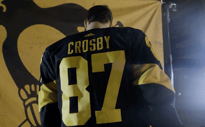
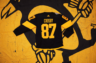
The Penguins on the other hand gave us a few more things to talk about. The jersey itself, as we've already seen, follows the same two-color pattern that the Flyers does. As Ryan pointed out on his post earlier this week, the design of this jersey is fairly reminiscent of the Flyers' jersey from 2017, with one angled stripe on each arm, a thinner trim on the hem, and a black collar. I have also seen the jersey compared to the Pittsburgh Steelers color rush jersey, which is an understandable comparison, though hard to tell if it was actually inspiration. You can also notice the triple stitching pattern on the logo of this jersey. Also, not seen in this unveiling but seen in the leak, is the inner collar inscription of "A Great Day For Hockey", a phrase of late Penguins coach "Badger" Bob Johnson, who led them to their first Stanley Cup in 1991, passing away due to brain cancer in November of that year. The phrase has lived on to be a mantra of Penguins hockey.
 |
| Image via @cody_reid on Twitter |
The name and numbers on both the back and arms are in plain yellow, in the same font that can be found on the other three Penguins jerseys this season. The main difference is that the TV numbers are in the same exact font as the back numbers, rather than the widened version that they usually use, and they're just enlarged.
Unlike the Flyers, the Penguins unveiling included some shots of the full uniform, with the exception of the helmet, which I'm sure is safe to assume will be black. The socks match the arms with one bold stripe, the pants are plain black with the exception of logos, and the gloves are plain black with the brand logo in yellow.
As for the Pens jersey, I actually quite like it in a vacuum, much more than I do after seeing the original leak, and much more once seeing it on a player. I was also hoping they'd go with yellow pants, but I can understand why they didn't. The creativity is still a bit of a problem, however, one that's hard to overlook.
It would appear that the Penguins don't only have one new logo for this game though, as if you look on the pants, you can see another new logo: a keystone shape with "PIT" inside of it.
As you can tell, it's very hard to see on these images as it is very small. However, I tried to mock up the full size version as best as I possibly could. I also mocked up what the Flyers' version may look like, assuming that they have their own version. The actual logo(s) will likely be a bit off from this, as for this mockup I just assumed the teams would be using their regular fonts inside of the logo.
I've given my more detailed thoughts on each jersey throughout the article as I've talked about them, but overall they're just meh. Nothing extremely awful, nothing that wows you very much. I'm sure we'll get more in depth on our opinions on the next edition of the Jersey Nerds Podcast, so give that a listen once it's out (which will be February 2).
What do you guys think of the jerseys and uniforms overall? Do you like the monochrome look, or does it need some white? What about the new keystone logo(s)? Let us know in the comments and some of them may be featured on the Jersey Nerds Podcast!
All images used above, unless otherwise noted, are screenshots taken from the Twitter posts embedded above, via @penguins and @NHLFlyers
UPDATE: 3:00pm
Overlord Ryan did some sleuthing and found some hi-res images of both jerseys. The full uniforms aren't pictured yet, though. All images below via Adidas.
UPDATE: 5:00pm
Looks like the Flyers have now unveiled their entire uniform. Have a look:
First off, it looks like that keystone PHI logo does not exist, just the PIT version.
As with the Penguins, we don't have a view of the helmet but I think it's safe to assume it'll be black to match the pants and gloves. And, just as the Penguins' uniform, the gear is plain black with orange accents.
The interesting part here is the socks. The striping is consistent with the arms, but instead of being at the bottom of the sock, they instead put it at the top. In my opinion this creates for a very unbalanced look, with most of the black being located towards the center of the uniform and not much on the top and bottom.
Here's a side-by-side of what the uniforms look like together:
What do you think of the matchup together? Let us know with a comment!
2019 Stadium Series Jerseys Officially Unveiled
 Reviewed by Bpoe
on
February 01, 2019
Rating:
 Reviewed by Bpoe
on
February 01, 2019
Rating:


No comments:
Post a Comment