First Look: Vancouver Canucks 50th Anniversary Logo
On Saturday the Vancouver Canucks gave us a look at the logo they will use to symbolize their 50th season.
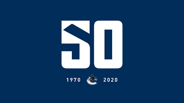
The number fifty in the logo is displayed in the current Canucks font. The logo uses the hockey stick from the team's alternate logo in the negative space to help form the five. Below the number is the team's current orca logo surrounded by 1970 and 2020 (Vancouver's first year playing in the NHL and their 50th).
50th season celebrations will include hosting the 2019 Draft in June...
Bringing back the black "spaghetti skate" jersey...
and revealing a new alternate jersey. To the Canucks from many jersey nerds, we hope that it follows along with their farm club's alternate unis!
The logo is fairly simple and gets the idea across easily, that it's the 50th season. Using the stick in the negative space to try and form the 5 is a bit of a stretch, but it's certainly not an eyesore. The Canucks' website tells us that the stick in this mark is from the original Canucks logo, but any logo and jersey nerds can clearly see that it's the updated stick for the updated alternate logo. In that sense I would liked to have seen more ties to previous eras in the team's history. After all part of the Canucks' history is the many identities that they have gone through.
Logo Rating: 7 / 10
We would love to hear what you guys think of this logo in the comments section below. Some of your opinions will be read on the Tuesday, February 26th edition of the Jersey Nerds Podcast!
The number fifty in the logo is displayed in the current Canucks font. The logo uses the hockey stick from the team's alternate logo in the negative space to help form the five. Below the number is the team's current orca logo surrounded by 1970 and 2020 (Vancouver's first year playing in the NHL and their 50th).
50th season celebrations will include hosting the 2019 Draft in June...
 |
| Sportslogos.net |
Bringing back the black "spaghetti skate" jersey...
and revealing a new alternate jersey. To the Canucks from many jersey nerds, we hope that it follows along with their farm club's alternate unis!
The logo is fairly simple and gets the idea across easily, that it's the 50th season. Using the stick in the negative space to try and form the 5 is a bit of a stretch, but it's certainly not an eyesore. The Canucks' website tells us that the stick in this mark is from the original Canucks logo, but any logo and jersey nerds can clearly see that it's the updated stick for the updated alternate logo. In that sense I would liked to have seen more ties to previous eras in the team's history. After all part of the Canucks' history is the many identities that they have gone through.
Logo Rating: 7 / 10
We would love to hear what you guys think of this logo in the comments section below. Some of your opinions will be read on the Tuesday, February 26th edition of the Jersey Nerds Podcast!
First Look: Vancouver Canucks 50th Anniversary Logo
 Reviewed by Ryan
on
February 24, 2019
Rating:
 Reviewed by Ryan
on
February 24, 2019
Rating:


No comments:
Post a Comment