
Thursday: Valentine's Concepts
Hello fellow HJC'ers, welcome to today's post. Today is Valentine's Day and well, I hope you all have a good day with that special someone. Anyway, the NHL is more then 1/4 through the season and I have loved having hockey back.
Some awesome news you've heard about all week, HJC will now have a Saturday writer! HJC Contributor, Kevin W, will now be posting normally on Saturday's at the normal time of 4:30 EST, so watch for his first post this Saturday! That is 20% (I think) more concepts for the week! So now there will be regular posts Monday through Saturday, followed up by the Weekend Update by Ryan on Sundays. Welcome aboard, Kevin!
-------------------------------------------------------------
Here are today's voting reminders...
-------------------------------------------------------------
Baie-Comeau Drakkar QMJHL concept (By: Scott D.)

Likes: The overall design with the yokes, all the striping looks great, all the logos, no real complaints here
Dislikes: Nothing
Suggestions: I love this, I wish I had some suggestions, I wouldn't really make any changes
8.5/10
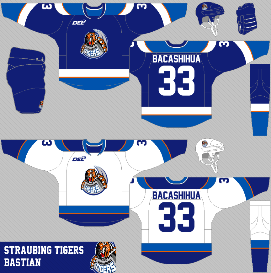
Straubing Tigers DEL concept (By: Bastian)

Likes: All of the striping designs are pretty cool, the number and name font, and the logo isn't that great, but Bastian has made it fit in here
Dislikes: Hmm, not much, I'm not a big fan of that collar
Suggestions: Use a different collar, maybe the default Reebok "V" collar?
7.5/10
Yale NCAA concept (By: Zachary S.)

Likes: The overall design of the sweater, the socks and pants look good as well, the font isn't bad either, the curved name, the logo
Dislikes: The blue piping on the hem under the stripes
Suggestions: Remove the blue piping on the hem under the stripes and this is golden
7/10
Anaheim Ducks concept (By: TJH42)

Likes: The mighty duck logos, the mighty duck striping, and I LOVE that alternate jersey
Dislikes: The emptiness of the home and away jerseys
Suggestions: Maybe add some shoulder patches (on the home and road) to help fill up the jersey, also fix the loose pixels on the tip of the collar
6.5/10
Vancouver Canucks concept (By: Brady S.)

Likes: The arm striping is awesome, the pants, socks all look great, the collar fits very well, and the "V" millionaires logo looks good -- and one thing I like here is what the Canucks DON'T do that well with their current uniforms, is follow ONE striping pattern, and not three (arm striping, sock striping, and pant striping is all different on their home uniform, for example)
Dislikes: No name
Suggestions: Add a name to the back of the jersey
8.5/10
Vancouver Canucks concept (By: CLIB542)

Likes: The Johnny Canuck and Millionaires logos, the simple striping, I also like the maroon being used here, and the default Canucks font looks good
Dislikes: Loose pixels at the tip of collar, and the grey collar insert
Suggestions: Make the collar insert maroon, and fix the loose pixels on the tip of the collar
7.5/10
Oklahoma City Thunder NBA concept (By: Mike S.)

Likes: The sleeve striping looks great, the logos, and font all fit here, I also like the similarity to the actual NBA jerseys -- my favorite of Mike's NBA series so far, as well
Dislikes: How high and thin the stripes are on the hem
Suggestions: Thicken out the hem stripes and lower them a bit
8/10
St. Louis Blues concept (By: Justin C.)

Likes: How the striping matches the logo, the chest stripes, the font, the pants and socks striping are all great as well, a great overall sweater here
Dislikes: I'm not sure if this is just an illusion, or just the template -- but, the hem striping mixed with the stitching almost makes it look a light grey, although I'm sure it was supposed to be white
Suggestions: Nothing
9/10 and a COTW nom from me
Team Canada concept (By: Ted N.)

Likes: The striping is really cool here, that classic logo, the font, and the light blue jersey -- and the maple leaf with the number in it are very cool (you forgot one on the red jersey *wink*)
Dislikes: Hmm, not anything really
Suggestions: Well, just fix the one maple leaf on the back of the Red jersey and these are awesome!
8.5/10
Adler Mannheim DEL concept (By: Bastian)

Likes: The striping on the "wings", and the back of the jersey with the curved name looks awesome, and wow, that's one great alternate!
Dislikes: The name on the alternate jersey
Suggestions: It looks weird without the name on the alternate being all caps, so make it all caps
8.5/10
Thanks for reading, have a happy Valentine's Day and Friday everyone!
Some awesome news you've heard about all week, HJC will now have a Saturday writer! HJC Contributor, Kevin W, will now be posting normally on Saturday's at the normal time of 4:30 EST, so watch for his first post this Saturday! That is 20% (I think) more concepts for the week! So now there will be regular posts Monday through Saturday, followed up by the Weekend Update by Ryan on Sundays. Welcome aboard, Kevin!
-------------------------------------------------------------
Here are today's voting reminders...
COTY-January vote (ends Friday @ 11:59pm EST)
COTW Feb 4-10 vote (ends Friday @ 11:59pm EST)
Untouchables Comp Top 5 vote (ends Friday @ 11:59pm EST)
-------------------------------------------------------------
Baie-Comeau Drakkar QMJHL concept (By: Scott D.)

Likes: The overall design with the yokes, all the striping looks great, all the logos, no real complaints here
Dislikes: Nothing
Suggestions: I love this, I wish I had some suggestions, I wouldn't really make any changes
8.5/10
Straubing Tigers DEL concept (By: Bastian)
Likes: All of the striping designs are pretty cool, the number and name font, and the logo isn't that great, but Bastian has made it fit in here
Dislikes: Hmm, not much, I'm not a big fan of that collar
Suggestions: Use a different collar, maybe the default Reebok "V" collar?
7.5/10
Yale NCAA concept (By: Zachary S.)

Likes: The overall design of the sweater, the socks and pants look good as well, the font isn't bad either, the curved name, the logo
Dislikes: The blue piping on the hem under the stripes
Suggestions: Remove the blue piping on the hem under the stripes and this is golden
7/10
Anaheim Ducks concept (By: TJH42)

Likes: The mighty duck logos, the mighty duck striping, and I LOVE that alternate jersey
Dislikes: The emptiness of the home and away jerseys
Suggestions: Maybe add some shoulder patches (on the home and road) to help fill up the jersey, also fix the loose pixels on the tip of the collar
6.5/10
Vancouver Canucks concept (By: Brady S.)

Likes: The arm striping is awesome, the pants, socks all look great, the collar fits very well, and the "V" millionaires logo looks good -- and one thing I like here is what the Canucks DON'T do that well with their current uniforms, is follow ONE striping pattern, and not three (arm striping, sock striping, and pant striping is all different on their home uniform, for example)
Dislikes: No name
Suggestions: Add a name to the back of the jersey
8.5/10
Vancouver Canucks concept (By: CLIB542)

Likes: The Johnny Canuck and Millionaires logos, the simple striping, I also like the maroon being used here, and the default Canucks font looks good
Dislikes: Loose pixels at the tip of collar, and the grey collar insert
Suggestions: Make the collar insert maroon, and fix the loose pixels on the tip of the collar
7.5/10
Oklahoma City Thunder NBA concept (By: Mike S.)

Likes: The sleeve striping looks great, the logos, and font all fit here, I also like the similarity to the actual NBA jerseys -- my favorite of Mike's NBA series so far, as well
Dislikes: How high and thin the stripes are on the hem
Suggestions: Thicken out the hem stripes and lower them a bit
8/10
St. Louis Blues concept (By: Justin C.)

Likes: How the striping matches the logo, the chest stripes, the font, the pants and socks striping are all great as well, a great overall sweater here
Dislikes: I'm not sure if this is just an illusion, or just the template -- but, the hem striping mixed with the stitching almost makes it look a light grey, although I'm sure it was supposed to be white
Suggestions: Nothing
9/10 and a COTW nom from me
Team Canada concept (By: Ted N.)

Likes: The striping is really cool here, that classic logo, the font, and the light blue jersey -- and the maple leaf with the number in it are very cool (you forgot one on the red jersey *wink*)
Dislikes: Hmm, not anything really
Suggestions: Well, just fix the one maple leaf on the back of the Red jersey and these are awesome!
8.5/10
Adler Mannheim DEL concept (By: Bastian)

Likes: The striping on the "wings", and the back of the jersey with the curved name looks awesome, and wow, that's one great alternate!
Dislikes: The name on the alternate jersey
Suggestions: It looks weird without the name on the alternate being all caps, so make it all caps
8.5/10
Thanks for reading, have a happy Valentine's Day and Friday everyone!
Thursday: Valentine's Concepts
 Reviewed by Tyler Gross
on
February 14, 2013
Rating:
Reviewed by Tyler Gross
on
February 14, 2013
Rating:
Reviewed by Tyler Gross
on
February 14, 2013
Rating:


8 comments:
Bastian's Adler Mannheim DEL concept for COTW
Die Adler Mannheim for COTW!!! Brilliant work.
Jutin C. for COTW, I noticed the gray thing too...
@ Scott D: altough I don't like the team, this is a really great kit for the Drakkar! Only one suggestion: since the primary color on the home jersey is yellow, then the road jersey should show more yellow I think. COTW in my opinion.
seconding justin c for cotw real sharp look!
Bastians Tigers for COTW, favorite part has got to be those yokes.
Justin, what program do you use to make your images?
@Kevin W. I use adobe illustrator.
Thanks for the noms. I understand what you're all day about the hem. I should have made it so the stitching doesn't turn the hem grey. But yes, it's supposed to be white.
Post a Comment