
Tuesday: Green, Red, Black, and Purple
Hello everyone. My comments today are a bit shorter than normal. Something unexpected came up, so I had less time to write. Sorry.
The COTW vote is currently happening right now. It is very important this week that we have a lot of votes, because with nine concepts in the running a tie is more likely.
.png)


--------------------------------------------------
The COTW vote is currently happening right now. It is very important this week that we have a lot of votes, because with nine concepts in the running a tie is more likely.
There is also the live chat this upcoming Sunday. Come here at 9pm for all the fun.
COTW Feb 11-17 vote (ends Friday @ 11:59pm EST)
Sunday, Feb 17 HJC Live Chat @ 9pm Eastern
--------------------------------------------------
Here are some of the contest entries that have come in since yesterday's post...
(by Brian B.)

(by Kyle C.)

(by Stephen T.)

(by Brian B.)


(by Stephen T.)

--------------------------------------------------
Texas Tornados (by Bailey S.)
.png)
Like: The striping on both jerseys. I'm kind of becoming a fan of mismatching striping patterns for minor league teams.
Dislike: The home's chest stripe seams a bit low. I also think the logo on each jersey needs a white outline. The inside of the black jersey should be black (bottom of the front).
Suggestions: Fix the above issues. I'd also suggest using front numbers and the same shoulder patch on both jerseys for a bit more consistency. 7/10
Montreal Canadiens (by Andrew G.)

Like: The design on the arms. The cut-off arm stripes look really good here. I also like the shoulder patch used.
Dislike: The design on the hem. I've never been a fan off cut off hem stripes, it just looks awkward to me.
Suggestions: Remove the piping that goes down to the hem, and then continue the hem stripes all the way around. 7/10
Boston Bruins (by Jack H.)

Like: The third jersey is really good, and I think it could be one of the best jerseys in the league with a few minor adjustments (see suggestions). The primary jerseys aren't bad either, a good update to the Bruins 1974-95 set.
Dislike: The black in the logo doesn't match the black of the jersey. Also those logos look a bit low and off-center.
Suggestions: Fix the issues with the logos. For the alternate, I think it would be great if yellow was used for the shoulder yoke and numbers, since the Bruins have historically emphasized yellow. I also think true white wouldn't bleed into the yellow as much. 8/10
Dallas Stars (by Caleb F.)
 Like: The colours look great. I also like how the hem and arm stripes are inspired by the North Stars 1975-78 jerseys.
Dislike: How the top of the star is a different colour than the rest.
Suggestion: Make the "Stars" in the logo yellow, and then make the "Dallas" white. 8/10
Los Angeles Kings (by Jordan R.)
 Like: Adding hem stripes to the home jersey. The grey jersey is great, the retro crown looks great in those colours. I'd love to see a grey jersey in the NHL.
Dislike: I think black numbers would be better on white backgrounds. I know the Kings experimented with both colourings, and I just think black stands out better. In real life the road jersey helmet would have to be white, but it doesn't look bad the way it is.
Suggestions: Change to black numbers on white backgrounds. 8/10
Toronto Maple Leafs/St. Pats (by Brady S.)
.png) Like: It's cool to see a concept for such an old team. The striping pattern looks to be inspired by the hem stripes of the St. Pats 1925-27 jerseys. I like the idea of the logo under the arched wordmark, and the leaf inside of the clover is a nice touch.
Like: It's cool to see a concept for such an old team. The striping pattern looks to be inspired by the hem stripes of the St. Pats 1925-27 jerseys. I like the idea of the logo under the arched wordmark, and the leaf inside of the clover is a nice touch.
Dislike: The St. Pats were never called the St. Patricks, so I'd shorten the wordmark to just "St. Pats".
Suggestions: I don't know if this is supposed to be faux-back concept, or a modernization of the St. Pats. If it's a faux-back I'd suggest solid numbers and blank pants (or pants with a solid green stripe) to fit with the St. Pats era. If it's a modernization I'd suggest green pants. 8/10
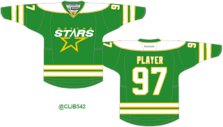
Dallas Stars (by Brian B.)
.png) Like: The whole design of the jersey looks great. The striping is a great match for these logos. I'm also glad to see "Dallas" return on the pants.
Like: The whole design of the jersey looks great. The striping is a great match for these logos. I'm also glad to see "Dallas" return on the pants.
Dislike: The black on the back hem is a different shade than the rest of the jersey (EDIT - fixed).
Suggestions: Fix the black on the back hem. Also I'd love to see a white version of this jersey. 9/10
Cleveland Barons (by Scott M.)
MadeFromScratch.png) Like: I love the fact that Scott made all the logos himself (which is a first for him). I never make logos, because I just don't have the talent, so I appreciate someone putting in this kind of effort. The colour scheme, which appears to be a subtle nod to the WHA's Cleveland Crusaders, also looks great. I also like how the third jersey is based on a jersey worn by the AHL's old Cleveland Barons.
Like: I love the fact that Scott made all the logos himself (which is a first for him). I never make logos, because I just don't have the talent, so I appreciate someone putting in this kind of effort. The colour scheme, which appears to be a subtle nod to the WHA's Cleveland Crusaders, also looks great. I also like how the third jersey is based on a jersey worn by the AHL's old Cleveland Barons.
Dislike: The shoulder yokes on the home and road don`t seem to match the rest of the striping.
Suggestions: I'd like to see the striping and shoulder yokes match better. I'd also suggest adding black to the home and road socks. Still though, this deserves a COTW Nomination!!! 9/10
Detroit Red Wings (by Jordan R.)
 Like: Raising up the home jerseys' hem stripe. The third jersey based on the Detroit Falcons jersey is also pretty cool.
Dislike: I know the yellow makes sense historically, but it doesn't feel like a Red Wings jersey.
Suggestions: Make everything with yellow just solid red. 8/10
Euro Leagues Style Detroit Red Wings (by Jordan R.)
.png) Like: This is what Jordan thinks the Red Wings would look like if they played in Europe. I think it is really cool and kind of scary.
Like: This is what Jordan thinks the Red Wings would look like if they played in Europe. I think it is really cool and kind of scary.
Dislike: If this was meant as a serious idea I wouldn't like much, but it's meant as a cool what if, so I have no complaints.
Suggestions: I'd love to see this for more teams, possibly the rest of the original six. 9/10
Dallas Stars (by Caleb F.)

Dislike: How the top of the star is a different colour than the rest.
Suggestion: Make the "Stars" in the logo yellow, and then make the "Dallas" white. 8/10
Los Angeles Kings (by Jordan R.)

Dislike: I think black numbers would be better on white backgrounds. I know the Kings experimented with both colourings, and I just think black stands out better. In real life the road jersey helmet would have to be white, but it doesn't look bad the way it is.
Suggestions: Change to black numbers on white backgrounds. 8/10
Toronto Maple Leafs/St. Pats (by Brady S.)
.png)
Dislike: The St. Pats were never called the St. Patricks, so I'd shorten the wordmark to just "St. Pats".
Suggestions: I don't know if this is supposed to be faux-back concept, or a modernization of the St. Pats. If it's a faux-back I'd suggest solid numbers and blank pants (or pants with a solid green stripe) to fit with the St. Pats era. If it's a modernization I'd suggest green pants. 8/10
Dallas Stars (by Brian B.)
.png)
Dislike: The black on the back hem is a different shade than the rest of the jersey (EDIT - fixed).
Suggestions: Fix the black on the back hem. Also I'd love to see a white version of this jersey. 9/10
Cleveland Barons (by Scott M.)
MadeFromScratch.png)
Dislike: The shoulder yokes on the home and road don`t seem to match the rest of the striping.
Suggestions: I'd like to see the striping and shoulder yokes match better. I'd also suggest adding black to the home and road socks. Still though, this deserves a COTW Nomination!!! 9/10
Detroit Red Wings (by Jordan R.)

Dislike: I know the yellow makes sense historically, but it doesn't feel like a Red Wings jersey.
Suggestions: Make everything with yellow just solid red. 8/10
Euro Leagues Style Detroit Red Wings (by Jordan R.)
.png)
Dislike: If this was meant as a serious idea I wouldn't like much, but it's meant as a cool what if, so I have no complaints.
Suggestions: I'd love to see this for more teams, possibly the rest of the original six. 9/10
Tuesday: Green, Red, Black, and Purple
 Reviewed by Steven Grant
on
February 19, 2013
Rating:
Reviewed by Steven Grant
on
February 19, 2013
Rating:
Reviewed by Steven Grant
on
February 19, 2013
Rating:


10 comments:
Brian's Stars for COTW!
I second Scott M for COTW!
I second Brian's Dallas Stars for COTW.
Wow, good eye Steven! Thanks for pointing that out.
I'll 3rd Scott for COTW, purple needs to be used more in hockey!
Haha, speaking of the different shade of black on Brian's concept... look at the back of the collar! Anyway, I'll third Brian's Stars.
Non-related question. If I'm designing a jersey series. How do you recommend sending it in. Individually, or all at once?
Thanks
@Keens, In my experience, it all depends on what you are doing, if it's a long series, and you don't have an idea on every concept, I'd do it in segements, get the concepts you have idea for done, and then search for ideas for the others.
In small groups sent over several days. Label each concept with same markings so we can all tell that they are in a series.
how good would that red wings third jersey look if it was all red? great stuff
Post a Comment