
Tuesday: A Normal Post
First of all I would like to congratulate Justin for his 2012 COTY win. It was well deserved, as his concepts are always very good, with great execution.
Also the C on my key-board isn't working very well, so if I happen to miss it in some words you know why.
Finally, I'm trying out the like/dislike/suggestions system again.

.png)


.png)


Also the C on my key-board isn't working very well, so if I happen to miss it in some words you know why.
Finally, I'm trying out the like/dislike/suggestions system again.
--------------------------------------------------------------------------------
Don't forget to vote in this week's COTW vote. Anyone an vote, you can even vote for yourself.
COTW Jan 28-Feb 3 vote (ends Friday @ 11:59pm EST)
--------------------------------------------------------------------------------
Here are the contest entries that have come in since yesterday's post...
(by Brady S.)

(by Derek H.)

(by Mike S.)

(by Shawn R.)

(by Tyler G.)

(by Zachary S.)

(by Brady S.)

(by Derek H.)

(by Mike S.)

(by Shawn R.)

(by Tyler G.)

(by Zachary S.)

--------------------------------------------------------------------------------
New Jersey Devils (by Adam H.)

Like: I appreciate the attempt to do something different and unique. TV numbers in the shoulder yoke are pretty cool, I wish at least one NHL team would try them.
Dislike: I think the home and third need white, there currently isn't enough contrast. Also the road jersey needs neon green if it is going to be used so much on the home jersey. I also don't think each jersey needs it's own set of pants and gloves.
Suggestions: Add white to the dark jerseys and use it for the names and numbers. Use black pants and gloves for all the jerseys, and black helmets for the home jersey. 6/10
Dallas Stars (by Chris G.)
.png)
Like: I like the idea behind the alternate skyline crest. It's lacking the professional touch, but I think it's a good idea and would like to see it used more here. The addition of hem stripes make the primary jerseys better.
Dislike: The front and shoulder area of the jerseys are too busy. Also the camouflage jersey isn't working, maybe a very subtle pattern could work, but I don't get what camouflage has to do with the Stars. The socks also need real stripes, instead of just being filled in. The front logos on all three jerseys are also too big.
Suggestions: Remove the front numbers, and move the TV numbers down from the shoulder yokes or remove the shoulder logos. Try using the skyline logo more, and make the primary logos about 30-40% smaller. Take a look at these helpful tutorials to improve your execution. 4/10
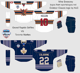
AHL Outdoor Classic (by Andrew G.)

Like: The striping pattern looks good for both jerseys, especially how the Marlies are inspired by their 1970's look. I also really like the retro logo used for the Marlies.
Dislike: I don't get why green is used on the Griffins jersey, but maybe I'm just missing something. I also don't think vintage white helps either jersey.
Suggestions: Ditch green for the Griffins unless it has some significance, use regular white. 7/10
Dislike: I don't get why green is used on the Griffins jersey, but maybe I'm just missing something. I also don't think vintage white helps either jersey.
Suggestions: Ditch green for the Griffins unless it has some significance, use regular white. 7/10
AHL Outdoor Classic (by Mike S.)

Like: The Griffins jersey is amazing, I love the striping pattern, everything else is good too. The Marlies jersey is okay, and once again the retro logo is cool.
Dislike: Normally I like lots of stripes for retro jerseys, but not so much on the Toronto jersey. I think the light blue bleeds into the vintage white too much. The logo and numbers are also a bit low on that jersey.
Suggestions: Raise up the Marlies' logo and numbers. Try re-working the striping pattern, and see how true white looks. 8/10
Team USA (by Chris Z.)

Like: The home and road are perfect. The striping has nice retro feel, and the stars on the shoulder yoke look great. I'm also a big fan of how the flag is used on the third jerseys' hem, it's really unique.
Dislike: The third jerseys' logo doesn't really work as a sports logo in my opinion. It needs to fit in with the colour scheme better to work as a full-time logo.
Suggestions: Find a better logo for the third jersey. 8/10
Dislike: The third jerseys' logo doesn't really work as a sports logo in my opinion. It needs to fit in with the colour scheme better to work as a full-time logo.
Suggestions: Find a better logo for the third jersey. 8/10
NHL All Star Game (by Bastian S.)

Like: I like basically everything. I honestly don't see anything "wrong" here.
Dislike: This isn't something bad about the concept, but I'd rather see something less traditional for an all star game. I really like how recent all star game jerseys have pushed the boundaries.
Suggestions: Try to push the envelope more. Think outside the box. 8/10
Dislike: This isn't something bad about the concept, but I'd rather see something less traditional for an all star game. I really like how recent all star game jerseys have pushed the boundaries.
Suggestions: Try to push the envelope more. Think outside the box. 8/10
Anaheim Ducks (by Daniel J.)
.png)
Like: The logo used is much better than their current script. While I'm personally a big fan of their current striping pattern, I could see a lot of people liking this striping pattern better.
Dislike: The logo is a bit too big. I also don't like the coloured mesh on the road jersey.
Suggestions: Make the logo about 20% smaller, and get rid of the coloured mesh. Also maybe use the oval-logo as a shoulder logo. 8/10
Dislike: The logo is a bit too big. I also don't like the coloured mesh on the road jersey.
Suggestions: Make the logo about 20% smaller, and get rid of the coloured mesh. Also maybe use the oval-logo as a shoulder logo. 8/10
Barrie Colts (by Alan H.)

Like: The logo used seems so much more professional than their current cartoony primary logo. The shoulder logo is very clever. I also like the idea behind the striping pattern, but I think it could be improved by fixing the following.
Dislike: The arm, sock, and pant stripes all use three colours, but the shoulder yokes, hem stripes, and name/numbers use only two colours. It looks mismatching in my opinion.
Suggestions: Utilise three colours in the shoulder yokes, hem stripes, and name/numbers. 8/10
Dislike: The arm, sock, and pant stripes all use three colours, but the shoulder yokes, hem stripes, and name/numbers use only two colours. It looks mismatching in my opinion.
Suggestions: Utilise three colours in the shoulder yokes, hem stripes, and name/numbers. 8/10
Nashville Predators (by Bastian S.)

Like: Bringing back the checker-board pattern is a great idea, having it sublimated makes it even better. The striping pattern is also good, same with the name and numbers.
Dislike: I'd rather the shoulder logo wasn't recoloured, it would fit better with their primary jerseys that way.
Suggestions: Use their current version of the shoulder logo, just make sure it has a white outline. 8/10
Dislike: I'd rather the shoulder logo wasn't recoloured, it would fit better with their primary jerseys that way.
Suggestions: Use their current version of the shoulder logo, just make sure it has a white outline. 8/10
Tuesday: A Normal Post
 Reviewed by Steven Grant
on
February 05, 2013
Rating:
Reviewed by Steven Grant
on
February 05, 2013
Rating:
Reviewed by Steven Grant
on
February 05, 2013
Rating:


16 comments:
On my concept, I used the green because the Grffins' old jerseys (approx. 1999) had the striping of green, red, and navy, just to clarify.
The Griffins used green in their original IHL jerseys http://gameworns.com/gallery/_team.php?g_city=GrandRapids&g_team=Griffins
I don't mean to lash out at you again this time Steve, but I'm sorry, how else are you supposed to work a bald eagle into a red white and blue color scheme??? It's the national symbol of our country and I think very patriotic looking the way it soars over the flag! You don't have black in the Canadian flag, yet why is there black on the team Canada jerseys? It'd look ridiculous if the eagle was colored red white and blue. If you really don't like it, I'm open to suggestions as far as what you think would make a better alternate logo!
Chris, it's just Steven's opinion. You're more than welcome to disagree and explain your ideas, but there is no need to get defensive. Please keep this in mind with your comments in the future or else I will not publish them.
Well I'm sorry Ryan, but like I said last time, I just think he's being a little too overcritical. Totally discarding someone's idea for a logo doesn't seem to me like the right way to judge them. (Especially when it's representing a whole country.) Everything doesn't always have to match. I've tried to take the criticism, but I still think it's just gotten to be a little too much lately, especially when Steve said so himself.
It's his job to be critical. If he said every concept was awesome his posts would be boring. It is his OPINION that the eagle doesn't work on your concept. You disagree, which you've stated. However there is no need to get defensive. That's where the conversation stops being constructive, on your end.
I'll admit I took a little too overzealous offense to it again, I'm sorry, but I thogut that I was being just as fair in my response to his critique and I was serious when I said I was open to suggestions from him as far as a better logo. If he's going to leave us certain comments in his critiquing, then he should follow them up with what he thinks would work better than just "get a different logo." That's just MY opinon and I think we're fully entitled to defending the hard work and time that goes into our concepts if we think the critiquing is too harsh.
@stlsnake1985: I actually was being the least harsh I could possibly be, but I had to point out the logo because it looks terrible. It just not a sports logo, it's an illustration (there's a big difference). Also it's in a completely different color scheme than the jersey. Bald eagle logos can work in blue and red, just look at the Capitals alternate logo.
Not everyone is going to love everything you do on each concept you make. You should be able to take a little critism.
@stlsnake1985 Try maybe using an eagle head instead of the whole bird. Like what the Philadelphia Eagles of the NFL use, but add in a little bit of red and blue into it.
You need to relax though when it comes to the critiquing of your concepts though. All of us have sent in concepts that were not well received, but it's nothing to get upset about. The logo was the only thing Steven didn't like by the look of it, everything else looks good.
Steve, I know your intentions were not meant to be offensive and I CAN take criticism (despite appearacnes), but it just came off the wrong way to me. BTW, the Capitals eagle is a cross symbol of an eagle that also forms the capital dome and a "W", so it's not really meant to be anatomycally correct. And like I said, all colors don't always have to match. The Blackhawks have green and yellow in their logos, yet it doesn't appear anywhere else on the jersey. I'll admit I didn't think the drawing was perfect and I wasn't hoping for a COTY nominee or anything, but I at least thought I'd get a little credit for creativity and symbolisim.
@stlsnake1985
They Hockey USA has a vintage logo of an eagle holding a shield. I don't know off hand where I can find a picture of it (maybe someone else can help with that) but I think it would look good on the patriotic flag stripe jersey.
Great work on the set. It looks good.
@stlsnake1985: I did give you credit for creativity, for the awesome flag striping in the third jerseys hem. And I agree that all colors don't need to match, but at least some do. Just look at the Blackhawks logo, it still has the red, black, and white that's used on the jersey. And I know what the Capital's eagle is, I was just replying to your question, "how else are you supposed to work a bald eagle into a red white and blue color scheme?".
We've all had negative comments about our concepts, myself included. If you don't agree with the comments that's fine, it's just a different of opinions. You don't need to "lash out" each time.
Well you don't have to worry about it anymore cause I won't be sending anymore concepts in for a while cause I'm just tired of it and I still don't like the feel of things on the site right now. Not only that but I really don't want to get into it with anybody else again if I overreact to someone's comments, and I don't want people to feel that they have to be careful when critiquing me cause I appear too sensitive. For now I'll just save everybody the time and trouble by just taking a break from it all.
Haha, the title of this post is kind of funny now.
@Ryan Hahahaha I just got a good laugh from that.
Irony, oh the Irony
Post a Comment