
Wednesday: "The JCR Graphics Show"
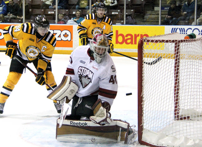 |
| Alex Galchenyuk (left) Charlie Sarault (right) Photo - theobserver.ca |
Also, I don't know how many of you readers saw the Blackhawks Canucks game last night, but I sure hope Colin, our Friday writer, never overhears me talking during a Hawks-Nucks or this blog would be down at least one writer. ;^)
Untouchables Entries
Kevin P.


John T.

Casey R.

Stephane S.


And the regular concepts for the day!
NBA Series: San Antonio Spurs - (Mike S.)

- With the revealing of the Golden State Warriors new sleeved alternate jersey, I've taken an interest in basketball uniform aesthetics, despite thinking the sport is a snooze-fest. Mike's NBA series continues with the Spurs.
- I like how the arm striping is consistent with the team's actual jerseys.
- The spurs on both sides of the number on the back are unnecessary and clutter the back of the jersey. I feel like the logos used are good but are in the wrong locations, at least for my taste. And I understand you might be going for a close representation of what the basketball jersey might look like on a hockey jersey, you are given a sort of artistic freedom, and duty in my eyes, to make it look better so the front number should go. In my eyes front numbers have no place in hockey, plus yours is very small.
- Here's what you should do with the logos in my opinion to make this a great looking N-BA-HL jersey... Take this current script and replace it with the shoulder patch you used. That way there's a logo on the front of the jersey and not the wordmark, erasing the need for the front number. Replace the shoulder patches with the Spurs on the back since the team uses it on their shorts which I guess is sort of basketballs "shoulder patches".
Rating: 6.5/10
Dallas Stars Concept - (Kyle C.)

- Kyle decides to rebrand the Stars to prepare for the eventual rebranding of the team. Kyle swaps out gold for silver and black takes a back seat to green who takes its rightful place as the primary color
- I like the use of silver, it's unique as most people keep the gold. The striping is new for the Stars and I like it. It's its own thing while still resembles the old North Stars simple striping.
- I don't know if I like the color scheme for "Dallas", now, if for whatever reason the Stars were to move to say, Seattle, this would be a great scheme for the "Seattle Stars". The gold just seems very "Texas" and makes me think of sheriff badges, which is a direction I think the Stars should explore for their rebranding. Also, the log is very difficult to see, especially on the home.
- This is your concept and the gold was just my opinion so you don't need to change that. Swap the green and silver on the logos. Maybe on the home jersey explore using just the star and not the letters. and maybe this is just my personal preference, but the green jersey would look fantastic if the silver on the hem continued to the bottom of the jersey. I don't know, that's just me/
Rating: 7/10
2015 All Star Game Concepts - (Stephen T.)

- Stephen reuses the very pinstripe heavy All-Star templates, BUT gives them a old school makeover with the NHL's former league colors. It's this weird mix of old school and new school and I kind of like it.
- Normally this is something I don't think I'd like but for some reason I do. Definitely only as a one time, all star weekend type of deal but still.
- I don't know how I feel about the orange stripes on Team Crosby's jersey, and please...Crosby? we all know that a Blackhawk will be the non-host player captain. Also the sock stripe and hem stripes on the black jersey don't match like they do on the white.
- Fix the sock/hem thing on the black jersey, and maybe try white pinstripes on the black jersey and give the jersey the orange pit stain.
Rating: 7.5/10

- Jack simplifies the Sabres current look by ditching the use of silver and piping and bringing back the brighter shade of blue, but keeps the dark blue around for the alt.
- I'm a fan of the look on the home and away. Very Sabres. I like how Jack pulls of using the same striping pattern on the alt by using a different color than the other two jerseys. Also, I love that script.
- While I like the look of the white yoke on the home jersey, it doesn't look right to me with the main stipe color being yellow. And even though I like the third, it does bother me that the jersey is dark blue and that color doesn't appear in the other jerseys, but since it seems to be a faux-back I can look past that. Also, I don't see why the stripe on the alt's pants has a white outline and not yellow
- Make the yoke on the home yellow. And fix the striping issue on the alt. pants I mentioned.
Rating: 8/10
Colorado Avalanche Concept - (Tyler G.)

- Tyler rebrands the Avs and gives them a very classic hockey look as opposed to trying to return them to their old mountain jerseys.
- I like this set. I don't think what they wear now looks that bad, but this is definitely better.
- I have the same gripe with their current set, but I always felt the home could use some white and the away could use some blue. I feel like a team named the "Avalanche" should have more blue and white in their identity.
- I don't know how you would want to do it with this striping pattern, I have my own ideas, but I would want to see more white in the home and blue in the away.
Rating: 8/10

- Jordan makes a set based off of Minnesota's current home jersey (which a slight variation of is the alt in this concept) Jordan's concepts have been some of my favorite on the site lately. I love his presentation and the player models he uses are fantastic and really give us a chance to see what these jerseys would look like when being worn instead of just being laid out on a table or something.
- I like the red jersey as an alt.
- I'm not a fan of the overall look here. I think the home and away should use a different template. I applaud Jordan for not trying to make a set based on the team's current alternate, which seems to be everyone's go to move right now. The home and away just look VERY Christmas-y to me.
- Keep the alt... change things up on the home and away though. The more I look at it though, if you take the red and green in the road jersey and switch them, It might look a lot more "Minnesota Wild" and less "Christmas-y". Again, fantastic execution though
Rating: 8/10
Philadelphia Flyers Concept- (Jordan R.)

- Jordan takes the Flyers 80's-90's jerseys and slightly alters them (thin stripe above cuff is different color on home, colored namebars) As well as adds a Quakers inspired alt.
- The Flyers are the one team in the NHL who can pull off the colored namebar, and that's solely because it's their thing. So I'm glad to see it used on this team. I've never cared for the Flyers one bit, but there's something about orange man... I just love it on a hockey jersey. That alt looks great, I love the socks.
- I feel like the logos on the home/road could be moved up a little bit. As well as the Flyers script on the alt could be shrunk down so it doesn't fill the width of the torso.
- Move the logos up and make the alt. script smaller so it fits on chest and not the entire midsection.
Rating: 8/10
Nashville Predators Concept - (Jordan R.)

- Jordan tries his hand at the Nashville Predators and draws inspiration from arguably the best looking team from the old EHL, The Nashville Dixie Flyers, especially with the script bearing alt.
- Nashville has looked fantastic since their rebrand in my eyes after looking very average and very shiny for years. I love the chest stripe in these colors, some might argue that the very modern logo doesn't exactly go with the classic chest stripe look and I'd agree, but since the team simplified the crap out of this logo a few years ago I think it squeaks by as being ok.
- I'm somewhat ok with the vintage white alt. But the script is white, while the number on the back is vintage white. Nashville might have hockey history but this franchise doesn't, so it's kind of up for debate on whether or not the Preds can justify wearing a vintage white jersey.
- Move the chest stripes on all the jerseys up a little bit, they seem low, and maybe try shrinking them so the Predator logo is slightly larger and bleeds off the top and bottom of the stripe similar to Ottawa's heritage jerseys how the O is bigger than the stripes. And if you did want to replace the vintage white as a nod to the Dixie Flyers, which wouldn't hurt because all the jerseys act as a nod to that team, do it with a blue jersey. I also feel that the away jersey could have white numbers on the back, the yellow looks odd to me.
Rating: 8.5/10
Calgary Flames Concept - (Jack H.)

- Jack also thinks the Flames should bring back the throwback look as the full time home and he also made a white version (which I love). The alt. jersey seems to be a mix of the 2000-07 jerseys with the 80's style. Which results in a fantastic looking jersey.
- I like a lot about this set. The away jersey looks fantastic. But I like that alt. jersey so much. I'm curious to see that as the home and a white version of that. With this home or away as the new alt.
- The only thing I don't like about this concept is the socks on the home. Very, very odd looking and just doesn't fit in. Also I don't care for the shoulder patch on the alt only being on one side.
- Fix that home sock and put the alt. shoulder patch on both shoulders.
Rating: 8.5/10

- Jets takes his shot at rebranding the Allen Americans, which is a good thing. They don't look awful per se, but they could definitely use some work. You would think a team named the "Americans" would use red, white, AND blue but from what I've gathered, they've only had two jerseys that featured blue anywhere but the logo.
- This is a very fitting set of jerseys for a team named the Americans. The striping is reminiscent of the American Flag which, just, I mean, that's the obvious way to go, right?
- The only gripe I have with this set isn't anything with the set itself, but again with the team's branding. I feel the team could come up with a better alternate logo than the Texas flag. I feel that if this logo is used, minus the gray "swoosh" marks, it makes a passable shoulder patch which would look great on these jerseys.
Rating: 9/10 and a COTW Nom from me!
Wednesday: "The JCR Graphics Show"
 Reviewed by DBro Alexander
on
February 20, 2013
Rating:
Reviewed by DBro Alexander
on
February 20, 2013
Rating:
Reviewed by DBro Alexander
on
February 20, 2013
Rating:


7 comments:
THAT was a great game last night wasn't it Dyaln? shame it had to end in a shootout, I would love to see the NHL work something out to eliminate the shootout. Yes they can be dramatic, but especially in an emotional game like VAN vs CHI last night they really bother me. An emotional team game should not be decided on an individual play.
also thanks for covering for me last friday :)
and COTW nom for Stephen T's all star unis... they look really sharp in the classic NHL orange and black
Ha! I almost couldn't handle it. I normally don't let my emotions get the most of me while watching a game in my living room but i was jumping and yelling with my roomies.
I wish maybe the OT's were a little longer but I like the shootout. But Andrew Shaw is my favorite player and seeing him pull that move off was a pleasant surprise.
And yeah no problem, I'll cover most anytime.
I'll 2nd Stephen, I think Team Ladd sounds good...hey...he was a blackhawk
that was a slick move by shaw. great pace, great hands. really impressive at top speed.
Jets96's Allen Americans Concept get a COTW nom from me.
I maybe from Chatham (far South from Sarina) but I've been in Sarina before, drive along outside of Sarina near the bay area you'll enjoy the view, but go downtown you better hope your GPS is on your side because the traffic is crazy beyond believe, as long you know where you're going you'll do fine. If you like going to casinos for fun go to Point Edward Casino that place is awesome.
I'd be all for team Ladd lol. I miss him.....and Big Buff
I myself have been playing Chelsea Dagger all day long. It's the sound of victory, after all.
Post a Comment