Wednesday: Sticks out for Harambe
One week into the season and I already have to deal with Islander fans wanting Snow and Capuano out. Ugh. We are 4 games into the season out of 82. Can we relax?
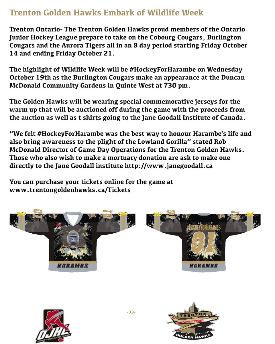
I KNOW! Let's relax with something a little light-hearted, yet charitable. Take a look at this press release below, courtesy of the Trenton Golden Hawks of the Ontario Junior Hockey League:
#SticksOutForHarambe
That game is tonight, and if anyone of our readers north of the border, specifically in Southern Ontario, want to check this out, I want to see pictures! Just keep your pants on, its what Harambe would've wanted. Also they are auctioning the jerseys during the game so I know you'd want one. Maybe Matthew Tkachuk will show up.
And for a bit more in the category of funny and stupid, I present the HJC Podcast! Probably our longest podcast yet. Also probably our worst podcast yet so therefore I'm proud. Listen to Steven M, Jets96, BPoe and yours truly as we take on a massive offseason of change and all of your ridiculous and non-ridiculous questions. It's actually on the side of the page for your convenience, but I'll provide a link anyway.
We have votes this week: COTW, COTY 3rd Quarter and Carolina. DO IT!
Wait, I didn't vote yet. Hang on a sec.... done!
Reminders, since I needed them today:
3rd Quarter Vote (ends Friday @ noon Eastern)
COTW Oct 7-13 vote (ends Friday @ noon Eastern)
Hurricanes Top 5 vote (ends Friday @ noon Eastern)
ON TO THE CONCEPTS!
Cole W: Saskatoon Blues Concept
Cole continues his story of the Blues actually having moved to Saskatoon, which we found the original true story for. Now I am interested with what this story has presented to us so far and of course I fall victim to reviewing the awful idea of the Edge re-brand. This is probably a reasonable concept for the Edge system, but again execution drags this down. First things first, I like the logo but the yellow stripes to create the wing could be better. Change the ends of those lines so that they are parallel to the rest of the S, and push the lines down a bit so that the space between the yellow is consistent. Make those numbers a bit bigger too, plus if you notice on that template, the nameplate always overlaps the template lines that curve up around the Reebok logo. The previous Florida set and the current Colorado set are good examples of this. But otherwise a decent next chapter in this story.
Rating: 68%
Glen W: Chicago Blackhawks Concept
One interesting idea I see time to time is to give the Blackhawks a Chicago city flag theme, one theme that has worked well for the local MLS (Fire) and NWSL (Red Stars) sides. I just wish that the blue you used was a tad darker so you have an excuse to keep those different colored stripes separate with that blue in between. The stars are a nice touch, as expected with a concept like this, but the logo and numbers could be bigger, and said numbers need to be angled slightly to parallel the template line. The recolored alternate logo looks good. I want to see the back of the jersey though, because a font can make or break a jersey, so I want to see all of it.
Rating: 73%
Lucas D: Team Canada (WCH) Concept
I never understood why Canada Hockey is obsessed with using black as a major color in their uniforms. Regardless, these are stunning. Moving the leaf up the arm is a big plus, because the leaf looks bigger and on top of that, the black jersey color and leaf outline actually make the leaf more prominent. Otherwise this is only slightly better what we had at the World Cup this year. Adidas stripes are disgusting, but that's standard for all World Cup jerseys so no penalty. Just wish there was a way to include some more red with the numbers and nameplate.
Rating: 84%
Taylor R: Red Deer Rebels (WHL) Concept
The Rebels have always had a nice color scheme and an interesting logo to go along with it. How do we make their nice jerseys even nicer? CHEST STRIPES! And good looking ones at that. The way the stripes compliment each other on the two jerseys, despite being somewhat different, is glorious. Yokes work well without an outline here. But there's one thing that kills me here: VINTAGE WHITE. I mentioned in the podcast that it doesn't work as a full time jersey color. I don't like it in Rockford for their alternate, I don't like it in Peterborough. The black helmet for that one makes it slightly more tolerable.
Rating: 85%
The Winner of my COTW Nomination is
TAYLOR R.
RED DEER REBELS CONCEPT
Another day, another zero dollars for me at HJC. Or for anyone for that matter. But we are still here and will continue to be here, specifically next week. See you then!
#SticksOutForHarambe
Wednesday: Sticks out for Harambe
 Reviewed by Unknown
on
October 19, 2016
Rating:
 Reviewed by Unknown
on
October 19, 2016
Rating:


1 comment:
I second Taylor R.'s Red Deer Rebels concept. If that was ever made I would own one. Great job Taylor
Post a Comment