Thursday: DEL Day
Hey there everybody and welcome to this post on this great Thursday. Yesterday (I think) was the trade deadline in the NHL and there has been tons and tons of trades the past few days. The Blackhawks acquired the Sharks' Michal Handzus, and I'm hoping Sharp and Hossa are back soon. Anyway, let's get going.
There is a bunch of COTW nominees this week, so vote, vote, vote! Nominees are on the banner to the right.
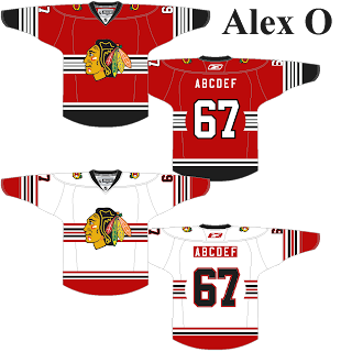
Here are today's contest entries for the Untouchables - Blackhawks competition...
(Alex O.)
Mississauga Steelheads OHL concept (By: Alex H.)
Alex starts out the concepts today with the Mississauga Steelheads who released new logos and jerseys this year along with their new name. Their look is pretty much copies of the Maple Leafs, and I think this concept gives them a cool unique look. I love the striping pattern and how the grey compliments the white. One thing that looks weird is the grey Reebok logo on the away jersey, I think it would look better if it was white, but that's minor. The grey alternate is very cool as well. Also, I'm not sure about this, but isn't it white at home in the OHL? Just wondering. Anyway, great concept Alex. 8.5/10
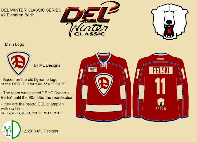
Eisbaren Berlin DEL Winter Classic concept (By: ML Designs)
ML Designs continues it's DEL Winter Classic concepts, which we first saw yesterday. Check yesterday's post to see the first couple concepts. I'm not gonna comment too much on these considering they already have descriptions on them, but this is a cool jersey. I like the colored namebar, I know Ryan hates it, but I like it. Also, either have the hem stripes go all the way around or completely get rid of them. 8/10
Tampa Bay Lightning concept (By: Adam H.)
Adam offers up a very unique Bolts concept, something I haven't seen before. The lightning bolt stripes are cool and a great idea. I like the logos, but why is there a hammer? That's also one very cool alternate, I love how the blue interacts with the lighter black. The curved names are cool as well. One thing, on the wordmark, I would make the "I" the lightning bolt instead of the "L", it looks odd. Almost like "FIGHTNING", or "IIGHTNING". Other then that, this is cool. 8/10
FC Barcelona concept (By: Stephen T.)
FC Barcelona is one of the most popular soccer teams in the world, and Stephen has created a hockey jersey for them. I love when people make hockey concepts for non-hockey teams and this is awesome. I'm pretty sure FC Barcelona actually does have a basketball team, but I doubt they have a hockey one. Anyway, this is awesome. If they actually made a hockey jersey for some reason, I'm sure it would look something like this. 7.5/10
Hamburg Freezers DEL Winter Classic concept (By: ML Designs)
Here is another DEL Winter Classic concept from ML Designs. I don't like how the "HAMBURG" is both on the front AND back, make it just one or the other. The numbers and names inside a box are unique and pretty cool. Don't like the plain blue arms though, add some type of striping, it looks weird in my opinion. Also, that Freezers logo in the top corner is freaking me out (haha)! 7/10
Phoenix Coyotes concept (By: Austin E.)
Here is what Austin wants the 'Yotes too look like, and I agree with every change here 110%. The collars look better, and the stripes also now on the hem. The shoulder patch on both shoulders looks better too. Also, is it just me or is the logo tilted right a little bit? Love it, Coyotes, do this NOW. 8.5/10
Montreal Canadiens concept (By: Adam H.)
Adam gives up his second concept of the day, and it's some unique Habs jerseys. I like the double sets of stripes on the arm and it looks pretty good as a chest stripe too. Not too sure about the logos above the arm stripes and the numbers on the yoke. I would switch the TV numbers and the shoulder logos. I don't like the logo on the pants either, it would be mostly covered up by the jersey anyway. Pretty cool idea overall, though. 6.5/10
Dusseldorfer EG DEL Winter Classic concept (By: ML Designs)
Our final DEL concept of the day, ML Designs brings us the Dusseldorfer EG (that's one awesome name by the way). The striping looks cool and I like the "DEG" over the logo. The NYR-type shadowed numbers look cool too. 8/10
Calgary Flames concept (By: Torin K.)
Now that the Flames have moved on from the "Iginla era", is it time for a rebrand? I think yes, and these concepts from Torin are just awesome. I love the lighter red with the simple, yet unique striping. That alternate with the sublimated flames is just awesome. I wouldn't mind these being released tomorrow. Awesome job, Torin. 9/10 and a COTW nom from me
Thanks for reading, and have a good Friday everyone!
-------------------------------------------------------------
There is a bunch of COTW nominees this week, so vote, vote, vote! Nominees are on the banner to the right.
COTW Mar 25-31 vote (ends Friday @ 11:59pm EST)
HJC Live Chat III (Saturday, April 13, 10:00pm EST)
-------------------------------------------------------------
Here are today's contest entries for the Untouchables - Blackhawks competition...
(Alex O.)
(Mike S.)
(Patrick C.)
-------------------------------------------------------------
Mississauga Steelheads OHL concept (By: Alex H.)
Alex starts out the concepts today with the Mississauga Steelheads who released new logos and jerseys this year along with their new name. Their look is pretty much copies of the Maple Leafs, and I think this concept gives them a cool unique look. I love the striping pattern and how the grey compliments the white. One thing that looks weird is the grey Reebok logo on the away jersey, I think it would look better if it was white, but that's minor. The grey alternate is very cool as well. Also, I'm not sure about this, but isn't it white at home in the OHL? Just wondering. Anyway, great concept Alex. 8.5/10
Eisbaren Berlin DEL Winter Classic concept (By: ML Designs)
ML Designs continues it's DEL Winter Classic concepts, which we first saw yesterday. Check yesterday's post to see the first couple concepts. I'm not gonna comment too much on these considering they already have descriptions on them, but this is a cool jersey. I like the colored namebar, I know Ryan hates it, but I like it. Also, either have the hem stripes go all the way around or completely get rid of them. 8/10
Tampa Bay Lightning concept (By: Adam H.)
Adam offers up a very unique Bolts concept, something I haven't seen before. The lightning bolt stripes are cool and a great idea. I like the logos, but why is there a hammer? That's also one very cool alternate, I love how the blue interacts with the lighter black. The curved names are cool as well. One thing, on the wordmark, I would make the "I" the lightning bolt instead of the "L", it looks odd. Almost like "FIGHTNING", or "IIGHTNING". Other then that, this is cool. 8/10
FC Barcelona concept (By: Stephen T.)
FC Barcelona is one of the most popular soccer teams in the world, and Stephen has created a hockey jersey for them. I love when people make hockey concepts for non-hockey teams and this is awesome. I'm pretty sure FC Barcelona actually does have a basketball team, but I doubt they have a hockey one. Anyway, this is awesome. If they actually made a hockey jersey for some reason, I'm sure it would look something like this. 7.5/10
Hamburg Freezers DEL Winter Classic concept (By: ML Designs)
Here is another DEL Winter Classic concept from ML Designs. I don't like how the "HAMBURG" is both on the front AND back, make it just one or the other. The numbers and names inside a box are unique and pretty cool. Don't like the plain blue arms though, add some type of striping, it looks weird in my opinion. Also, that Freezers logo in the top corner is freaking me out (haha)! 7/10
Phoenix Coyotes concept (By: Austin E.)
Here is what Austin wants the 'Yotes too look like, and I agree with every change here 110%. The collars look better, and the stripes also now on the hem. The shoulder patch on both shoulders looks better too. Also, is it just me or is the logo tilted right a little bit? Love it, Coyotes, do this NOW. 8.5/10
Montreal Canadiens concept (By: Adam H.)
Adam gives up his second concept of the day, and it's some unique Habs jerseys. I like the double sets of stripes on the arm and it looks pretty good as a chest stripe too. Not too sure about the logos above the arm stripes and the numbers on the yoke. I would switch the TV numbers and the shoulder logos. I don't like the logo on the pants either, it would be mostly covered up by the jersey anyway. Pretty cool idea overall, though. 6.5/10
Dusseldorfer EG DEL Winter Classic concept (By: ML Designs)
Our final DEL concept of the day, ML Designs brings us the Dusseldorfer EG (that's one awesome name by the way). The striping looks cool and I like the "DEG" over the logo. The NYR-type shadowed numbers look cool too. 8/10
Calgary Flames concept (By: Torin K.)
Now that the Flames have moved on from the "Iginla era", is it time for a rebrand? I think yes, and these concepts from Torin are just awesome. I love the lighter red with the simple, yet unique striping. That alternate with the sublimated flames is just awesome. I wouldn't mind these being released tomorrow. Awesome job, Torin. 9/10 and a COTW nom from me
Thanks for reading, and have a good Friday everyone!
Thursday: DEL Day
 Reviewed by Tyler Gross
on
April 04, 2013
Rating:
 Reviewed by Tyler Gross
on
April 04, 2013
Rating:


8 comments:
Torin I just finished a Calgary Flames concept myself, and I am disappointed in myself after seeing yours! Great job! Those look awesome!
Alex H's Steelhead for COTW
I'm really enjoying Martin's Winter Classic series, they are very simple, while using a lot of simpler creativity. Also, Torin for COTW. I love that look for the Flames and the Alternate looks great! I also really like Adam's Lightning concept, so out there and sort of Conan the Barbarian like, while also keeping to the blue.
I really like what Adam H. has been doing these past couple of days. Building a concept around a new set of logos is an interesting path. Look forward to seeing more, keep it up.
Second Dylan W's COTW nom.
My guess is with Adam's TBL concept, the hammer is a reference to Thor.
Adam H, is the hammer in your logo for the Lightning supposed to be a nod to the Norse god Thor? If so, I like it. That's clever. Also, Fightning would be an awesomely bad name for a minor team. I'm thinking of a lightning bolt with fists...I would love to see that.
Haha For some reason I think it's looks way better with the logo tilted. Thanks for noticing. -Austin Ell
I'll third Torin for COTW!
Post a Comment