Sunday: Catching Up With an Old Friend
Hi everybody. Welcome back to another Sunday post. If you were like me, you watched as much of the Stadium Series game as possible. And if you are also like me, you're happy that the Penguins won. That's besides the point though. Today I'm not going to talk about how the jersey looked during the game but instead about what the NHL did during the week coming up to the event.
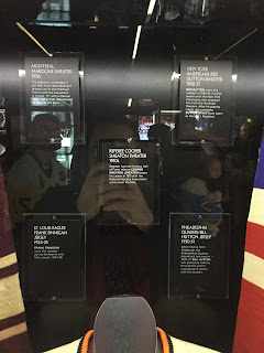
The NHL has been taking around a make-shift museum made out of a tractor trailer called the NHL Fan Arena. This past Thursday they had it parked near my work so I went in and took a few pictures (pictures were allowed if anybody is concerned).
Also, I happened to see Iceburgh, the Penguins' mascot, with the Stadium Series Jersey on so I kindly asked him if he could pose for a picture. Fun Fact about me: I grew up next to Iceburgh's parents (Mr and Mrs Iceburgh we'll call them) and Iceburgh treated my brothers and I like family so it was nice to see that Iceburgh is still done by the same person. Thanks again Iceburgh!
You guys know what's less than a week away? Your entries for the Pairs comp. Also, don't forget to vote for the COTW!
Ok let's get to it!
Negatives: That logo is huge on the front of the jersey as well as the numbers. Also, you don't have any TV numbers. The dark socks being two toned doesn't look that good.
Overall: 6.5/10
Negatives: I honestly don't have any negatives for this jersey. You did a good job creating a traditional black jersey for the Devils.
Overall: 9.5/10 COTW NOMINEE!
Negatives: I don't see any negatives other than those red pants on the top jersey. Make those black.
Overall: 8.75/10
Negatives: The chest stripe is just overdone that it it seems like something that would just be a copy of another said NHL team's identity, but it still works.
Overall: 9/10
Negatives: My only issue is that there isn't a back to this. I really like it but show the back in some representation please.
Overall: 8.5/10
Well that's everything I got today. I hope you guys enjoy the pictures and I'll see you all next week.
The NHL has been taking around a make-shift museum made out of a tractor trailer called the NHL Fan Arena. This past Thursday they had it parked near my work so I went in and took a few pictures (pictures were allowed if anybody is concerned).
 |
| All Photos from My phone! |
Also, I happened to see Iceburgh, the Penguins' mascot, with the Stadium Series Jersey on so I kindly asked him if he could pose for a picture. Fun Fact about me: I grew up next to Iceburgh's parents (Mr and Mrs Iceburgh we'll call them) and Iceburgh treated my brothers and I like family so it was nice to see that Iceburgh is still done by the same person. Thanks again Iceburgh!
 |
| Iceburgh at the PPG Ice Rink |
Ok let's get to it!
Anthony C- Italy
Positives: Compared to what Italy already wears the white jersey is a big improvement. The stripe being designed in the way of the Italian flag is a really nice touch and the two tone blue jersey really gives the dark jersey more character.Negatives: That logo is huge on the front of the jersey as well as the numbers. Also, you don't have any TV numbers. The dark socks being two toned doesn't look that good.
Overall: 6.5/10
Lucas D- New Jersey Devils
Positives: The whole uniform overall is really nice Lucas. You can't stray to far from a traditional style uniform for the Devils and I think that you did a pretty good job with the stripping and all back get up.Negatives: I honestly don't have any negatives for this jersey. You did a good job creating a traditional black jersey for the Devils.
Overall: 9.5/10 COTW NOMINEE!
Mike F- Germany
Positives: Oh Germany. Such a strange history when it comes to being ruled. I must say that you did a excellent job of making different era jerseys for Germany. Each one harkens to different times of the past 100+ years? My favorite out of all is the blue with that angled hem striping.Negatives: I don't see any negatives other than those red pants on the top jersey. Make those black.
Overall: 8.75/10
Ryan C- Dallas Stars
Positives: The chest stripe looks really good On the white jersey. That green just really pops out. Oh, and overall excellent job on the execution but you already knew that Ryan.Negatives: The chest stripe is just overdone that it it seems like something that would just be a copy of another said NHL team's identity, but it still works.
Overall: 9/10
Ryan H- Finland
Positives: Finishing up with the head honcho of the blog, The chest stripe with the crest works really well on the WCH jersey. couple that with the hem being matched on the sleeves and this would have been a much better alternative for Finland last year.Negatives: My only issue is that there isn't a back to this. I really like it but show the back in some representation please.
Overall: 8.5/10
Well that's everything I got today. I hope you guys enjoy the pictures and I'll see you all next week.
Sunday: Catching Up With an Old Friend
 Reviewed by Steve Marc
on
February 26, 2017
Rating:
 Reviewed by Steve Marc
on
February 26, 2017
Rating:


No comments:
Post a Comment