Tuesday: Happy 4th of July!!!
USA USA USA USA USA USA USA USA USA USA USA USA USA USA USA USA USA
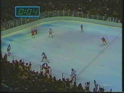
11 seconds ya got ten! The countdown's going on right now! Morrow... Up to Silk... FIVE SECONDS LEFT IN THE GAME! DO YOU BELIEVE IN MIRACLES?!?!?!? YES!!!!!!
HAPPY 4TH OF JULY!!!!!!!
Hello again, and welcome, Hockey Fans, to this Tuesday's post! And a Happy 4th of July to everyone! You've already seen my tribute to American Hockey above, so I'm going to do a quick 5 Best American Sweaters of all time!
5. 2016 World Cup Of Hockey Sweaters
4. Current Road/Clash sweaters
3. 1972 Olympic Sweaters
2. 1980's Miracle on Ice Sweaters
1. 1960's Olympic "Forgotten Miracle" Sweaters
And Happy Belated Canada Day to my Neighbors to the North! {Since this blog is run by a Canadien... I mean Canadian ;) }
We also have our regular COTW voting, as well as the HJC Open! But those entries were due today at noon.
Today we have some American concepts, a Canadian team concept, a couple of North Korean concepts, and a few concepts from the greatest American hockey state, The State of Hockey, Minnesota!
On to the concepts!
Anthony C.- Columbus Blue Jackets (NHL)
Anthony starts us off with a patriotic themed team, the Columbus Blue Jackets!
Good-
Anthony C.- Sarnia Sting (OHL; CHL)
Next up we have our only Canadian-based team, the Sarnia Sting!
Good-
Jets96- Minnesota Wild (NHL)
Jets brings us our first State of Hockey design as a redo of an original concept!
Good-
Jordan R.- Nampo Tigers (NKHL-Fictional)
Jordan shows off some of his work for the North Korean Hockey League. Up first is the Nampo Tigers
Good-
Jordan R.- Pyongsong Atoms (NKHL-Fictional)
Up next is Jordan's other Korea concept! This one is for the Pyongsong Atoms!
Good-
Ryan C.- Minnesota Wild (NHL)
Good-
Well that's all from me, you Tuesday writer, Chase! Come back for more!
11 seconds ya got ten! The countdown's going on right now! Morrow... Up to Silk... FIVE SECONDS LEFT IN THE GAME! DO YOU BELIEVE IN MIRACLES?!?!?!? YES!!!!!!
(via Youtube)
Hello again, and welcome, Hockey Fans, to this Tuesday's post! And a Happy 4th of July to everyone! You've already seen my tribute to American Hockey above, so I'm going to do a quick 5 Best American Sweaters of all time!
5. 2016 World Cup Of Hockey Sweaters
4. Current Road/Clash sweaters
3. 1972 Olympic Sweaters
2. 1980's Miracle on Ice Sweaters
And Happy Belated Canada Day to my Neighbors to the North! {Since this blog is run by a Canadien... I mean Canadian ;) }
We also have our regular COTW voting, as well as the HJC Open! But those entries were due today at noon.
HJC Open Quarter Semi-Finals vote (ends Friday @ noon ET)
COTW June 23-29 vote (ends Friday @ noon ET)
Today we have some American concepts, a Canadian team concept, a couple of North Korean concepts, and a few concepts from the greatest American hockey state, The State of Hockey, Minnesota!
On to the concepts!
------------------------------------------------------------
Anthony C.- Columbus Blue Jackets (NHL)
Anthony starts us off with a patriotic themed team, the Columbus Blue Jackets!
Good-
- I really like the traditional striping pattern!
- I also really like the breezers triangle insert! I wish more teams would do that, it always looks fantastic!
- Good logo choice
- Once again, no socks... And with two different striping patterns on the jersey itself, I can't really make an assumption about what the socks look like...
- While I like the shoulder yoke, I don't like how the name and the Captain's patch overlap the yoke. It looks sloppy, and unprofessional. Moving the yoke up more would be better.
- The numbers also don't fit the traditional look of the striping
- I'd also like to see helmet logos.
Anthony C.- Sarnia Sting (OHL; CHL)
Next up we have our only Canadian-based team, the Sarnia Sting!
Good-
- I like the sash design, it works really well with the logo.
- I also like the gloves!
- The arm striping does techincally match the sash, but it feels out of place, and should bee a little closer.
- A wordmark as a shoulder patch is generally a bad idea... No exception here
- SOCKS?!?!?!?!?
- You're also missing helmet logos again...
- The back and the TV numbers are a little big.
Jets96- Minnesota Wild (NHL)
Jets brings us our first State of Hockey design as a redo of an original concept!
Good-
- I like that there are actually numbers on the jersey now!
- I also like the idea behind this! It's very neat, and it's always a good idea to go back over old concepts!
- I don't understand the black. I mean maybe you don't either, as it could just be a little Jets thinking that BFBS is cool.
- You also used the far inferior logo as the main logo...
- I also don't like how you filled in the template area in the arm pit area. It would have looked better without filling those in...
- There should also be some red in the numbers on the back
- You also have the pants logo flipped backwards...
Jordan R.- Nampo Tigers (NKHL-Fictional)
Jordan shows off some of his work for the North Korean Hockey League. Up first is the Nampo Tigers
Good-
- Fantastic striping pattern!
- I also love the logos!
- Fantastic presentation!
- As much as these sweaters are fantastic, these are exactly what the Oilers wore during the playoffs, except for black instead of Royal blue.
Jordan R.- Pyongsong Atoms (NKHL-Fictional)
Good-
- I really love the color scheme! It's very original!
- Fantastic presentation!
- The logos are also very clever, and work nicely!
- I would have added some green to both numbers, along with some red to the black jersey's numbers...
Ryan C.- Minnesota Wild (NHL)
Ryan brings us our second State of Hockey concept, with a concept that helps match the home and road better!
Good-
- I like the full chest stripe that wraps all the way around
- I also like the shoulder logos!
- The red numbers also work really well on the chest stripe!
Bad-
- You have the Wild's logo rotated wrong. Sportslogos.net has the logo facing straight up like your logo, where it actually is rotated down a little... Like seen in the alt logo that is on Sportslogos.net
- I don't like that you got rid of the beige/ off-white color... It's too Christmas-y...
- I also don't like the double outlines on the numbers... It really clutters it up.
- The TV numbers also don't look the best in red. The really blend in on the green jersey.
- The arm striping on the white jersey doesn't really work, as the red blends into the green.
- The pants stripe should also match the green jerseys stripes a little more...
My rating: These are close to the ones they just unveiled, but most of your changes are a downgrade... 7/10
Adam L.- Minnesota Wild (NHL)
Adam closes out the day with another State of Hockey concept! Good-
- I really like the tail stripe that matches the arms!
- Good job on using the correct logo rotation!
- Matching the shoulder patches also was a good idea!
- Keeping the road intact was also a good idea!
- The names and captain's patches are really pixelated...
- The back numbers are off centered just slightly. The fight strap is a good way to center the numbers...
- The tail stripes are just slightly curved odd on the right side...
- You're also missing helmet logos...
----------------------------------------------------
Well that's all from me, you Tuesday writer, Chase! Come back for more!
Tuesday: Happy 4th of July!!!
 Reviewed by Chase A. Carlson
on
July 04, 2017
Rating:
 Reviewed by Chase A. Carlson
on
July 04, 2017
Rating:


6 comments:
Why did you call the USAs current road their "Clash"? Do they wear their white whenever possible and only change if they have to?
I feel I should explain the Wild concept:
I admit the design choices are weird, things like the green pits and black wouldn't be my favourite choice, but in 2011, I made a very rough idea of how that would look. The main purpose of this was to see if there was ANYTHING to that concept....and there was. I was impressed that while I'd never want Minnesota to ever wear black, it didn't look like the worst thing ever and that early Wild roundel logo isn't even that bad of a logo despite its confusing colour scheme.
Oh and the idea of the logo on the pants being mirrored was to have it pointing the same way as the player
I'll 2nd Jordan R. for COTW
@Danny R.- I called it a clash, because I'm not entirely sure about the IIHF uniform color rules. I think it's white at home, but I just called it a clash to make sure.
Technically speaking, since most IIHF events are in one location, there isn't necessarily a home or road team in that regard, so the jerseys are considered primary jerseys or secondary/clash jerseys. Oftentimes, despite being the host nation, you'll see teams wearing both jerseys over the course of the event. The navy jerseys are the secondary jerseys. And the only thing that keeps them that low are those dopey white helmets.
COTW nom to the PyongSong Fidget Spinners!
he made a bee pun for sarnia sting
Post a Comment