Tuesday: Jumping right in
Hello again, and welcome Hockey Fans, to this Tuesday's post!
College is a stressful time, so I'm gonna have to jump ahead to today's concepts. But before we dive in, let's check out the newest Toledo Walleyes comp. entries!
Tuomas R.-
Don't forget, your entries are due on Friday!
We also have our regular COTW Voting! SO GO VOTE!
COTW Aug. 18th-24th Vote
Toledo Entries Due Friday @ Noon ET
On to the concepts!
-------------------------------------------
Adam G.- Pittsburgh Penguins (NHL)
Adam starts the day off with a Pittsburgh Penguins
Good-
- The striping pattern is wacky, but it works!
- The grey works well too
- The number font works really well with the logo.
Bad-
- The white jersey is a little grey heavy
- The logo also disappears on the white jersey
My rating: This is a rather nice set for the Penguins, but a little too 90's, and the color balance is a little off. 8/10
Matt G.- Philadelphia Flyers (NHL)
Next up is Matt's Flyers concept!
Good-
- I like the striping pattern, and it's absence of white
- The white numbers on the back also look good!
Bad-
- The logo is a little oversized
- The TV numbers should be white
- The orange nameplate doesn't work very well.
My rating: It's decent, but a little to Halloween-ish... 7/10
Matt G.- Philadelphia Flyers (NHL)
Matt G.- Philadelphia Flyers (NHL)
Matt's second concept is also a Flyers concept!
Good-
Noah B.- Vancouver Canuckcaps
Good-
- I like the orange collar insert
- This a Flyers home jersey on a new template. Anything that you changed isn't really an original idea... You have talent, but you shouldn't waste it on updating a jersey to a new template
Noah B.- Vancouver Canuckcaps
Noah here crosses the Canuck(lehead)s and the Whitecaps
Good-
- I love the recolored Orca for the shoulder patch! The Canucks should consider changing that on their sweaters!
- The striping pattern is fantastic!
- The sleeve cuffs balance out the colors a little better on the white jersey
Bad-
- I don't like the solid white stripe on the pants...
- The numbers may work for the idea of this concept, but they don't work the best on the sweaters.
- The collar also leaves a little more to be desired
My rating: A great crossover! 9/10 and my COTW NOMINEE!!!!!!!!!
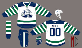
TC Moore- SUEA
TC finishes off the day with a concepts for SUEA! My apologies for not knowing who this is however...
Good-
- I love the pattern based off the logo! And good job adding in a little more creativity with the tail stripe!
- The Numbers are done nicely on the arms!
- I also like the collar!
Bad-
- This is a great jersey, but not one to build a set around...
My rating: A fun jersey, that would be an instant fan favorite, but it's not something I'd want to see every game...
------------------
Well, that's all from me, your Tuesday writer, Chase! Come back for more!
Tuesday: Jumping right in
 Reviewed by Chase A. Carlson
on
August 29, 2017
Rating:
 Reviewed by Chase A. Carlson
on
August 29, 2017
Rating:


3 comments:
Just to Clarify, it's the Surrey Eagles of the BCHL.
All of my adidas updates have a home, away, alternate, and historic jersey. The second Flyers jersey is a throwback to the Bobby Clarke era jerseys and not a copy of what the team wore last season.
Also, the Flyers typically don't have matching colored numbers which is why I chose to do so on the alternate.
Post a Comment