Wednesday: ¿Dónde estás?
NEWS: 2018 NHL Draft Logo has been unveiled as they head deep in the heart of Texas:
(via NHL.com)
For this logo, while it looks lazy compared to the others, the devil is in the details of this. The green and white stripes are beveled, similar to the logo of the Dallas Stars, who are hosting the draft in 2018.Also beveled, though not as much, are the letters in "DRAFT", fading from white to silver on the bottom of each letter. You'll also see the stars from Dallas' logo itself, minus the D, at the end of the beveled streaks. I like that a lot.
Rating: 85%
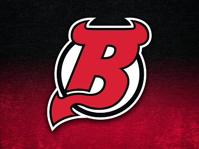
The Binghamton Devils have released their logos, which we have seen on this blog enough, and suffice to say, I would have loved it if they had a clean, Devils-esque B logo with horns and a tail, similar to the one our own Scott M designed:
Instead we have a logo that looks goofy and disassociates the team from the parent club, which can be a good thing usually, but isn't so here in my opinion. The Devils have a clean look, while the B-Devs throw that away.
Rating: 65%
COMPETITIONS:
Entries so Far:
Liam H:
Vaughn R:
Ross T:
Phil B:
VOTING: We have Concept of the Week only this week. No slacking here!
REMINDERS:
COTW July 21-27 vote (ends Friday @ noon ET)
Hockey Card Comp (entries due August 11th)
ON TO THE CONCEPTS!
Chris W: USC Trojans (NCAA) Concept
The Trojan head is easily the best logo of the set, combined with well executed ancient Greek-style striping. Though while technically not Greek, the ancient city of Troy did share in some cultural ideas of Greece. The Dark jersey looks brilliant with the omission of white everywhere except that PAC-8 logo. Shouldn't it be PAC-12? Stitching I will let slide only because the Rebirth template has stitching below the striping pattern on their actual jerseys. Otherwise a no-no.
Rating: 95%
Brooks F: Buffalo Sabres Concept
While the goat-head logo itself is the definition of late 90s NHL design, Brooks makes it even crazier by making it enormous and wrapping around the jersey itself. I don't know what that striping pattern is supposed to represent, maybe fur from the buffalo? A crazy concept as expected, but one that doesn't entirely make sense.
Rating: 80%
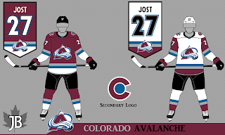
Justin B: Colorado Avalanche Concept
The cool thing about this concept is that the sleeves of the jerseys are perfectly identical to each other. But that's about where the cool ends. The off color upper sleeve is getting played out, in my opinion, with Pittsburgh, Arizona and Vegas all sporting it now. This concept doesn't scream "Colorado Avalanche" at me. It is clean, but it doesn't stand out.
Rating: 80%
Steven G: Carolina Hurricanes Concept
Here we see the Hurricanes new Adidas set with only one design change. The sublimated flag pattern is now added to the away jersey on the hem. If the Canes really wanted to improve, they'd have the striping pattern on the sleeves too. One thing I'm not sure of is whether or not the new Adidas jerseys will have the nameplate in the yoke or not. We didn't really get to see a back view of the new jersey when it was unveiled. Also I think the gloves would look better with the red and black swapped so that they can have red dominant. It would look better with the away jersey. However personally I'm not a fan of concepts with minor tweaks, as opposed to something totally new.
Rating: 75%
The WINNER of my Concept of the Week Nomination is:
CHRIS W
USC TROJANS CONCEPT
This might be the first Wednesday post of the summer drag here at HJC, unless you guys send in more concepts. I want to make sure this blog is interesting, so while we wait for news with the new Portland ECHL team, AHL expansion rumors and the two remaining away jerseys to be released by Adidas (Toronto and Nashville), I need your help to make the blog better for you. Send in your concepts, even if it isn't your best work, because the only concepts that are a waste of time are plagiarized concepts. A concept I rate at 40% is never a waste of my time. It's useful to me to help you develop your skills.
Of course if you have some 95% rated concepts you can send those in too. I like giving out awards.
Wednesday: ¿Dónde estás?
 Reviewed by Unknown
on
August 02, 2017
Rating:
 Reviewed by Unknown
on
August 02, 2017
Rating:


4 comments:
I'll second Chris W for COTW. great job and nice attention to details.
thanks for the nomination. Pac-8 is the hockey conference they play in. I guess only 8 of the schools actually have a hockey team. UCLA, Washington, USC, Utah, Oregon, Arizona State I know have teams or had teams in the Pac 8
I think Oregon is selling their jerseys right now.
Steven G for COTW
Post a Comment