Sunday: Happy Mothers Day!
Hi everybody. Steve here with a special throwback edition of our Sunday Post. Being that it's Mother's Day I'd figure that I keep this short an sweet so you can spend showing appreciation to the Woman (or women) who put up with you on a daily basis. Before I do, Don't forget to vote for the COTW, COTW-April, and the Wheeling Nailers comp.
let's get down to business!
Negatives: The centurion striping on the collar is a little much.
Overall: 8/10
Negatives: I understand that you wanted to keep the red yoke to match with the current away jersey but having that space in between the blue yoke trim and the yoke really throws the design off and, being honest, the design would be just as strong without it.
Overall: 7/10
Negatives: You have a few sizing errors in the numbers, name, and crest logo but other than that you've got a decent design.
Overall: 6/10
Ok everybody that's all I got. Thanks for stopping by and have a good rest of your week!
COTW- April vote (ends Friday @ noon ET)
COTW May 4-10 vote (ends Friday @ noon ET)
Wheeling Nailers ReDesign vote (ends Friday @ noon ET)
let's get down to business!
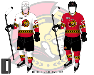
Lucas D-Ottawa Senators
Positives: Looking back now at what the Sens decided to go with, this would've been a vast improvement. The centurion patterned striping on both jerseys were a nice choice to go with on the sleeves and hem and they always looks better in a traditional style striping.Negatives: The centurion striping on the collar is a little much.
Overall: 8/10
Taylor R- Montreal Canadiens
Positives: Reaching into 2016, we see a concept by Taylor that has heavy emphasis on redesigning the away jersey. The hem and sleeve stripes with the the white to break them up really works well on the white. It keeps a template but doesn't do a complete color swap. Also, leaving the home jersey the same was a good choice.Negatives: I understand that you wanted to keep the red yoke to match with the current away jersey but having that space in between the blue yoke trim and the yoke really throws the design off and, being honest, the design would be just as strong without it.
Overall: 7/10
Vaughn R- Chilliwack Chiefs
Positives: Keeping to a classic design was the right choice here and, believe it or not, I like the Kings numbers on the jersey. it goes with the logo's angular design.Negatives: You have a few sizing errors in the numbers, name, and crest logo but other than that you've got a decent design.
Overall: 6/10
Ok everybody that's all I got. Thanks for stopping by and have a good rest of your week!
Sunday: Happy Mothers Day!
 Reviewed by Steve Marc
on
May 13, 2018
Rating:
 Reviewed by Steve Marc
on
May 13, 2018
Rating:


No comments:
Post a Comment