
Friday: a grab bag of concepts
Hey everyone, a there are a lot of concepts to get to today, as well as contest entries from the Detroit untouchables contest (get you entries in by 11:59 EST tonight!), but before we get to that, let's take a look at the implications of the leaked Winter Classic sweaters. (If you haven't read about them, check them out here and here). From the leaks we have seen, I am really thrilled to see a colour vs colour game. That would look awesome. also, the sweaters are really classy as well. But, since these sweaters have been leaked do you think they will see action in next years Winter Classic, or are we going to see something completely different? Also, will these sweaters open the door for other colour vs colour games? Which colour vs colour game would you like to see happen most?
here are your daily voting, contest, etc. reminders:


here are your daily voting, contest, etc. reminders:
COTW Feb 11-17 vote (ends Friday @ 11:59pm EST)
HJC Live Chat (Feb 24 @ 9pm Eastern)
Untouchables Red Wings Entry Phase (entries due Friday @ 11:59pm EST)
------------
----------------------------------------------------------------------------------------------------------------
Here are the untouchables entries for today:
V. Blums

Dylan W.

Matt M.

V. Blums

Dylan W.

Matt M.

Derek H.

Nick F.

Andrew G.

----------------------------------------------------------------------------------------------------------------
On to the concepts!
Montreal Canadiens concept (by Ryan (HJC))

This seems less of a concept and more of a prediction of what the Habs will go with when they switch over to lace-up collars (as they are rumoured to do for next season). Everything has stayed the same except the collars. the blue looks good on the home, but I would be inclined to keep the blue collar for the road also (for continuity, and to add some blue to the white sweater. (I'm not ging to give this concept a rating, simply because it is SO similar to what the Habs wear, and because the change is So minor, good job though Ryan).
Vancouver Canucks concept (by JCR Graphics)

The Johnny Canuck V really looks good in these colours... the stick in the rink, not so much. I think if the stick in the rink were mostly black instead of red it would look better. The striping is great on these sweaters, because it work for the Nucks back in the 90's (as did Kirk Maclean's mask!), however by one gripe with the jersey design is the collars, they don't look cohesive with the rest of the sweater. 7/10.
Phoenix Coyotes concept (by E. Awad)

I love the idea of bringing sand into the striping patter for the Yotes. However, this sweater seems a bit black for black's sake. I think if a different crest were used, I wouldn't feel the same way. I definitely suggest the running Coyote logo. 8/10.
Florida Panthers concept (by Jets96)

The striping design is bold and bright, that really works for me. I also love this collar design, and think it should be used more! execution seems a bit rushed on these. lots of loose pixels around the logos and shoulder patches, also when using this collar, there is a section above the section with the NHL shield in it that should be filled in the same colour as the inside of the neck (it is coloured white on the home, and yellow on the away). 6/10.
New York Rangers concept (by Stephen T.)

Love the white sweater, although I would make the wide stripe on the arms blue, and the outer stripes red. The blue jersey has a lot of potential. I like that there is no yoke, but there are yoke stripes, I would like to see a red yoke stripe as well though. THe logos and shoulder patches look a bit blurry/ pixelated to me, just be careful with that. 6/10.
Grizzly Adams Wolfsburg (DEL) concept (by Bastian S.)

First off, I can't explain to you how much joy I have because there is a hockey team named Grizzly Adams! how fun is that?!?! I like the slack sweater the best of this set. For the orange and white sweaters they just seem a bit empty. If the arm and hem striping were exactly switched from the white to the orange jerseys (and vice versa) I think that would add some more contrast. Also, the words in the stripes could be a bit larger in my opinion. 7/10.
Denver Cutthroats (ECHL) concept (by Jets96)

I really like the home sweater, although some of the execution is again a bit off. there are loose pixels around the logo, which could do with a solid white outline. I like the white sweater, but think it could do with a bit more blue in the striping design. 7/10.
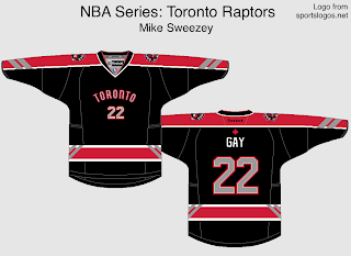
Toronto Raptors (NBA) concept (by Mike S.)

I really like the chevron design on the arms, I think it works well, although I would like to see the stripes go all the way down the arm, and not stop awkwardly at the cuffs. I think the TORONTO, and number on the fron could also be a tad larger. 6/10.
Anaheim Ducks concept (by JCR Graphics)

I know many people think adding green to the ducks colour scheme would fix their jersey woes... I am not necessarily in that camp, but do like how the green looks here. I think white letters and numbers would work best on the home sweater, and think you could get away with having the exact same striping on each sweater (use the design from the white sweater), and just switch the base colours. This would add more orange to the home sweater, and keep the colour hierarchy the same. 7/10.
Team Denmark (IIHF) concept (by Bastian S.)

These are fantastic simple sweaters. I love the reverse sleeves, and how they look with the cuffs, and the rest of the jersey. Also, this logo is very cool, obviously there is a royal heraldry vibe with the lion, but it also feels a bit like a college team's sweater. Great Job. 8/10 and a COTW nom from me.
Friday: a grab bag of concepts
 Reviewed by Unknown
on
February 22, 2013
Rating:
Reviewed by Unknown
on
February 22, 2013
Rating:
Reviewed by Unknown
on
February 22, 2013
Rating:


7 comments:
I sent in my contest entry yesterday but it's not in today's post.
Second Bastian for COTW
personally, I'd either like to see a Montreal - Toronto or Montreal - Los Angeles colours game.
Send again. It seems that we don't have it.
@ Ryan: I think you're right about the lace-up and the red collar on the road, but it will probably be white on the home jersey, just like in the 70s. Hope the font tourna into a block one like you suggested.
Stephane : it probably will be a white collar. The blue was a personal choice or because I liked the way it look in 2009 on the Retro sweater.
Just sent it again.
Scott, it will be on tomorrow's post.
Post a Comment