Tuesday: Leaks to be True.
Over the weekend I spent my time in Chattanooga, Tennessee. Very nice place, really exceeded my expectations. Now I'm back home, back at school and ready to hit the books again. Of course, I have to go back to work too. Not exactly excited about that part but hopefully I'll find a new job soon that doesn't make me want to cry.
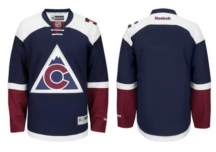
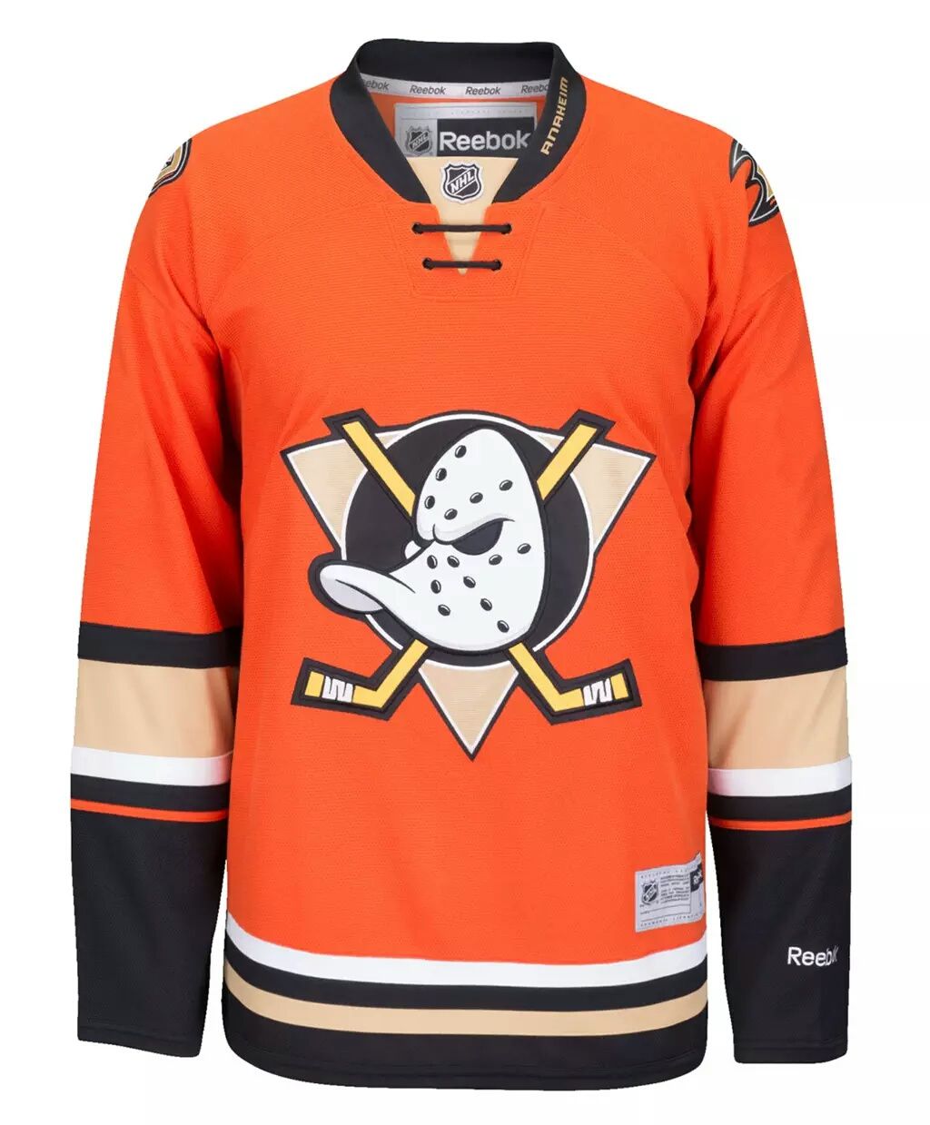
In actual hockey news though we had some new leaks of leaked jerseys that seem to be completely true now if it wasn't already before. If you don't know, I'm talking about the Colorado Avalanche and Anaheim Ducks new alternate jerseys.
In actual hockey news though we had some new leaks of leaked jerseys that seem to be completely true now if it wasn't already before. If you don't know, I'm talking about the Colorado Avalanche and Anaheim Ducks new alternate jerseys.
Colorado Avalanche
In a group message yesterday Dylan A. and Matt Mc. were talking about these new leaks. From the virtual leak these jerseys looked meh and in actual form I would agree with what Dylan and Matt had to say, they look much better. I have always loved the blue the Avalanche use and wanted that to become the eventual primary, but would I want these to become the eventual overhaul for the team? No, not whatsoever, but as a third jersey, these are very nice. I really like the white yokes, gives that icy mountaintop feeling. Then just having the arms have red is something that I'm usually not a fan of, but I actually like here. Perfect description of a modern throwback.
Rating: 8.3/10
Anaheim Ducks
This to me is the opposite of the Avalanche. In terms of how it looks in real jersey form. To me the big difference is the amount of black. The online 2D concept form had much more black to it. The black numbers helped a lot too. Here the hem striping has a lot less black than I thought it would. To me the whole hem striping should be higher up. If you read the blog a lot and have gotten to know me, you also know I'm really not a fan of the bronze/gold color. Side note, anyone noticed since the Stadium Series started the jerseys that NHL shop uses look like night gowns and not jerseys? I don't know, maybe that's just me.
Rating: 7.8/10
I know there are some others I could touch up on but I'd rather not waste more space on what has already been taken care of from the day before. So let's just get to the day's concepts.
COTY-August vote (ends Friday @ 11:59pm Eastern)
COTW Aug 30-Sept 5 vote (ends Friday @ 11:59pm Eastern)
Chicago Cougars entries (due Friday @ 11:59pm Eastern)
Chicago Cougars Contest Entries
Brooks F.
John E.
Ryan C.
Anaheim Mighty Ducks (Soccer) Concept - Daniel L.
Daniel takes the Mighty ducks and makes them a soccer squad. If there's any question on what the Ducks would look like in soccer form then it has been answered here. This is exactly what I'd expect from a crossover jersey. Very nice job on execution here, and adding in the fan scarves. Really not too much to say as it's just the jerseys into soccer but it does look very cool. Like a small memorabilia to have in your mancave. Very cool, nice to see.
Rating: 8.9/10
2015 Stadium Series Concept - David P.
David takes a different route in designing this years Stadium Series game. I really like how you made it look transitioning onto the back. It's something that Reebok would have done. It's a very cool look to see done. In my opinion it really only works for the Kings right here, probably because of their vertically aligned logo. Something just seems really off about the Sharks one though with the vertical lines cutting into a triangular logo. Also, I'd leave the nameplates where they are supposed to be on a normal Reebok jersey. By doing it up there you are adding a nameplate which adds more when it's completely unnecessary. Cool to see, maybe the Sharks could have used the horizontal and Kings could have worn the vertical. Would have followed the theme but have them two separate uniforms.
Rating: 8.1/10
Bakersfield Condors Concept - Jordan R.
Jordan comes back to HJC with a smashing concept for the Oilers new club team. I really like how he integrated the Oilers theme without it being direct knockoffs. I especially like the blue jersey. You can tell they're related to the Oilers but you still get a sense of their own identity with this striping. I guess my only real gripe would be the fact that the alternate is the same jersey as the home and road, I would want to see a little more style and flare in the alternate. Maybe that's just me because they're the minor team to the Oilers but I don't know, I'd like to see something different.
Rating: 8.4/10
Binghamton Senators Concept - Jordan R.
Jordan makes his own logos for this AHL team. The logo is nicely done. My critique on it is just the black area between the helmet and the face. It almost looks like his face is being covered up for some reason. Or like Two-Face from Batman. It kind of distracts from the logo. I would say clean up that spot and you'll have a nice logo for the Senators farm club. The home and road are classic designs with a slightly unique yoke look. I think with the white numbers I would want to see more white in the black jersey. Or maybe No white in the numbers at all. The alternate is pretty cool though. Looks like jerseys they would have worn back in the 40's or something and they brought them directly back. No complaints with that one simply because of the style it's portraying (I think).
Rating: 8.3/10
Anaheim Ducks Concept - Mari A.
For the centennial of the NHL Mario proposes new jerseys for the Ducks. Obviously this is basing off the Mighty Ducks movie. My problem right away is just the way the colors look. They seem too 70's. It has a very bright but dull look to them. So I would try and match the colors to what they were in the movies. AS for the design, it's decent. Not sure if it's a small mistake on your part or you meant it but there's a small white line on the yoke of the home jersey. If it's an error then next time just make sure you fill in everything. If it's supposed to be part of the design then you'll need to make that more noticeable rather than just a very thin white line. You'll need to make the stripe thicker. Also on the jersey you have yellow touching purple, so I feel that stripe should be yellow rather than white.
Rating: 6.9/10
Quebec Nordiques Concept - Mario A.
This is a very different look for Quebec that Mario gives them. Uses more red and adds in a navy blue. Seems like something they would do if they make a return. That also brings up my question. If they do return, do they bring back the old Nordiques the best way possible or do they completely overhaul a new look? To me though, sorry, this concept screams mediocre. The typical 3 stripes filled in with a rounded yoke. It's like one of those sweatshirts on the NHL's shop with every team having those same stripes filled in with their own colors. I would just like to see more thought into it. The color balance could use some work mostly on the white jersey. There's an abundance of red and navy on the home jersey but on the road jersey it looks like that light blue should be the primary color.
Rating: 7.1/10
Ottawa Civics Concept - Taylor R.
The only thing I could find on this team is that they replaced the Denver Spurs and didn't have time to create a logo so they used the Denver orange uniforms without a crest. So I take it this would be their actual first uniforms. T-Roy does a very nice job of giving them an identity. Talk about classic uniforms here. If the WHA never fell apart I could see them still rocking these. The number font is very stylized but I think it still works. With a double thicker number though I think you would have to resize them. Like the number '99' would be very wide on these. Other than that though these are very cool. I also like how you use an old style collar. Very well done.
Rating: 9.2/10 COTW Nomination from me.
San Diego Gulls Concept - Taylor R.
Taylor tries to fix the Gulls look, and it simply looks better. They have so much piping on their jerseys it's ridiculous. T-Roy takes more into the black color and less of the orange and blue. I actually disagree with that. I would like to see more blue and orange into the look. Would make it even more unique to them. I know blue is just their outline color, so maybe not that, but orange I think should be more prominent in the jerseys. Nice job like Jordan did of incorporating their parent club but having their own look.
Rating: 8.5/10
Another day down. First time in awhile we've had a lot of concepts on each day. Hopefully that means HJC will start to ring in more viewers and artists and be back in full swing. Until next week every, My name is Dylan Nowak and this was Tuesday on HJC!
Tuesday: Leaks to be True.
 Reviewed by Unknown
on
September 08, 2015
Rating:


4 comments:
Cant see the contest designs for today
The contest entries aren't showing
COTW nom to Jordan's Bakersfield concept
I second Jordan's Bakersfield concept
I'll 3rd Jordan R.'s Condors Concepts for COTW!
Post a Comment