Sunday: Bring it on Vegas!
Hi everybody. Welcome back. I have nothing but Vegas concepts today (no surprise there.) It's going to be the Maple Leafs post all over again. Also, I have two new jersey news that doesn't have to do with any college teams.
Let's start with my favorite team to hate, the Philadelphia Flyers. They recently revealed their Stadium Series jersey that they'll wear in Pittsburgh in February.
At first look, It's pretty basic looking but nice at the same time because it's a black Flyers jersey. Then you realize that they decided to have black numbers on a black jersey with that different colored nameplate and then you start to think that they Flyers whiffed on it. My score: 6/10
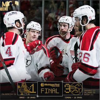
The other news is with the Grand Rapids Griffins. They went with a fauxback style jersey (80's to be exact) on Friday and it turned out beautifully.
The logo is totally 80's and almost reminds me of the mobile Pegasus logo. As for the jersey, the simple red and black stripes with the red yoke with black and white accent striping is great. They even went a step further and made the pictures look like they were from the 80's as well with the classic scoreboard and logos (good job on the vintage admirals logo). My score: 8.75/10
Don't forget that we have the COTW, COTW-November, and the HJC season week 5 voting going on right now so take the 30 seconds to do that.
Onto the concepts:
Negatives: That triangle that comes down behind the logo just looks strange.
Overall: 7/10
Negatives: That Panthers style alternate will just be strange to see. Maybe some more detail in the striping and it'll be beautiful.
Overall: 8.5/10
Negatives: The gold numbers could be a little hard to see from a distance with that little outline.
Overall: 8.75/10 COTW NOMINEE
Negatives: The chest logos look too small and there is too much of a space between the name and numbers. Also, that white half sleeve on the dark jersey just doesn't look that good
Overall: 6/10
Negatives: Other than the fact that it's a template, the piping on the jersey.
Overall: 8.75/10
That's it guys. Have a good week and I'll see you guys next week.
Let's start with my favorite team to hate, the Philadelphia Flyers. They recently revealed their Stadium Series jersey that they'll wear in Pittsburgh in February.
 |
| Picture Courtesy of Flyers.nhl.com |
The other news is with the Grand Rapids Griffins. They went with a fauxback style jersey (80's to be exact) on Friday and it turned out beautifully.
 |
| Photos from instagram.com/griffinshockey |
Don't forget that we have the COTW, COTW-November, and the HJC season week 5 voting going on right now so take the 30 seconds to do that.
COTW-November vote (ends Friday @ noon Eastern)
COTW Dec 2-8 vote (ends Friday @ noon Eastern)
The Season Week 5 voting (ends Friday @ noon Eastern)
Onto the concepts:
Brian B- Vegas Golden Knights
Positives: I like the striping that you did on the pants and the back of the collar as well as those simple stripes on the arms with the half black.Negatives: That triangle that comes down behind the logo just looks strange.
Overall: 7/10
Glenn T- Vegas Golden Knights
Positives: simple but traditional. Safe way to go but it's pretty effective. The simple two stripes on the primary set looks great as well as having the alternate logo on the shoulders.Negatives: That Panthers style alternate will just be strange to see. Maybe some more detail in the striping and it'll be beautiful.
Overall: 8.5/10
Lucas D- Vegas Golden Knights
Positives: Believe it or not, That diagonal stripe across the chest is really nice. It's something different in the hockey world but it really works for other sets. The collar is beautiful as well.Negatives: The gold numbers could be a little hard to see from a distance with that little outline.
Overall: 8.75/10 COTW NOMINEE
Mario A- Vegas Golden Knights
Positives: The black sides and the black ends look pretty good. Overall it looks a lot like the sharks pre-edge jerseys.Negatives: The chest logos look too small and there is too much of a space between the name and numbers. Also, that white half sleeve on the dark jersey just doesn't look that good
Overall: 6/10
Zack R- Vegas Golden Knights
Positives: The numbers and color pattern looks great on this jersey. The dark grey accents and the gold accents look beautiful.Negatives: Other than the fact that it's a template, the piping on the jersey.
Overall: 8.75/10
That's it guys. Have a good week and I'll see you guys next week.
Sunday: Bring it on Vegas!
 Reviewed by Steve Marc
on
December 11, 2016
Rating:
 Reviewed by Steve Marc
on
December 11, 2016
Rating:


1 comment:
COTW nom to that Vegas set
Post a Comment