
First Set of WC Entries
I'm getting a lot of positive feedback on this Winter Classic competition. I'm really glad to hear that a lot of you are enjoying it!
Minnesota Winter Classic Competition Entries #1
Winter Classic concepts (by Brian B.)
Winter Classic concepts (by Colin)
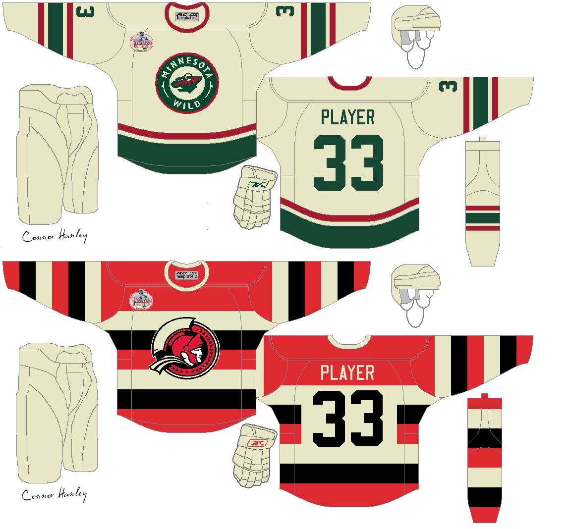
Winter Classic concepts (by Connor)
Winter Classic concepts (by John T.)
Winter Classic concepts (by Stephen T.)
For those who question Colin's Avs jersey and John's Sharks jersey, yes they are retro jerseys, but read how the rule is written...
Keep those COTW and 3rd Quarter votes coming in!
QUICK HITS
North Dakota Tigers concepts (by Cody)
Tampa Bay Lightning concept (by Mark M.)
Vancouver Canucks concept (by Elias) Elias re-colours the Canucks' 3rd jersey to the black, gold and red of the 80's. If this were an entry into the Winter Classic comp, it would be allowed because it is not an EXACT copy of an existing jersey.
St. Louis Blues concepts (by Kyle C.) That home Blues concept is one of my favourite Blues concepts I have seen! I think the white one would be better if the thicker stripes were blue. Just to let you know Kyle, on the front of the jerseys you have your shoulder patches facing the wrong way.
Boston Bruins concepts (by Steven G.) This is a really great combination of the Orr era jerseys and the new logo and font. I also really like that 3rd B jersey! Another feature that I like is the removal of the outline on the shoulder patches. Now they are just a part of the yoke. COTW nomination from me!
Ottawa Senators concepts (by Kris) Kris takes the new 3rd, makes a matching home jersey and has placed old shoulder patches on them. That's a good choice, they go well with the jersey. I think the coloured namebar is unnecessary though. I'd like the red alternate better if the logo was black. Still, this is a solid concept from Kris.
Minnesota Winter Classic Competition Entries #1
Winter Classic concepts (by Brian B.)

Winter Classic concepts (by Colin)

Winter Classic concepts (by Connor)
Winter Classic concepts (by John T.)

Winter Classic concepts (by Stephen T.)

For those who question Colin's Avs jersey and John's Sharks jersey, yes they are retro jerseys, but read how the rule is written...
"You are not allowed to use EXACT retro/vintage
jerseys of the team you are creating the concept for".
Colin's jersey is not an EXACT retro Avs jersey and John's uses a retro jersey that was never used by the Sharks franchise.jerseys of the team you are creating the concept for".
Keep those COTW and 3rd Quarter votes coming in!
QUICK HITS
North Dakota Tigers concepts (by Cody)

Tampa Bay Lightning concept (by Mark M.)

Vancouver Canucks concept (by Elias)
 Elias re-colours the Canucks' 3rd jersey to the black, gold and red of the 80's. If this were an entry into the Winter Classic comp, it would be allowed because it is not an EXACT copy of an existing jersey.
St. Louis Blues concepts (by Kyle C.)
 That home Blues concept is one of my favourite Blues concepts I have seen! I think the white one would be better if the thicker stripes were blue. Just to let you know Kyle, on the front of the jerseys you have your shoulder patches facing the wrong way.
Boston Bruins concepts (by Steven G.)
 This is a really great combination of the Orr era jerseys and the new logo and font. I also really like that 3rd B jersey! Another feature that I like is the removal of the outline on the shoulder patches. Now they are just a part of the yoke. COTW nomination from me!
Ottawa Senators concepts (by Kris)
 Kris takes the new 3rd, makes a matching home jersey and has placed old shoulder patches on them. That's a good choice, they go well with the jersey. I think the coloured namebar is unnecessary though. I'd like the red alternate better if the logo was black. Still, this is a solid concept from Kris.
First Set of WC Entries
 Reviewed by Ryan
on
October 19, 2011
Rating:
Reviewed by Ryan
on
October 19, 2011
Rating:
Reviewed by Ryan
on
October 19, 2011
Rating:


8 comments:
Would I be able to use my original Senators concept, if I went that direction?
I don't remember that concept Tex. Send it in anyways and I'll let you know after I get it.
Oh, the one resembling the new Sens jersey.
That one wouldn't be allowed.
About my Sens jersey, the off colour namebars were supposed to give the jerseys a heritage look. I modeled it after the full barberpole jerseys where the numbers were on a white patch.
@Ryan We were discussing in an earlier comment section that Brandon was using a logo mashup like mine. Here is the post in question.
http://hockeyjerseyconcepts.blogspot.com/2011/08/week-of-august-22-28-2011.html
@Blue&White: I just took a look and it's just a coincidence. They have very similar compositions, but have been executed differently.
A few days ago you posted a link to a pretty awesome Leafs hoodie from Old Time Hockey. I haven't seen a CBJ one online, but last night I was at Nationwide and they have the same one (both for the regular logo and alternate logo) at the team shop. Pretty sweet!
http://www.icejerseys.com/item_details_simple.php?id=10999
Post a Comment