Wednesday: WELP
So with Ryan's computer gone down the tubes, he gave us the option to post freely or take the day off.
BYE!
Just kidding, It's time for tonight's top 10!

But before that, a little bit of news out of Brampton. The ECHL's Brampton Beast have an online form in which representatives from the other 26 ECHL franchises may fill out in order to request forfeiture in advance of playing Brampton. That's right, you can forfeit your games to Brampton this season, but why?
(Via cdnuniguy on Photobucket)
While this debuted the fantastic logo we see today, This jersey is plagued by the fact that there are two dark colors too close to each other: the standard navy blue and BLACK. Everyone here should be familiar with the term "BFBS", or black for black's sake. If you don't, it's the idea that we should add black because why not? Other teams experimented with it, but the two darks in close proximity here rank this as the biggest BFBS violator in the pre-EDGE era.


(via sportsjerseypedia.com)
While the design patterns and the logo aren't half bad (the logo does have a lot going on though), there's one thing that was always featured on this original turdburger: MUSTARD! As a New Yorker, the concept of mustard on a burger is repulsive *ducks and dodges*, but as a jersey enthusiast, the concept of mustard on a jersey is even worse. They had a perfectly good shade of yellow. Why ruin it?

(via Sports Illustrated)
The Lightning began the precedent of crazy patterns on the hem and sleeves, and who else but the Coyotes took advantage of it. The desert is in full effect here with actual rock formations and cacti on the hem and arms, with the alternate logo of the moon down on the hem too. The stand-alone head logo isn't an issue, but the shoulder logo was, because we weren't sure if it were a bird's eye view of a coyote or a salamander.
BYE!
Just kidding, It's time for tonight's top 10!

(via bostoninteractive.com)
But before that, a little bit of news out of Brampton. The ECHL's Brampton Beast have an online form in which representatives from the other 26 ECHL franchises may fill out in order to request forfeiture in advance of playing Brampton. That's right, you can forfeit your games to Brampton this season, but why?
"The ‘blessing’ may very well mean a Kelly Cup Championship is in the cards for the Beast for the upcoming 2016-17 season.
As Canada’s only ECHL franchise, the Beast have chosen to embody the giving nature that Canadians are known to uphold and have offered to extend an olive branch to their ECHL competitors who now fear playing against the Brampton Beast.
As of today, the Beast are scheduled to appear in 72 ECHL contests, starting with the club’s season opener against the Wheeling Nailers at WesBanco Arena on October 15, 2016.
The Beast would like to offer our ECHL competitors the opportunity to forfeit their scheduled contests against the Beast organization in an effort get a head start on the 2017-18 ECHL season."
The form can be found here: http://bramptonbeast.com/news/?article_id=813&full=1
ON TO THE CONCEPTS!
Oh.
I mean, tonight's top 10 list is the top 10 Alternate Jerseys you Never Want to See Again On Ice.
ON TO THE CONCEPTS!
Oh.
I mean, tonight's top 10 list is the top 10 Alternate Jerseys you Never Want to See Again On Ice.
You may want to see them as a collector, but never again in action.
Number 10!
Columbus Blue Jackets 2003-07
(Via cdnuniguy on Photobucket)
While this debuted the fantastic logo we see today, This jersey is plagued by the fact that there are two dark colors too close to each other: the standard navy blue and BLACK. Everyone here should be familiar with the term "BFBS", or black for black's sake. If you don't, it's the idea that we should add black because why not? Other teams experimented with it, but the two darks in close proximity here rank this as the biggest BFBS violator in the pre-EDGE era.
Number 9!
Philadelphia Flyers 2002-07

(via hockeybydesign.com)
While the sleeve pattern is nice, the biggest problem here is the logo. How do we take a timeless logo and modernize it? Let's add a thick silver trim to the inside of each colored portion of the logo. There is only one way to describe what happened with that logo and because I can't say it on cable television, I won't say it here.
Number 8!
New York Islanders 2011-14

(via themcj.com)
There are four teams in New York that don blue and orange. One didn't exist at the time (NYCFC), two of them had dropped black entirely at that time. So what does the other one do? ADD black! Yes folks, BFBS comes back with a vengeance. The Mets and Knicks had just dropped black because they smartened up and said black doesn't look good with blue and orange. So let's add grey too for no reason! The blue helmets don't help either, and while I can respect not being able to design a quality alternate logo that fits the jersey, The name and number option for the front is inexcusable. It's amateur at best.
Now why isn't the current black here? Because black and white without blue and orange works very well. The only orange is in the logo and the only blue is on the inside of the collar. The grey makes no sense at all. Many consider these worse than the fisherman jersey. Include me in that. (Fisherman wasn't included because it wasn't officially an alternate, but rather part of a normal rotation the Islanders used in 1997 until the redesign brought sanity back to Uniondale).
Number 7!
Atlanta Thrashers 2008-2011
(Via Yahoo Sports)
Remember what I said about the amateur look of the name and number on the front? Well here we are. While I always will appreciate seeing the Thrashers in red, albeit only in concept, This was not the way to do it. Oftentimes in concepts I will discuss execution with shoulder patches. These are too large for anyone's liking. But what really makes this concept is the socks. Who in their right mind would design that? Does it match the side panels? Sort of/not really. So we can all thank True North Sports & Entertainment for relocating this team, if only to rid ourselves of these.
Remember what I said about the amateur look of the name and number on the front? Well here we are. While I always will appreciate seeing the Thrashers in red, albeit only in concept, This was not the way to do it. Oftentimes in concepts I will discuss execution with shoulder patches. These are too large for anyone's liking. But what really makes this concept is the socks. Who in their right mind would design that? Does it match the side panels? Sort of/not really. So we can all thank True North Sports & Entertainment for relocating this team, if only to rid ourselves of these.
Number 6!
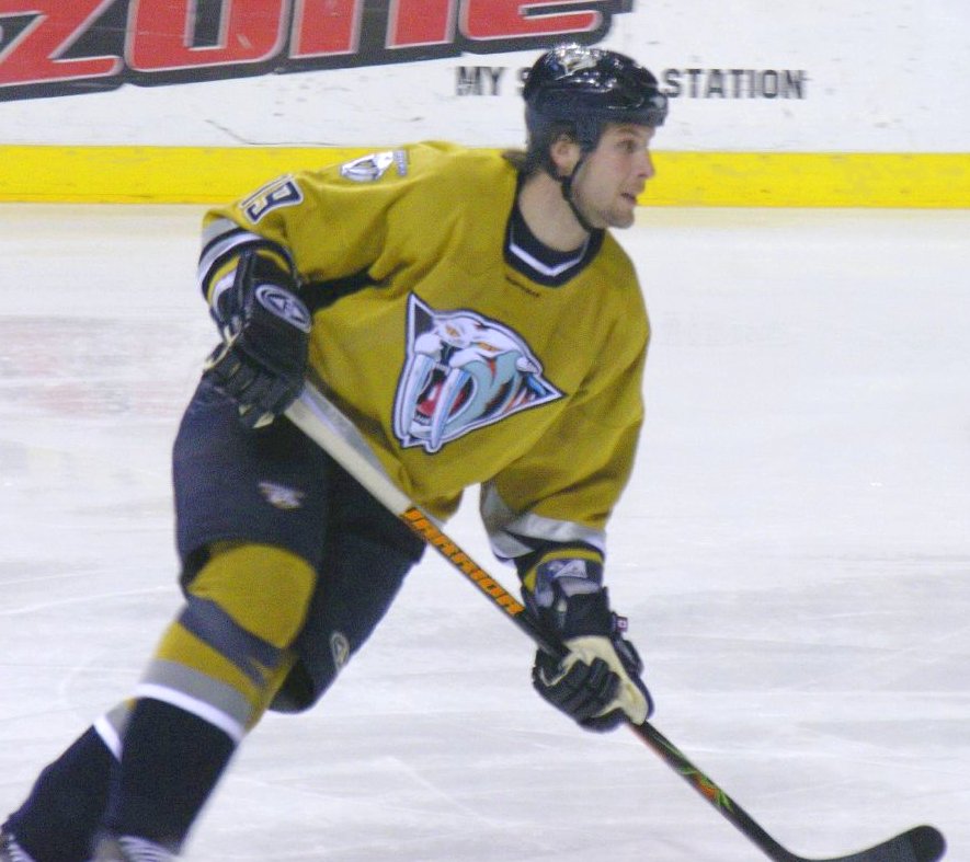
Nashville Predators 2001-07
(via sportsjerseypedia.com)
While the design patterns and the logo aren't half bad (the logo does have a lot going on though), there's one thing that was always featured on this original turdburger: MUSTARD! As a New Yorker, the concept of mustard on a burger is repulsive *ducks and dodges*, but as a jersey enthusiast, the concept of mustard on a jersey is even worse. They had a perfectly good shade of yellow. Why ruin it?
Number 5!
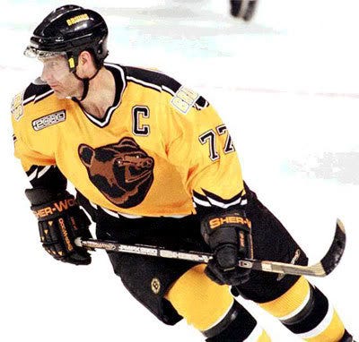
Boston Bruins 1995-2006
(via Barstool Sports)
Yellow alternate? Points! Awful bear head logo? Points deducted. Wordmark shoulder logo? Points deducted. Jagged striping? Points deducted. All this for an original 6 team? All points lost and then some, We have had some concepts in which we talk about wordmark logos NOT working on the shoulders, and this is your case study as to why it shouldn't exist in real life. The bear head logo needed an upgrade from before 1995 but this is not the bear head design we were looking for.
Yellow alternate? Points! Awful bear head logo? Points deducted. Wordmark shoulder logo? Points deducted. Jagged striping? Points deducted. All this for an original 6 team? All points lost and then some, We have had some concepts in which we talk about wordmark logos NOT working on the shoulders, and this is your case study as to why it shouldn't exist in real life. The bear head logo needed an upgrade from before 1995 but this is not the bear head design we were looking for.
Number 4!
Tampa Bay Lightning 1996-99
(via Icethetics)
It seems like an injustice to see Vinny Lecavalier wearing that. The floodgates opened up after this jersey was unveiled. Well actually they were opened up when the Islanders rebranded and when another third jersey was unveiled that you'll see later. But the floodwaters were well present on this jersey as the hem pattern. Oh and let's add rain on the front and lightning on the sleeves. From a design aspect though I think it's pretty cool that there's a grey yoke extending past the numbers to connect to the lightning, as it's reminiscent of a cloud with lightning striking from it.
It seems like an injustice to see Vinny Lecavalier wearing that. The floodgates opened up after this jersey was unveiled. Well actually they were opened up when the Islanders rebranded and when another third jersey was unveiled that you'll see later. But the floodwaters were well present on this jersey as the hem pattern. Oh and let's add rain on the front and lightning on the sleeves. From a design aspect though I think it's pretty cool that there's a grey yoke extending past the numbers to connect to the lightning, as it's reminiscent of a cloud with lightning striking from it.
Number 3!
Phoenix Coyotes 1998-2003
(via Sports Illustrated)
The Lightning began the precedent of crazy patterns on the hem and sleeves, and who else but the Coyotes took advantage of it. The desert is in full effect here with actual rock formations and cacti on the hem and arms, with the alternate logo of the moon down on the hem too. The stand-alone head logo isn't an issue, but the shoulder logo was, because we weren't sure if it were a bird's eye view of a coyote or a salamander.
Number 2!
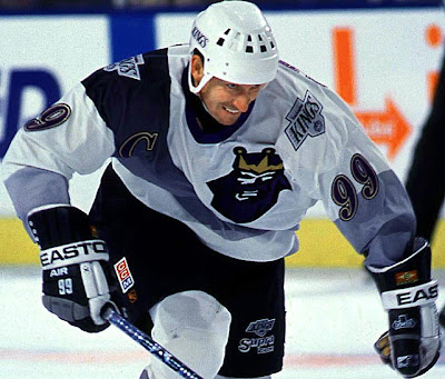
Los Angeles Kings 1995-96

(via The Royal Half)
Gradient swoop. A font better suited for a term paper. The return of purple and gold. and that logo. BURGER KING! If you thought seeing Lecavalier in that Bolts jersey was a disgrace, then there's no bigger disgrace than the Great One wearing this. I don't have to say much about this one. While an all-time classic for collectors, an all-time stinker for players.
Gradient swoop. A font better suited for a term paper. The return of purple and gold. and that logo. BURGER KING! If you thought seeing Lecavalier in that Bolts jersey was a disgrace, then there's no bigger disgrace than the Great One wearing this. I don't have to say much about this one. While an all-time classic for collectors, an all-time stinker for players.
NUMBER 1!
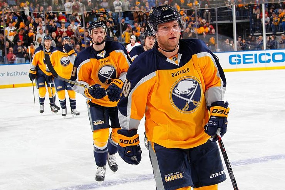
Buffalo Sabres 2013-15
(via Icethetics)
I had mentioned the Preds mustard jersey as a turdburger only to make the burger-mustard joke. However if you do a Google search of the word "turdburger", this is the seventh result, and the first one not actually related to human bowel movements or burgers, seventh result overall. From the front it looks ok, but coulde use some work with that silver trim. From the back, you'd never guess that it was the same jersey. The back is navy, the front is yellow. This jersey has every right to be called Dr. Frankenstein's newest monster, but instead we call it the Turdburger.
HONORABLE MENTION: Dallas Stars 2003-06 (Mooterus).
That'll do it for this week. Concepts return next week unless Ryan's computer isn't fixed and/or issmashed to pieces and subsequently replaced by the end of the week.
Wednesday: WELP
 Reviewed by Unknown
on
August 24, 2016
Rating:
 Reviewed by Unknown
on
August 24, 2016
Rating:





4 comments:
The fact wild wing isn't number one is interesting. The fact it isn't even on the list is just sad.
So where was Wild Wing on this list?
I posted this earlier in the week but it might have been too late for anyone to see it. So here it is:
Ctrl C
Ctrl V
Icethetics had an article saying the second they put ads on the WCoH jerseys, we, as Hockey Jersey enthusitists, need to respond. Loudly. I don't know what the deal between HJC and Icethetics is, but I am now passing on the message. We NEED to stop this from happening. We CANNOT have ads on NHL jerseys. Pass the message: NO ADS!!! #Stoptheads #Notonmyjersey
GO JACKETS!!! GO MONSTERS!!! GO BUCKS!!! BOO ADS!!!
I own two of these (Atlanta and Philly). I think your list is fair, you and I agree to disagree on the Islanders jersey (that diamond pattern, I love it) I will defend some of these because hey, discussion is awesome!
10- Nailed it
9- It was the first real deviation we saw of the Flyers traditional jerseys and the striping looked good. To be fair that chromed Flyers logo was not the worst to come out in that era
8- I love it
7- The sad thing about that jersey is if it had a real logo it'd be tolerable, I agree with the shoulder patches, but the template could have worked
6- Nailed it, the jersey was salvageable with a better shade of yellow
5- I have a soft spot for this jersey, and I get it is divisive amongst Bruin fans
4- It's the worst of the 90s flamboyant jersey, but I'd love to own one
3- I agree with you on the shoulder patches, but i do like that the pattern chosen matches the logo
2- I want one, but I will say if Gretzky never wore it, would it be as hated?
1- Seriously, you can google turdburger and this will come up rather quickly (it was the 3rd on my phone), the players look so sad in it.
Good list none the less
Post a Comment