Thursday: Classic Blues
So after leaking about a week ago, the St. Louis Blues have officially unveiled their jerseys for the upcoming Winter Classic.
Personally I really like the look, and I think it would be a good modern day look if they used the current logo. The only thing I don't like is the inconsistency between hem and arm stripe thickness, and that feature can be attributed to history, so I don't mind.
Overall: Good vintage look, 9/10
I'd expect all of the other new uniforms to be unveiled soon as well, plus we've seen a few other leaks, so keep your eyes peeled for new jerseys.
--------------------------------------
This week is a simple week, only the COTW vote. Unless you're participating in The Season and haven't submitted your concept yet, if so, it's due tomorrow.
--------------------------------------
Brooks F. - Brandon Wheat Kings
Our #WinterClassic jersey is vintage, old-school and even original. But most of all, it’s perfect. https://t.co/6RSqK2ZjzI #stlblues pic.twitter.com/iQTXLWdMO9— St. Louis Blues (@StLouisBlues) November 9, 2016
Personally I really like the look, and I think it would be a good modern day look if they used the current logo. The only thing I don't like is the inconsistency between hem and arm stripe thickness, and that feature can be attributed to history, so I don't mind.
Overall: Good vintage look, 9/10
I'd expect all of the other new uniforms to be unveiled soon as well, plus we've seen a few other leaks, so keep your eyes peeled for new jerseys.
--------------------------------------
This week is a simple week, only the COTW vote. Unless you're participating in The Season and haven't submitted your concept yet, if so, it's due tomorrow.
COTW vote Oct 28 - Nov 3 (ends Friday @ noon Eastern)
Get your The Season entries in by Nov 11!
--------------------------------------
Brooks F. - Brandon Wheat Kings
+Always like a unique primary color used, good choice.
+Good color balance.
+Nice font and logo choice.
+I really like the wheat in the stripes. It may be too much for the NHL but it works here. It works great for the pants stripe.
-The designs look a bit too busy/crowded. I'd drop the shoulder yokes, it works on the alternate.
-Yellow numbers may not be the best idea on a white jersey, even with a black outline.
Overall: 8/10
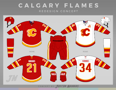
Justin N. - Calgary Flames
+While this has no effect on the concept itself, the fact that it won the competition gives it a bit of prestige. Kind of like how a jersey that's lifting the Stanley Cup gains a legacy.
+The Flames are due for a redesign at this point, still using their original Edge uniforms.
+While I don't hate it, I'm not a big fan of the black in the Flames uniforms. I'm in favor of removing it.
+Good color balance.
+Really like the font.
-Minor issue, but the hem stripe on the white jersey doesn't color a pattern that's anywhere else on the jersey. Just add some consistency and it'll be much better I think.
-An even smaller issue, I'd reverse the helmet logo on the red helmet so it faces the front of the helmet. I know the Penguins do this but I'm not sure about other teams.
Overall: 9.5/10 and my COTW nomination
Ryan C. - Calgary Flames
+If the Flames are to use black, I think it works best as just a trim/accent color like it is on the jerseys. I'd prefer red pants/helmet, but there's no reason to mark that as negative since that's only my personal preference.
+On that note, I really like the black numbers on the white jersey.
+Good font choice too.
+I like the use of the script logo on the front, and that secondary on the shoulders.
-I think the solo flaming C would be much better as the primary logo on the home/away set, the script is better suited to an alternate.
+Simple, traditional striping is the best way to go for Calgary I think.
-I like how you stepped out of the box with the pants, but it just doesn't work. It looks too gimmicky and to some degree like a design from the '90s.
Overall: 8/10
--------------------------------------
And that's all for today. I hope you enjoyed the post, thanks for reading, and I'll see you all again next week.
Thursday: Classic Blues
 Reviewed by Bpoe
on
November 10, 2016
Rating:
 Reviewed by Bpoe
on
November 10, 2016
Rating:


2 comments:
Brooks F for COTW
Chicago unveiled theirs.
Post a Comment