Thursday: I Challenge You
Hello everyone, welcome back!
Not much news to report lately aside from the fact that Las Vegas will be unveiling their logo and name next Tuesday, the 22, in case you missed that. I'm very curious as to what the decision was, and I'm hoping their logo doesn't look rushed considering that it's possible they didn't start this process until after they were approved. I'm not really sure what to expect, though, aside from maybe the usage of black and vegas gold. We'll find out soon I guess.
With the extra time you have from this week's short posts, take some extra time to go vote, or maybe enter the Caps competition. Don't worry, it's toll free.
Caps entries:
Jimmy T.
Not much news to report lately aside from the fact that Las Vegas will be unveiling their logo and name next Tuesday, the 22, in case you missed that. I'm very curious as to what the decision was, and I'm hoping their logo doesn't look rushed considering that it's possible they didn't start this process until after they were approved. I'm not really sure what to expect, though, aside from maybe the usage of black and vegas gold. We'll find out soon I guess.
With the extra time you have from this week's short posts, take some extra time to go vote, or maybe enter the Caps competition. Don't worry, it's toll free.
COTW-October vote (ends Friday @ noon Eastern)
COTW Nov 4-10 vote (ends Friday @ noon Eastern)
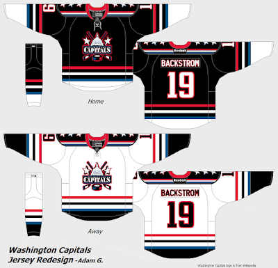
Washington Capitals ReDesign (entries due Friday @ noon Eastern)
Jimmy T.
Tyler M.
Adam G.
----------------------------------------------
Brooks F. - South Carolina Stingrays
+For those who don't know, this was one of Brooks' two entries in the competition that was hosted by Icethetics about a month or two ago. Personally, this is my favorite of the two designs you entered.
+Good logo choice (well...you didn't technically have a choice here). It must feel nice being able to say "Shoulder patch created by me", huh?
+The striping pattern is solid, and the added tail shape on the hem makes it even better.
-I do think it would help to be a bit thicker, though. The problem is that the tail shape won't work as well with a larger stripe, so I'm not sure what to do there.
+Good color balance.
-I'm not completely sure, but the design may look less busy, therefore better, if you remove the shoulder yoke.
Overall: 9/10 and my COTW nomination
Lucas D. - Pittsburgh Penguins
+One of the things Vegas Gold really had going for it is that it was unique to the NHL. Quite interesting to see it take over as the primary color of a uniform.
+With a modern color like that, a modern design fits well. Good idea to go with the pre-edge design.
+Assuming the equipment is black, good color balance.
-It would be nice to see that equipment as part of the concept.
+Good idea to keep the retro design too, and even better as the consistency has been improved.
-On the main set, the diagonal striping should continue through to the back inside hem instead of stopping after the front, as the back's design would be showing there.
Overall: 8.5/10
----------------------------------------------
That's all for today! I hope you enjoyed the post, thanks fo- wait, hold up a minute I'm not done yet.
I usually don't end posts with the articles and stuff, but I figured it'd be fresher on your mind this way. So, to attempt to combat the shortage of concepts, here are a few challenges for you guys, and feel free to comment any other ideas!
-Use both Vegas and Pittsburgh gold in the same uniform. Not like Lucas did above, use both on the actual same jersey.
-Use this random color generator to choose a team's color scheme, and make a concept for them with it.
-If you want to get more random, use the random number generator to decide how many stripes you have, how many colors you use, whatever you want.
-Completely screw up a team, especially an original 6. Change everything you know about their branding, just do something new.
If I get any other ideas I may update the post later, but for now, try out one of these.
Now that's really all for today. I hope you enjoyed the post, thanks for reading, and I'll see you all again next week.
Thursday: I Challenge You
 Reviewed by Bpoe
on
November 17, 2016
Rating:
 Reviewed by Bpoe
on
November 17, 2016
Rating:


1 comment:
Brooks F. for COTW!
Also have to say I really dig the idea behind Adam G's Caps entry
Post a Comment