Tuesday: Traditional and Vintage
Hello again, and welcome, Hockey Fans, to this Tuesday's post!
There's not a whole lot of uniform news, as the NHL playoffs are in the second round, but the Dallas Stars did unveil the patch that they will be wearing next year for their 25th Anniversary in Texas. And it's chrome...
It's kinda odd, but it does fit with the current identity...
As for HJC, we have our regular COTW voting, and we have our Random Competition going on right now! Now let's see some of our latest entries!
Thomas J.- Minnesota Wild (Green & Grey)
Anthony C.- Montreal Canadiens (Blue & White)
Spencer R.- Winnipeg Jets (Blue & Black)
Vaughn R.- St. Louis Blues (Red & Orange)
Chase C.- Dallas Stars (Red & Blue)
Don't forget to get you're entries in by Friday! And then don't forget to vote!
COTW vote April 21-27
Random Comp
On to the concepts!
-----------------------------------------------------
Jordan R.- Hamilton Tigers (Defunct NHL)
First up we have Jordan and his update on defunct NHL teams! This one belongs to the Hamilton Tigers!Good-
- I love the logos and Striping pattern!
- Very Classic Feel to it!
- Very similar to the Boston Bruins!
Bad-
- It's very similar to the Boston Bruins. (This is both good and bad... It looks great, but is a little too close. It also brings up the idea of what the Bruins would look like if the Tigers still existed, because the Bruins first year, was the 1925, which was the last year of the Tigers, the Bruins wore brown and gold. What would the Bruins look like in this Modern update???)
My rating: A fantastic update for the Vintage Hamilton Tigers! 9/10 and my COTW NOMINEE!!!!!
Ryan C.- Kalamazoo Wings (ECHL)
Next up is Ryan and his Kalamazoo Wings concept!
Good-
- I really like the sleeve length yoke! It keeps the current feel, but changes it up a little!
- I also like the sock pattern! It reminds me of the 2000-2006 Calgary Flames socks
- Number font also looks good!
Bad-
- I don't like the White logo on the white sweater. Their current logo has the blue wordmark across the front, so the color works out a little better. Using a blue or red logo would have worked better...
- The pants stripe doesn't fit the best...
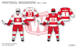
Jordan R.- Montreal Wanderers (Defunct NHL)
Jordan continues his defunct series with the Montreal wanderers!
Good-
- I LOVE the TV numbers in the shield!
- I also like the double outline on the red jersey's logo
- I also like how the back numbers are completely inside of the stripes
- I don't like the socks compared to the jersey striping. Matching those would look better
Anthony C.- Trail Smoke Eaters (BCHL)
Next up is one of our busiest concept artists, Anthony, and his Trail Smoke Eaters concept!
Good-
- I like the simplified striping pattern
- I also like the orange numbers!
- I don't the tail stripe not matching the arm stripes
- I also don't like the logo on the black jersey. It needs an outline, as their current black jersey has the white outline...
Ryan H.- Washington Capitals (NHL)
Ryan has the next concept for the Washington Capitals!
Good-
- I love the striping pattern, especially the the Star!
- I also really like the white shoulder yoke!
- I also like the Weagle on the front!
Bad-
- The blue numbers and Captains patch might be hard to read... the opposite colored numbers would be easier to read...
- I also would like to see the backside of the sweater, and the equipment
My rating: A good looking concept, but I would like to see more of it... 7/10
Anthony C.- HC CSKA Moscow (KHL)
Anthony has the last concept of the day with a concept for HC CSKA Moscow!
Good-
- I really like the striping pattern!
- I also like the idea of putting the TV numbers on the shoulder yoke to make room for the stripe.
Bad-
- The TV number has a one, so the "6" should leak a little to the other side, like this...
- The TV numbers, logos, and the Captain's patch are all small...
- I'd also like to see the equipment for this concept...
My rating: A decent concept, but a few execution errors are bringing it down... 7/10
----------------------------------
Tuesday: Traditional and Vintage
 Reviewed by Chase A. Carlson
on
May 02, 2017
Rating:
 Reviewed by Chase A. Carlson
on
May 02, 2017
Rating:


2 comments:
Jordan's Wanderers concepts for COTW
2nd the Wanderers concept for COTW
Post a Comment