Friday: Red and Blue
Hello everyone, welcome back!
No new news to talk about today, as this time of year normally doesn't have much new being unveiled, so I'm just going to jump right into it!
This week in voting we have a fairly laid back week, with only the COTW vote, and the entries for the Australian Ice Hockey League re-design. Click the banner up top for more info! For anyone interested in writing for the blog, you still have until 6pm ET TODAY to get your mock posts in. Not much time, but there is some (if you're reading this right away, that is).
-------------
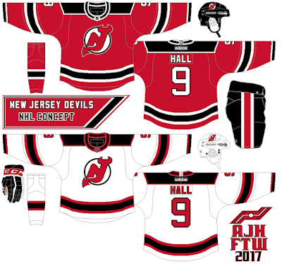
Alan H. - New Jersey Devils
-------------
No new news to talk about today, as this time of year normally doesn't have much new being unveiled, so I'm just going to jump right into it!
This week in voting we have a fairly laid back week, with only the COTW vote, and the entries for the Australian Ice Hockey League re-design. Click the banner up top for more info! For anyone interested in writing for the blog, you still have until 6pm ET TODAY to get your mock posts in. Not much time, but there is some (if you're reading this right away, that is).
COTW Sept 15-21 vote (ends Friday @ noon ET)
Australian Ice Hockey League Comp (entries due Oct 13 @ noon ET)
Writer Applications (due TODAY @ 6pm ET)
-------------
Alan H. - New Jersey Devils
+Realistically, sticking close to their identity is a good move.
+I'd take these over their current long sleeve shirts any day.
+The changes you've made to this set mostly improve it, especially the white outline on the red jersey's yoke. It really helps it pop.
-I would avoid the multi-outlined collar in the way you did it. It makes the shoulder and collar area look very busy, especially on the home jersey.
-Helmet logos look way too big.
-This concept also isn't very creative at all; it's basically the Devils' old set with a yoke outline, different collar, cuff stripes, and curved stripes. Depending on your purpose for this series, that may not be a bad thing, though.
Overall: 7.5/10
Anthony C. - Michigan Wolverines
+This is a beautiful color scheme, and you've used it well. The yellow and white both pop well.
+Similarly, good job keeping them from touching (aside from the pants). As you can see from the pants, they would blend together a bit if they did touch.
+While the arms look a bit plain, I don't think it's bad enough to not work, especially with the yoke stripes added.
-The arms could probably use something, though, even something little.
-Change the pentagon to blue. It really doesn't add anything standing out like that.
Overall: 8.5/10
Jets96 - Kalamazoo Wings
+A fundamentally solid design for the K-Wings.
-One issue is that the red and blue vibrate a bit more here when touching, though.
-Compared to those jerseys, again, this is definitely a less unique look.
+Props for doing something new, though.
+I like the white hem and cuff color on the blue jersey. Definitely helps the color balance between the two jerseys.
-Small nitpick, but shouldn't the helmet logo be rotated a bit, to match the helmet's rotation?
Overall: 8.5/10
Justin B. - New York Rangers
+Good adaptation of their alternate jerseys into a full set.
+Glad you dropped the vintage white.
+I also dig the "NEW YORK" being used for the road jersey.
+I like the yoke stripes on the home.
+ Interesting to see the logo you used as their primary (despite it never showing up on jerseys). I think I'm a fan, personally.
-Not a big fan of the navy blue being used for a team that's primarily blue, though I'm a fan of bold and vibrant colors for jersey design.
-This isn't the most creative design I've ever seen, though it's not exactly a straight copy of current jerseys either.
Overall: 8/10
And that's all for today! I hope you enjoyed the post, thanks for reading, and I'll see you all again next week.
Friday: Red and Blue
 Reviewed by Bpoe
on
September 29, 2017
Rating:
 Reviewed by Bpoe
on
September 29, 2017
Rating:


1 comment:
Anthony's Michigan for COTW.
Post a Comment