Wednesday: A Familiar Situation
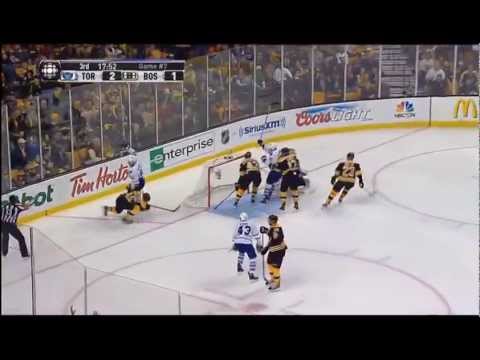
Another Wednesday rolls along, which means it's my turn to welcome you all to HJC. A massive day in the hockey world as tonight all eyes will be in Boston for game 7 against the Toronto Maple Leafs. Something like that has happened once before. The Leafs storming back from a 3-1 series deficit to force a game 7 in Boston..... AND THEN WHAT HAPPENED?
Be warned if the Leafs take a 4-1 lead....
COMPETITION: The St. Andrew's design comp is ending soon. Get your entries in this Friday!
ENTRIES SO FAR:
Brooks F (1):
Brooks F (2):
REMINDERS:
ON TO THE CONCEPTS!
Adam G: Nashville Predators Concept
Here Adam continues with his De-Zero series (see last week for the terminology) with Nashville. Nashville's Adidas jerseys were simple when they came out. Almost too simple. These jerseys are also simple, but a bit more dynamic than a traditional design with the angled stripes. The inclusion of grey is interesting, and a move I think is a direct result from the use of the old alternate logo based on the tower attached to Bridgestone Arena. Now while that logo was dumped well before the name of the arena changed, it's still a nice logo that honors a unique piece of architecture that the Predators contributed to the Nashville skyline. I'm just not sure how effectively the grey serves it's purpose as separation between the stripes and hem/sleeve ends, moreso on the yellow jersey. I get that you're trying to avoid yellow blending in with white, but the grey does exactly that. The pants could also use that yellow stripe they currently have.
Rating: 80%
Adam G: Vegas Golden Knights Concept
Vegas has known nothing but Adidas in their brief time in the NHL when it comes to apparel. The logo was unveiled after the Adidas announcement, so because they were not officially a team until this season, Adidas had all the rights to manufacture their apparel. But now Adam says it's CCM's turn. I kind of liked how their jerseys used grey as a base color, since with their entire color scheme as is, it lightened up the look of the entire jersey instead of this black base we see here. The grey base works because the only black that is used in the logo is the background of the shield behind the helmet. Everything else is either grey, gold or white. Using black as a base color kind of takes away from the purpose of the shield. It looks good but isn't optimal. And on top of that, going with a striping pattern that doesn't use white is harder on the darker black background than the grey. The road whites keep the exact striping as the home blacks, which is a nice touch. I just wonder what would happen to this look if you swapped the black and grey. I think it would be an improvement.
Rating: 77%
Lucas D: Nashville Predators Concept
One of the challenges Nashville had in their most recent Reebok jerseys was keeping the pattern consistent between the jerseys but swapping yellow for white. It forced the road jersey to move away from having yellow as their dominant color. I use that as a comparison to this because I've already mentioned how boring Nashville's Adidas set is. Here Lucas does one thing to improve the Preds' jerseys. He has a simple design for the road, but he changes the base color for the away jersey to white while keeping the white stripes intact around the blue ones (which have an amazing checkerboard pattern to relate back to the last Predators alternate jersey in the Reebok era), while keeping yellow as the dominant color with a full sleeve yoke design. He also adds a second shoulder patch to Nashville's existing idea, which is only one patch. That helps balance out the jerseys much better. I'd buy this if I could, but two things prevent that: copyright issues preventing production and my wallet's lack of funds. I'd dump the white on the collar, and add the keyboard design on the inside of the collar.
Rating: 97%
The WINNER of my Concept of the Week Nomination is:
Another Wednesday in the books. And as the playoffs started with me here at HJC, so too do they end. Game 7. Winner Take All. Here's hoping we can celebrate Maple Leafs Elimination Day tomorrow. But until then I will see you next week. Keep on the lookout for Round 2 of the HJC Playoff Pool upon the conclusion of the Bruins-Leafs game. It will be posted sometime soon since the Penguins and Caps get Round 2 started tomorrow at 7 with the Sharks and Golden Knights to follow. You don't have much time to make your picks so watch this space. See you next week!
Be warned if the Leafs take a 4-1 lead....
COMPETITION: The St. Andrew's design comp is ending soon. Get your entries in this Friday!
ENTRIES SO FAR:
Brooks F (1):
Brooks F (2):
REMINDERS:
COTW April 13-19 vote (ends Friday @ noon ET)
St. Andrew's College jersey entries (due Friday @ noon ET)
ON TO THE CONCEPTS!
Adam G: Nashville Predators Concept
Here Adam continues with his De-Zero series (see last week for the terminology) with Nashville. Nashville's Adidas jerseys were simple when they came out. Almost too simple. These jerseys are also simple, but a bit more dynamic than a traditional design with the angled stripes. The inclusion of grey is interesting, and a move I think is a direct result from the use of the old alternate logo based on the tower attached to Bridgestone Arena. Now while that logo was dumped well before the name of the arena changed, it's still a nice logo that honors a unique piece of architecture that the Predators contributed to the Nashville skyline. I'm just not sure how effectively the grey serves it's purpose as separation between the stripes and hem/sleeve ends, moreso on the yellow jersey. I get that you're trying to avoid yellow blending in with white, but the grey does exactly that. The pants could also use that yellow stripe they currently have.
Rating: 80%
Adam G: Vegas Golden Knights Concept
Vegas has known nothing but Adidas in their brief time in the NHL when it comes to apparel. The logo was unveiled after the Adidas announcement, so because they were not officially a team until this season, Adidas had all the rights to manufacture their apparel. But now Adam says it's CCM's turn. I kind of liked how their jerseys used grey as a base color, since with their entire color scheme as is, it lightened up the look of the entire jersey instead of this black base we see here. The grey base works because the only black that is used in the logo is the background of the shield behind the helmet. Everything else is either grey, gold or white. Using black as a base color kind of takes away from the purpose of the shield. It looks good but isn't optimal. And on top of that, going with a striping pattern that doesn't use white is harder on the darker black background than the grey. The road whites keep the exact striping as the home blacks, which is a nice touch. I just wonder what would happen to this look if you swapped the black and grey. I think it would be an improvement.
Rating: 77%
Lucas D: Nashville Predators Concept
One of the challenges Nashville had in their most recent Reebok jerseys was keeping the pattern consistent between the jerseys but swapping yellow for white. It forced the road jersey to move away from having yellow as their dominant color. I use that as a comparison to this because I've already mentioned how boring Nashville's Adidas set is. Here Lucas does one thing to improve the Preds' jerseys. He has a simple design for the road, but he changes the base color for the away jersey to white while keeping the white stripes intact around the blue ones (which have an amazing checkerboard pattern to relate back to the last Predators alternate jersey in the Reebok era), while keeping yellow as the dominant color with a full sleeve yoke design. He also adds a second shoulder patch to Nashville's existing idea, which is only one patch. That helps balance out the jerseys much better. I'd buy this if I could, but two things prevent that: copyright issues preventing production and my wallet's lack of funds. I'd dump the white on the collar, and add the keyboard design on the inside of the collar.
Rating: 97%
The WINNER of my Concept of the Week Nomination is:
LUCAS D
NASHVILLE PREDATORS CONCEPT
Another Wednesday in the books. And as the playoffs started with me here at HJC, so too do they end. Game 7. Winner Take All. Here's hoping we can celebrate Maple Leafs Elimination Day tomorrow. But until then I will see you next week. Keep on the lookout for Round 2 of the HJC Playoff Pool upon the conclusion of the Bruins-Leafs game. It will be posted sometime soon since the Penguins and Caps get Round 2 started tomorrow at 7 with the Sharks and Golden Knights to follow. You don't have much time to make your picks so watch this space. See you next week!
Wednesday: A Familiar Situation
 Reviewed by Unknown
on
April 25, 2018
Rating:
 Reviewed by Unknown
on
April 25, 2018
Rating:


5 comments:
Phil sucks!
Adam G's Vegas Golden Knights Concept for the COTW.
Ryan for COTW! (Comment of the week, that is)
Second Lucas D's Preds for COTW.
Adan G's Nashville for COTW
Post a Comment