Sunday: Speed run!
Howdy. First off, thank you Steve G for covering for me while I had to deal with a family matter. I'm back and I'm going to speed run it.
We have the COTW, COTW Q4, and the Maple Leafs alternate jersey (I still have nightmares about that post Ryan) so get on it.
Negatives: other than what I stated, the stripes are too thin for my liking, the numbers just look strange on the jersey with a traditional design. Also, the white jersey looks extremely bare compared to the dark jersey.
Overall: 7.5/10
Positives: Really digging the candy stripe yoke and simple striping overall. It's a good choice for a team named "Americans." As for the logo, it's really nice and modern looking.
Negatives: Getting back to the crest logo, while it's nice and modern it would suit more as a shoulder patch or as a logo for a soccer team.
Overall: 9/10
Negatives: It's really plain. After being around for 40 some years you think that they would have modernized their style by now. I could see this as an alternate jersey but as a full time set in today's game? They would most likely come up with some modern style design like they all do or make it a little more different than what you have, but good job.
Overall: 8.25/10
Negatives: That huge yoke just looks strange in the front and I would expect a more modernized logo.
Overall:8.5/10
Negatives: The English style "D" doesn't really fit on the white jersey. Put the main logo or that beautiful modern style "D" that they wore on their last SS jerseys and you got a great jersey to work with.
Overall: 9/10 COTW NOMINEE
Negatives: The "B" looks a little big and that tiny little sliver of black next to the yellow stripes can be a bother.
Overall: 8.75/10
Negatives: What the *Explicit* kind of color is that? is it magenta? I can't tell. Whatever it is, it doesn't work well on this or any hockey jersey (unless you're owned by the Hart brothers).
Overall: 8/10
Negatives: That silver in the triangle of the Mighty Ducks logo just throws this whole jersey off. Make it that gold color again and you've nailed it!
Overall: 9/10
We have the COTW, COTW Q4, and the Maple Leafs alternate jersey (I still have nightmares about that post Ryan) so get on it.
COTY Semi-Final votes (end Friday @ noon Eastern)
COTW Jan 13-19 vote (ends Friday @ noon Eastern)
TOR 3rd Jersey Top 3 vote (ends Friday @ noon Eastern)
Ben S- New Jersey Devils
Positives: The striping on the yoke looks really good and it's actually nice to see you bring back the dark green.Negatives: other than what I stated, the stripes are too thin for my liking, the numbers just look strange on the jersey with a traditional design. Also, the white jersey looks extremely bare compared to the dark jersey.
Overall: 7.5/10
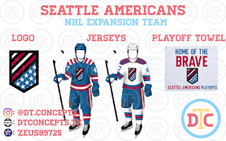
DTC- Seattle Americans
Positives: Really digging the candy stripe yoke and simple striping overall. It's a good choice for a team named "Americans." As for the logo, it's really nice and modern looking.
Negatives: Getting back to the crest logo, while it's nice and modern it would suit more as a shoulder patch or as a logo for a soccer team.
Overall: 9/10
Tyler M.S.- Houston Aeros
Positives: The simplistic design of the jersey that looks similar to the original jersey is nice with the logo of the former AHL team attached looks really nice overall and it's a nice to see a team remain rooted in history, much like the Canadiens.Negatives: It's really plain. After being around for 40 some years you think that they would have modernized their style by now. I could see this as an alternate jersey but as a full time set in today's game? They would most likely come up with some modern style design like they all do or make it a little more different than what you have, but good job.
Overall: 8.25/10
Tyler M.S.- Indianapolis Racers
Positives: The hem stripe looks amazing and the names in the yoke was a pretty good ideal as well.Negatives: That huge yoke just looks strange in the front and I would expect a more modernized logo.
Overall:8.5/10
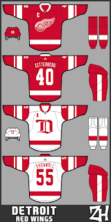
Zach H- Detroit Red Wings
Positives: Keeping the jersey predominately the same with the new striping and looks beautiful. It's a minor adjustment that could really work with the Red Wings.Negatives: The English style "D" doesn't really fit on the white jersey. Put the main logo or that beautiful modern style "D" that they wore on their last SS jerseys and you got a great jersey to work with.
Overall: 9/10 COTW NOMINEE
Ryan H- Boston Bruins
Positives: This jersey really sticks true to the bruins style of jersey. It has elements of the old jerseys and brings in new elements as well. Also, the numbers look pretty good.Negatives: The "B" looks a little big and that tiny little sliver of black next to the yellow stripes can be a bother.
Overall: 8.75/10
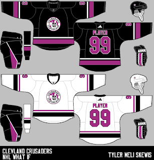
Tyler M.S.- Cleveland Crusaders
Positives: The striping on the jersey and pants are very nice and effective.Negatives: What the *Explicit* kind of color is that? is it magenta? I can't tell. Whatever it is, it doesn't work well on this or any hockey jersey (unless you're owned by the Hart brothers).
Overall: 8/10
Zach H- Anaheim Ducks
Positives: Really like the striping on this jersey. It give both jersey a different feel with the same striping, in a good way. Also, the "OC" patch on the shoulders looks awesome as well.Negatives: That silver in the triangle of the Mighty Ducks logo just throws this whole jersey off. Make it that gold color again and you've nailed it!
Overall: 9/10
Well that's all the time I have for you guys today. Thanks again Steve G and I'll see you guys next week.
Sunday: Speed run!
 Reviewed by Steve Marc
on
January 22, 2017
Rating:
 Reviewed by Steve Marc
on
January 22, 2017
Rating:


No comments:
Post a Comment