Wednesday: The Pride of Women's Hockey
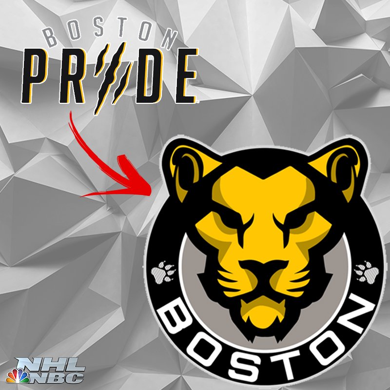
NEWS: The latest news in hockey design is the release of a new logo for the Boston Pride of the NWHL.

(Graphic via NHL on NBC)
There's more information surrounding the logo here at SB Nation's The Ice Garden here.
Its without question a major improvement over the inaugural wordmark logo, but it does look a bit awkward with the positioning of the paw prints, with stripes across the pawprints. Also I think the ring in its entirety is rather pointless, as the standalone head could suffice as the primary logo.
Rating: 75%
COMPETITIONS: The Arena Logo comp. We have 2 logos so far. That's literally it. Come on guys, have a go!
I am working on a logo though so keep your eyes peeled here.
REMINDERS:
COTW vote September 8-14 (ends Friday @ noon ET)
Arena Logo Competition entries (due Friday @ noon ET)
ON TO THE CONCEPTS!
Alan H: Dallas Stars Concept
I have always thought that Dallas could incorporate more silver in their scheme I think this is a step in the right direction, but I also think the off colored cuffs are unnecessary. Plus I think the socks could use some more color to better match the sleeves, preferably under the existing striping.
Rating: 83%
Alan H: New York Islanders Concept
For this concept the devil is in the details. The striping is reminiscent of the Fisherman era, just less crazy. The name and number represent the best player to ever wear 66 (inb4 upset Penguins fans). The shoulder patch is interesting, as I interpret it as a representation of the 5 boroughs of New York City (the pentagon shape) plus 4 waves for the 4 cups. There are also 4 stripes behind the NHL shield on the collar. Plus with the new Adidas jerseys, the Islanders logo looks better on white with a blue outline around the logo. The patch is a little rough around the edges though.
Rating: 89%
FC MacBeth: SM Tshung Tsin Sabah (Malaysian Secondary School) Concept
One of your tamer concepts here, as you create a concept for a secondary school in Malaysia. Can't say someone has done that before so props to you. I do want to point out though the inconsistent shades of red between the logo and the main sets of jerseys. The darker red actually is a cool touch though for the alternate, and with the text in the chest stripe, it does give off a feel of a high school/collegiate jersey. The text on the hem of that alternate is cool too. Maybe primarily red gloves for that alternate would be good.
Rating: 80%
Jets96: Adirondack Thunder (ECHL) Concept
Somehow this looks better without the yellow the Thunder use. The lightning bolts work well on the pants. I think that a black helmet would look better for this set. Nice touch of the helmet wings. Nothing that really stands out enough for me considering that this is an ECHL team. Which by the way, ECHL branding would be nice here.
Rating: 78%
Jets96: Florida Everblades (ECHL) Concept
Using the brighter shade of green from the logo as the base color here is the right idea, as it helps the logo stand out better. The silver is a nice touch too. I'm not a fan of the single white stripe on the pants though. This is not an upgrade from their current look, but not a bad look. Again, could use ECHL branding.
Rating: 75%
Lucas D: 2018 Winter Classic (New York Rangers vs Buffalo Sabres) Concept
Personally I do not believe the Rangers will use that logo on the front of their jerseys. Still a classic jersey regardless, though the Rangers obsession with navy blue is a bit confusing. That Sabres jersey is the better of the two as it throws back to the original Sabres look. When the Sabres formed, Punch Imalch was recently fired from the Leafs. After his hiring as GM and coach of the Sabres for their inaugural season, he wanted to have the Sabres look like the Leafs as a bit of payback/rivalry, so the Sabres had three sets of 3 stripes on their socks. Lucas expands on that here well.
Rating: 87%
Matt G: Dallas Stars Concept
Matt replaces the silver with gold from the previous Stars identity. The gold is then used minimally as a trim to outline the striping pattern on the home and away jerseys. The alternate is like the pre-edge Stars look minus white trim outlining the gold and black. Slightly different but not too different. The historic jersey looks great especially with that outline. However I'm in the minority that believe that black actually helped the North Stars look, because of the yellow and white being together. They are distinct enough, but it would look better regardless.
Rating: 90%
The WINNER of my Concept of the Week nomination is:
MATT G
DALLAS STARS CONCEPT
Split squad action tonight in Brooklyn and Lehigh Valley between the Islanders and the Flyers. Regular season is almost here! GET HYPED! SEE YOU NEXT WEEK!
Wednesday: The Pride of Women's Hockey
 Reviewed by Unknown
on
September 20, 2017
Rating:
 Reviewed by Unknown
on
September 20, 2017
Rating:


7 comments:
Lucas D's 2018 Winter Classic concept for the COTW.
On my Islanders concept I had Tavares on the back, but due to rumors of him being on the trading block during the off-season so I quickly put Ho-Sang on the back.
Alan H's Islanders for COTW.
Great idea on the Stars alt. Takes the page from the Avs Adidas jersey and works just as well.
I second Matt G it's a sick concept. It's got to win the COTW vote.
I'll second Alan's Islanders set for COTW
Tavares isn't going anywhere. Period.
2nd Alan H.'s Islanders for COTW.
Post a Comment