Friday: Rats and Stars
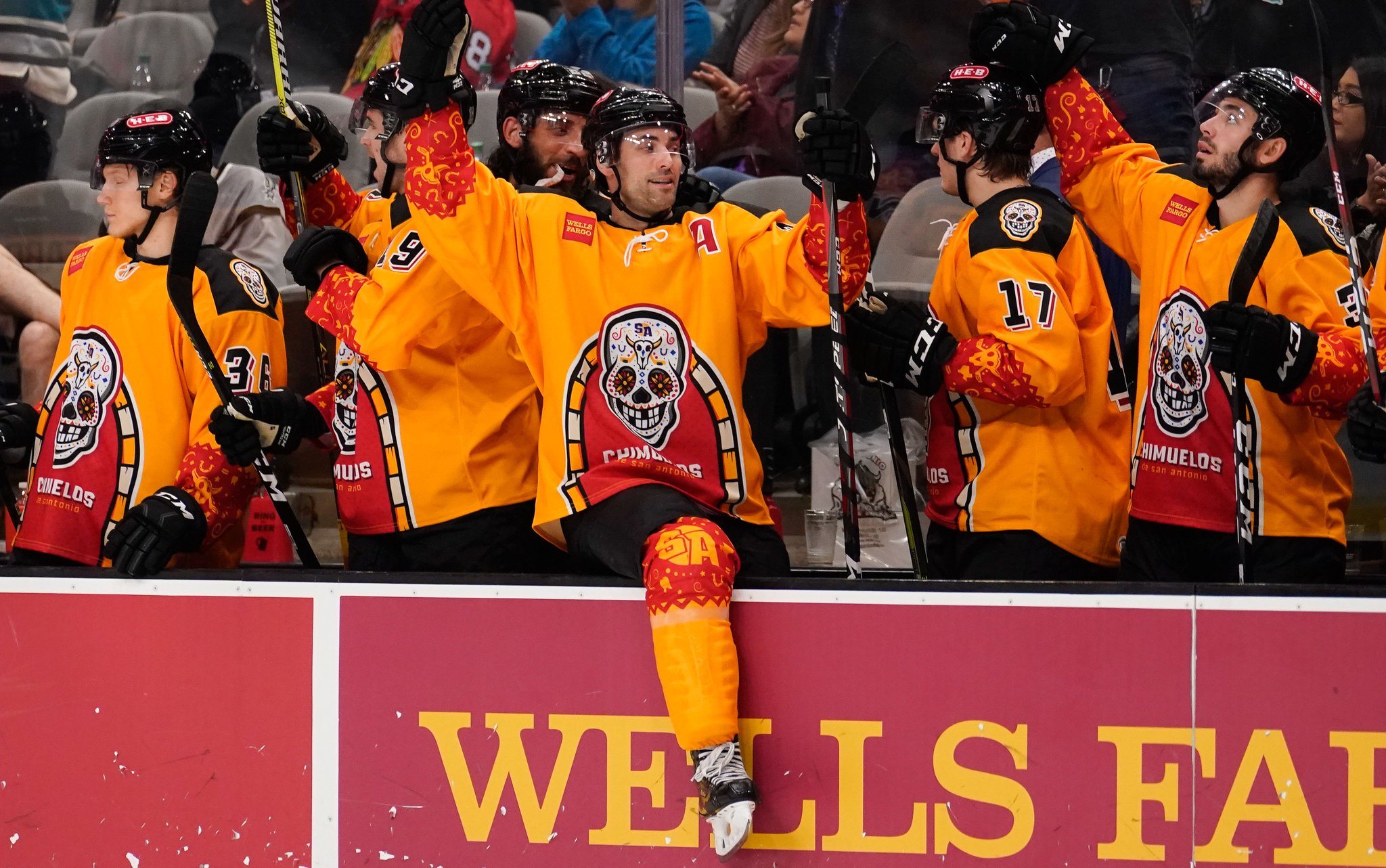
Hey y'all, and welcome to another Friday post here at HJC. Wednesday morning, the San Antonio Rampage announced that its Hispanic Heritage jerseys will be worn four more times this year.
The Rampage, who will be rechristened the "Chimuelos" (or "toothless" for our gringo readers), will be wearing these specialty jerseys for the final Friday games in the months of November, December, January, and March. While the jersey itself if okay, I'm a much bigger fan of the idea behind it, as I think many minor league teams, especially ones in non-traditional hockey markets, could benefit from specialty uniforms that tie into the local culture and heritage. This can really drum up local support and even give fans a more personal stake in the team. Given the close proximity of San Antonio to the Mexican border, celebrating Hispanic heritage with this uniform is a no-brainer, and will definitely help garner fan attention in a market that's pretty heavily dominated by the local basketball team. I like the move, and I hope that other teams follow suit, as other minor league sports teams have shown that it can work.
In voting news, we have the regular COTW vote for November 9-15, with polls closing Friday at noon EST. We are also in the entry phase for our Predators ReDesign Competition, so be sure to get your entries in by Friday at noon EST.
COTW November 9-15 vote (ends Friday @ 12pm EST)
Jersey Nerds Podcast (new episode every Tuesday)
Nashville Predators ReDesign (entries due by Friday @ noon EST)
----------------------------------------
Now on to today's concepts!
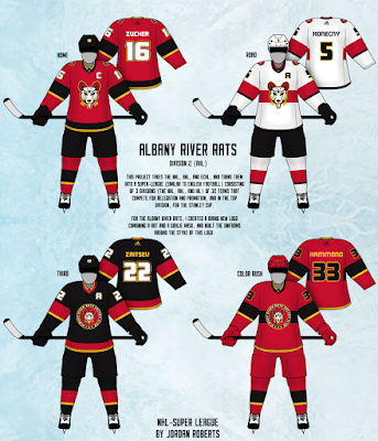
Jordan R.- Albany River Rats
Our first concept of the day is Jordan R.'s design for the defunct Albany River Rats. Right off the bat, I really like the Mighty Ducks-esque logo, it's much sharper than their original logo. I like the striping design, but it bothers me that the home and alt use a more traditional hem stripe, while the away and color rush use a chest stripe similar to the Panthers' design, especially since the chest stripe doesn't match. Font choice is solid, and I really dig the shoulder patch that's used as a primary on the two alternates. Final verdict: really solid logo design, but the inconsistencies in the striping really bring this one down. 7.5/10
Justin B.- Dallas Stars
Next up is our very own JB with a Color Rush design for the Dallas Stars. I'm actually impressed at how well the grey works on this set, and the Stars' bright Victory Green keeps it from being too drab. The simplified version of the "Big Star" jersey looks really good, and the less detailed logo looks really clean. Gear and presentation are solid, as always. Final verdict: a great looking grey jersey for the Stars that I wouldn't mind seeing on the ice. 8.5/10 and my COTW NOMINEE!!!!!
Lucas D.- Washington Nationals
Our next concept is Lucas D.'s latest MLB crossover, this one for the Washington Nationals. I really like the stars in the striping pattern, it fits in well with the team's identity. I also like the use of red in the cuffs and hem on the away jersey, it does a great job of helping out the color balance, especially when paired with the blue breezers. The blue and red in the striping are pretty close in color, though, so I would either break them up or thicken up the blue stripe. I like the Nats' W logo as the main crest, but I would have liked to have seen a shoulder patch (possibly using this logo) to keep it from looking too bare up top. Blue gear works pretty well, but I'm not a fan of that number font. Final verdict: a decent crossover for the Nats, but a few small tweaks could really make this one a home run. 8/10
Mac W.- Dallas Stars
Our final design of the day is Mac W.'s design for the Dallas Stars. Once again, we see a simplified version of the Big Star jersey, but this time I think it's a little too simple. With only one stripe separating the two main colors, it becomes a little too much like color blocking for my liking. Furthermore, the black stripe on the white jersey is too close to the green, especially with the use of the original darker green rather than the current Victory Green. The main logo has been simplified almost to the point that it becomes cartoonish, and I hate the split collar. As for the alternate, I like the idea behind the custom logo, but trying to merge the two eras' color schemes makes it a bit of a mess. The striping would be okay, but the shoehorning in of the gold is just unnecessary and takes away from the design. Finally, the predominantly white shoulder patch sticks out like a sore thumb on a black jersey. Final verdict: some decent ideas and credit for an original logo, but there's just a lot going wrong with this set. 6.5/10
That's all for me this week, see y'all next Friday!
Friday: Rats and Stars
 Reviewed by TC Moore
on
November 16, 2018
Rating:
 Reviewed by TC Moore
on
November 16, 2018
Rating:


1 comment:
Been loving Justin's colour rush concepts. Keep it up!
Post a Comment