Monday: Cyber Monday
Happy Cyber Monday everyone! For those that don't know, Cyber Monday I the Monday after Black Friday. Unlike Black Friday though, there's no fist fights, pushing, trampling or any of the other things we've come to love about Black Friday. Instead people are encouraged to shop online, so hopefully while you were surfing the net for some deals you stopped by here to get your dose of concepts.
Overall - 8.5/10
COTW November 16-22 vote (ends Friday at 12pm ET)
Nashville Predators Top 3 vote (ends Friday at 12pm ET)
Jersey Nerds Podcast (new episode every Tuesday)
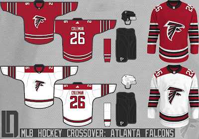
Lucas D - Atlanta Falcons
First off as a Patriots fan, part of me wishes the number on the jersey was 28. Now that I've upset Falcons fans, lets move on to the jersey itself. The logo has always been one of my favourites and it translates well to a hockey jersey. the sleeve stripes are interesting as the almost give the sleeves wings. Good call putting the numbers on the shoulder as on the sleeves would have made the arms very busy. I think the Falcons look works really well on a hockey jersey. This s a fairly basic design but the sleeve striping makes it a unique look.Overall - 8.5/10
Mac W. - Montreal Canadiens
Ok so I mentioned I was a Patriots fan above, well I'm also a Canadiens fan. Born and raised in La Belle Province. So I will try to put personal bias aside.I really like the idea of the home and away jerseys matching. That would be the only uniform change (other than adding a third) that I would approve of. Now lets talk about the logo. The look of it is fine, but I think the Canadiens deserve better than a Cincinnati Reds style C for their logo. The M logo inside of a maple leaf looks good, but the problem is that they have a team in Toronto that wouldn't approve. I like the way the away looks on an Adidas template, maybe just stick with red or white numbers instead of red on the sleeve and white on the back. The alternate looks like the 1909 jersey had a love child with the Nordiques jersey. I feel like the fleur de lis hem is way too similar to the Nords, I would've stuck with them as a shoulder patch. The logo on the third jersey looks to be inspired by the University of Toronto Varsity Blues logo. Stylistically I think the logo looks very nice, but nothing about it or the jersey screams Canadiens. Visually the set looks decent, but it takes away almost all of the teams history. Canadiens fans (even fans of other teams) wouldn't approve this drastic of a change.
Overall - 5.75/10
Taylor R. - Chicago Blackhawks
Now this is a good example of a redesign of an Original 6 team that, unlike the concept above, keeps the teams tradition present. The home jersey has minor changes such as fixing the collar (thank you!), removing a stripe on the hem and adding a stripe to the arm. The away jersey sees the addition of a red yoke. While I don't see something like this being adopted full time, its a great take on their look and it adds more red in the away jersey which I feel at times is lacking. The hem and sleeve stripes on the away don't match the home which takes away from the set slightly. Regardless of that this is still a fantastic look. The home jersey is without doubt an improvement over their current home, while only tweaking it and the away while being a big change, isn't offensive and revamps a lot of what already existed and giving it more colour.
Overall - 8.75/10 COTW nominee
That's all from me. Don't forget to vote for the COTW and the Nashville Predators competition. Voting ends on Friday at noon ET. See you all next week.
Monday: Cyber Monday
 Reviewed by Unknown
on
November 26, 2018
Rating:
 Reviewed by Unknown
on
November 26, 2018
Rating:


3 comments:
Can we please address that the Falcons concept says its an MLB crossover??
@Jamie: I noticed that a while ago, adjusted it on my concepts already posted on the sportslogos.net boards and on future concepts, but the next couple will still say MLB.
One the blackhawks' away, put the double stripe back on the bottom and it's golden
Post a Comment