Thursday: HJC Open Voting & Last Day COTW Voting
-----------------------------------------------------------
In all the hoopla of the HJC Open the COTW vote has taken a little bit of a backseat. Today is the last day to cast your vote for that. So, while your making your Open votes why not place your COTW vote as well!
-----------------------------------------------------------
Committee Members, here is your voting rundown...
COTW June 18-24 vote (ends Thursday @ 11:59pm EST)
HJC Open Round 1 votes (ends Sunday @ 11:59pm EST)
-----------------------------------------------------------
Johannesburg Jaguars concepts (by Chuckie)
I'm sorry. I'm trying, but I can't bet past the fact that it's a Jacksonville Jaguars logo. I also find hockey in Johannesburg hard to believe as well. As for the concepts they are decently executed, but the completely white uniform is a little gimmicky. 5/10
Nashville Predators concepts (by Stephen T.)
The re-colouring of the logo is a major downgrade. I get that the jerseys are playing off of the old 3rd jersey, but they look a bit boring. Also, the shading needs to be properly executed on the full body models. 5/10
Bakersfield Condors concepts (by WinnipegJets96) *Description on concepts. 7/10
Oakland Seals concept (by Tristan)
It's an Edge-ified Seals jersey. Execution is alright. Why did the logo lose all of its outlines? The laces have loose pixels in them and there are loose pixels at the tip of the collar. 6/10
Kings vs Devils concepts (by Ricky)
On the Kings jerseys, the colours throw me off a bit. There's black trim on the purple jersey, but not really on the white jersey. Then again on the purple jersey the yokes and big crown are yellow, but on the white they are different colours. The Devils jerseys are okay, but I think the logo on the cuffs would be irrelevant as it would get covered by the players' gloves. Also, these busy backgrounds make the image seem cluttered. 6/10
Los Angeles Kings concepts (by Brandon C.)
These are nice, classic, and simple fauxback Kings sweaters. The white collar works for me on the yellow jersey, but not on the purple one for some reason. I think the reverse coloured logo on the yellow jersey would have worked better. I like that Brandon put the time into altering a live action photo. 7/10
Washington Capitals concept (by Jeremy T.)
I'm not a fan of the two different sleeve designs, but this one is alright. I'd go without the fade on the back though and just have it cut off at the stitching. I'd also go with 3 stars on the sleeve instead of 5. 7/10
Washington Capitals concepts (by Kevin D.)
Kevin has altered the home and road jerseys a bit. It's a lateral move in my opinion, but not bad. The new 3rd jersey is quite good! I think white numbers with a thick red outline would work better though. 8/10
Adirondack Phantoms concepts (by NB14)
I like these, but I do think they need something on the hems. I also think that the purple on the collar gets lost unless you use orange with it. These are very nicely executed though.7/10
Rouyn-Noranda Huskies concept (by Brady)
Because of how "flashy" the gradients are I think using plain black pants would be best here. I'm not really a fan of gradients, but if they HAD to be on there then Brady has done a nice job here. Also to note, the player that Brady has put on the jersey is a former teammate of his who was drafted by the Huskies. 7/10
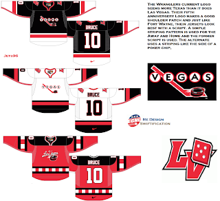
Las Vegas Wranglers concepts (by WinnipegJets96) *Description on concept. 6/10
Pittsburgh Penguins concept (by Tyler G.)
Tyler Edge-ified the late 80's Penguins jersey, but has gone with white numbers using two thin outlines. This is really well executed. 7/10
Anaheim Ducks concepts (by MasonII)
I like these because they seem like a more traditional simplification of the current Ducks sweaters. On the black jersey, instead of going with two gold stripes I think making the stripe closest to the cuff black would look better. These are still great and well executed. 8/10
New York Americans concept (by Brian B.)
This is excellent. I love the stars on the angled yokes and I even like the red on the sides of the jersey! The simple stripes on the pants are nice too. I think some stars going down the side of the pants would really add to this concept. COTW nom from me! 8/10
Thursday: HJC Open Voting & Last Day COTW Voting
 Reviewed by Ryan
on
June 28, 2012
Rating:


.png)


6 comments:
I'll second Brian's COTW!
brady for COTW also, good luck to everyone in the HJC open!
Brian B for COTW! Even if you scratch Mike Ivall's great logo, you have there excellent and original jerseys!
Woops! Not Mike Ivall's logo, Micah's logo! My mistake, sorry!
LOVE the Vegas jerseys Jets96! COTW from me! Also I like what's goin on with the Kings/Devils set Ricky. The crown on on the base of the Kings jersey is cool but if you don't mind me sayin, I don't think too many Rangers fans would like the idea of the Devils using the same drop shadow numbers style! (Still looks cool though!)
I've been away for a while from HJC, so I thought id catch up on all I've missed. Ryan I know u didn't like that Jaguars concept, but if it was meant to be a Jacksonville football meets hockey concept, i think it's pretty cool. It looks like a soccer jersey 2.
Post a Comment